Demo - Figma - Twitter
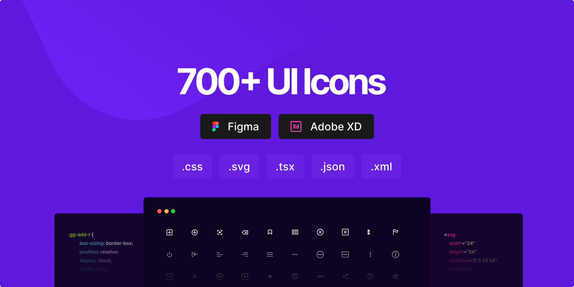
Open-source CSS, SVG and Figma UI Icons
Available in SVG Sprite, styled-components, NPM & API


New in 2.0
🥳
200 New Icons
🚀
SVG Icons
🔥
SVG Sprite
💅
Styled Components
⚛️
React Local Styled Components
🦄
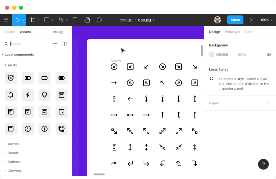
Figma Components
🔮
Adobe XD Components
Table of Contents
- Get Started
- HTML include
- CSS @import
- SVG
- JSON - paths
- XML - paths
- React
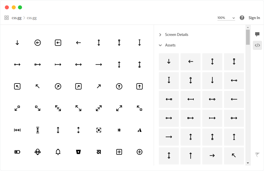
- Design Tools
- Contributors
- Donate
- Support
- v.1.0.6 or older
- TODO:
Get Started
Install the latest version via npm or yarn
npm i css.gg
yarn add css.gg
Using Package Manager
This package contains the following directories and files:
| Path | What it is |
|---|---|
| /css | individual *.css icons |
| /scss | individual *.scss icons |
| /svg | individual *.svg icons |
| /tsx | individual *.tsx icons styled-components |
| /all.css | all icons compressed in a single file |
| /all.d.ts | styled-components |
| /all.fig | local figma file same as https://css.gg/fig |
| /all.js | list of exported styled-components |
| /all.js.map | styled-components |
| /all.json | all icons *.css, *.svg, *.tsx including markup & public path |
| /all.scss | all icons in a single SCSS file npm i node-sass needed |
| /all.svg | SVG Sprite with all icons |
| /all.xd | local adobe xd file same as https://css.gg/xd |
| /all.xml | all icons *.css, *.svg, *.tsx including markup & public path |
HTML include
1. All icons
<link href='https://css.gg/css' rel='stylesheet'>


<link href='https://unpkg.com/css.gg/icons/all.css' rel='stylesheet'>


<link href='https://cdn.jsdelivr.net/npm/css.gg/icons/all.css' rel='stylesheet'>
2. Single icon
<link href='https://css.gg/ {ICONNAME} .css' rel='stylesheet'>


<link href='https://unpkg.com/css.gg/icons/css/ {ICONNAME} .css' rel='stylesheet'>


<link href='https://cdn.jsdelivr.net/npm/css.gg/icons/css/ {ICONNAME} .css' rel='stylesheet'>
3. Collection
<link href='https://css.gg/css?= {ICONNAME} | {ICONNAME}' rel='stylesheet'>
4. Markup
<i class=" {ICONNAME} ">i>


<span class=" {ICONNAME} ">span>


<div class=" {ICONNAME} ">div>


<gg-icon class=" {ICONNAME} ">gg-icon>
5. Example
>
<html lang="en">
<head>
    <meta charset="UTF-8">
    <meta name="viewport" content="width=device-width, initial-scale=1.0">
    <title>Documenttitle>


    <link href='https://css.gg/css' rel='stylesheet'>

head>
<body>


    <i class="gg- {ICONNAME} ">i>


    <div class="gg- {ICONNAME} ">div>


    <gg-icon class="gg- {ICONNAME} ">gg-icon>

body>
html>
CSS @import
1. All icons
/* css.gg */
@import url('https://css.gg/css');

/* UNPKG */
@import url('https://unpkg.com/css.gg/icons/all.css');

/* JSDelivr */
@import url('https://cdn.jsdelivr.net/npm/css.gg/icons/all.css');
2. Single icon
/* css.gg */
@import url('https://css.gg/ {ICONNAME} .css');

/* UNPKG */
@import url('https://unpkg.com/css.gg/icons/css/ {ICONNAME} .css');

/* JSDelivr */
@import url('https://cdn.jsdelivr.net/npm/css.gg/icons/css/ {ICONNAME} .css');
3. Collection
/* css.gg */
@import url('https://css.gg/css?= {ICONNAME} | {ICONNAME}');
4. Resizing
To resize an icon you just need to change the value of a css variable "--ggs" to any value you like if not specified it falls back to 1 or the actual size.
.gg-{ICONNAME} {
    /* This value will multiple the actual size  */
    --ggs: 10;
}
The variable can be added to the parent, custom class,body or root level if you want all icons same size.
:root {
    --ggs: 6;
}
5. Coloring
By default all the CSS, SCSS icons inherit the color from the parent by using currentColor attribute how ever you can apply any color you like.
.gg-{ICONNAME} {
  color: teal;
}
SVG
1. SVG Sprite - Download Path
You can't use these paths, you must download since SVG doesn't allow external sources.
https://css.gg/svg


https://unpkg.com/css.gg/icons/all.svg


https://cdn.jsdelivr.net/npm/css.gg/icons/all.svg
1.1. Example
>
<html lang="en">
<head>
    <meta charset="UTF-8">
    <meta name="viewport" content="width=device-width, initial-scale=1.0">
    <title>Documenttitle>
head>
<body>


<svg><use xlink:href="path/to/all.svg# {ICONNAME} "/>svg>

body>
html>
2. SVG Single Icon - Download Path
https://css.gg/ {ICONNAME} .svg


https://unpkg.com/css.gg/icons/svg/ {ICONNAME} .svg


https://cdn.jsdelivr.net/npm/css.gg/icons/svg/ {ICONNAME} .svg
2.1. Example - SVG Sprite
>
<html lang="en">
<head>
    <meta charset="UTF-8">
    <meta name="viewport" content="width=device-width, initial-scale=1.0">
    <title>Documenttitle>
head>
<body>


<svg><use xlink:href="path/to/all.svg# {ICONNAME} "/>svg>

body>
html>
2.2. Example - Inline SVG Sprite/Symbol
You can add as symbol each or copy the entire file contents at one of the CDN alternatives as mentioned at 2.1
>
<html lang="en">
<head>
    <meta charset="UTF-8">
    <meta name="viewport" content="width=device-width, initial-scale=1.0">
    <title>Documenttitle>
head>
<body>

  <svg xmlns="http://www.w3.org/2000/svg" style="display: none;" >
    <symbol id="{ICONNAME}">

    symbol>
  svg>


  <svg><use xlink:href="# {ICONNAME} "/>svg>

body>
html>
2.3. Example Single copy/paste icon
You can go to https://css.gg/{ICONNAME} and copy the SVG icon directy and paste it on your project.
You can also download a single icon by just visiting https://css.gg/{ICONNAME}.svg
>
<html lang="en">
<head>
    <meta charset="UTF-8">
    <meta name="viewport" content="width=device-width, initial-scale=1.0">
    <title>Documenttitle>
head>
<body>


  <svg width="24" height="24" viewBox="0 0 24 24" fill="none" xmlns="http://www.w3.org/2000/svg" > <path d="M9 13H15V17H9V13Z" fill="currentColor" fill-opacity="0.5" /> <path d="M6 7H18V11H6V7Z" fill="currentColor" /> svg>

body>
html>
3. Encode SVG for CSS
You need to define width and height in order for this to work. Afterwards you can just create a div
.gg-{ICONNAME} {

  background-image:
    url("data:image/svg+xml,");

}
To encode use this tool
https://yoksel.github.io/url-encoder/
3.1. Example - Encoded SVG for CSS icon
>
<html lang="en">
<head>
    <meta charset="UTF-8">
    <meta name="viewport" content="width=device-width, initial-scale=1.0">
    <title>Documenttitle>
head>
<body>


    <i class="gg- {ICONNAME} ">i>


    <div class="gg- {ICONNAME} ">div>


    <gg-icon class="gg- {ICONNAME} ">gg-icon>

body>
html>
4. Coloring a SVG icon
By default all colors use currentColor as value in order to inherit the color from the parent.
If you wish to change that color you can do the following.
4.1. Directly on the icon
>
<html lang="en">
<head>
    <meta charset="UTF-8">
    <meta name="viewport" content="width=device-width, initial-scale=1.0">
    <title>Documenttitle>
head>
<body>

    <svg><path fill=" {COLOR} " />svg>

body>
html>
4.2. using class
>
<html lang="en">
<head>
    <meta charset="UTF-8">
    <meta name="viewport" content="width=device-width, initial-scale=1.0">
    <title>Documenttitle>

    <style>
      /* 1. You define the CSS class like this:  */

      .custom__color path {
        color: teal;
      }

    style>
head>
<body>


    <svg class="custom__color"><path />svg>

body>
html>
JSON - paths
1. All icons
https://css.gg/json


https://css.gg/json?=&op=css


https://css.gg/json?=&op=css+markup


https://unpkg.com/css.gg/icons/all.json


https://cdn.jsdelivr.net/npm/css.gg/icons/all.json
2. Single icon
https://css.gg/json?= {ICONNAME}


https://css.gg/json?= {ICONNAME} &op=css


https://css.gg/json?= {ICONNAME} &op=css+markup
3. Collection
https://css.gg/json?= {ICONNAME} | {ICONNAME}


https://css.gg/json?= {ICONNAME} | {ICONNAME} &op=css


https://css.gg/json?= {ICONNAME} | {ICONNAME} &op=css+markup
XML - paths
1. All icons
https://css.gg/xml


https://css.gg/xml?=&op=css


https://css.gg/xml?=&op=css+markup


https://unpkg.com/css.gg/icons/all.xml


https://cdn.jsdelivr.net/npm/css.gg/icons/all.xml
2. Single icon
https://css.gg/xml?= {ICONNAME}


https://css.gg/xml?= {ICONNAME} &op=css


https://css.gg/xml?= {ICONNAME} &op=css+markup
3. Collection
https://css.gg/xml?= {ICONNAME} | {ICONNAME}


https://css.gg/xml?= {ICONNAME} | {ICONNAME} &op=css


https://css.gg/xml?= {ICONNAME} | {ICONNAME} &op=css+markup
React
On a React project you can include a single icon as CSS, Styled Component, SCSS, SVG or call the contents using .json or .xml files.
Note that only styled-components icons can be called directly such as:
import { ICONNAME } from 'css.gg'
1. Styled Components
💅
After you install the package by using npm i css.gg or yarn add css.gg you can add a single icon like this:
import React from 'react'
import { ICONNAME } from 'css.gg'

export default function() {
  return (
    <div>

      <ICONNAME />

    </div>
  )
}
2. Local Single Icon as styled-component
If you need to download a single typescript or styled-componment format icon without downloading the entire package just visit the link like this:
https://css.gg/{ICONNAME}.tsx
2.1. Copy directly from the page
If you don't want to download at all but just copy paste visit the icon page and you have a special tab for it.
https://css.gg/{ICONNAME}
2.2. Local Component Example
import React from 'react';

// local path
import { ICONNAME } from "./ {ICONNAME} "

function App() {
  return (
    <div>

      <ICONNAME />

    </div>
  );
}

export default App;
3. SVG Sprite method
import React from 'react';

// Import function from package
import { SVG } from 'css.gg'

function App() {
  return (
    <div>

      <svg width="24" height="24"><use xlinkHref={SVG + '#gg-ICONNAME'} /></svg>

    </div>
  );
}

export default App;
4. All CSS icons
import React from 'react';

// Import function from package
import { CSS } from 'css.gg'

function App() {
  return (
    <div>

        <!-- Using i tag  -->
        <i className="gg- {ICONNAME} "></i>

        <!-- Using div tag  -->
        <div className="gg- {ICONNAME} "></div>

        <!-- Using custom tag  -->
        <gg-icon className="gg- {ICONNAME} "></gg-icon>

    </div>
  );
}

export default App;
4.1. Single CSS icon
import React from 'react';

// Import path from package
import 'css.gg/icons/css/ {ICONNAME} .css'

function App() {
  return (
    <div>

        <!-- Using i tag  -->
        <i className="gg- {ICONNAME} "></i>

        <!-- Using div tag  -->
        <div className="gg- {ICONNAME} "></div>

        <!-- Using custom tag  -->
        <gg-icon className="gg- {ICONNAME} "></gg-icon>

    </div>
  );
}

export default App;
5. All SCSS icons
SCSS format to work you need to have node-sass installed npm i node-sass
import React from 'react';

// Import function from package
import { SCSS } from 'css.gg'

function App() {
  return (
    <div>

        <!-- Using i tag  -->
        <i className="gg- {ICONNAME} "></i>

        <!-- Using div tag  -->
        <div className="gg- {ICONNAME} "></div>

        <!-- Using custom tag  -->
        <gg-icon className="gg- {ICONNAME} "></gg-icon>

    </div>
  );
}

export default App;
5.1. Single SCSS icon
SCSS format to work you need to have node-sass installed npm i node-sass
import React from 'react';

// Import path from package
import 'css.gg/icons/scss/ {ICONNAME} .scss'

function App() {
  return (
    <div>

        <!-- Using i tag  -->
        <i className="gg- {ICONNAME} "></i>

        <!-- Using div tag  -->
        <div className="gg- {ICONNAME} "></div>

        <!-- Using custom tag  -->
        <gg-icon className="gg- {ICONNAME} "></gg-icon>

    </div>
  );
}

export default App;
6. Combined import SVG, CSS, SCSS etc.
import { SVG, CSS, SCSS, ICONNAME, ICONNAME } from 'css.gg'
Design Tools
1. Figma - https://css.gg/fig
All icons are available as components on assets from where you can search for a sigle icon or browse categories.
2. Adobe XD - https://css.gg/xd
All icons are available as components
Contributors
- Astrit - Author
- JiangWeixian - Styled Components
- Lona - Figma/SVG Design
To become a contributor do a new pull request.
Donate
| Source | Link |
|---|---|
| Github Sponsor | https://github.com/sponsors/astrit |
| Open Collective | https://opencollective.com/css-gg |
| PayPal | https://paypal.me/GjonMalsijaj |
Support
Discord - https://discord.gg/e7NDKFM
v.1.0.6 or older
In order to access older versions you can use one of the provided CDN Alternatives
https://unpkg.com/browse/[email protected]/


https://cdn.jsdelivr.net/npm/[email protected]/
TODO:
- CSS Modules
- Angluar
- Vue.js
If you would like to contribute feel free to do a new pull request.


 302 Sep 26, 2022
 110 Dec 24, 2022
 117 May 26, 2021
 96 Dec 10, 2022
 21 Oct 9, 2022
 37 Sep 26, 2022
 26 Dec 31, 2022
 1 Jan 6, 2022
 10.2k Jan 4, 2023
 4 Oct 7, 2021
 14.5k Jan 4, 2023
 17 Aug 8, 2022
 1.1k Jan 2, 2023
 32.1k Jan 4, 2023
 173 Dec 30, 2022
 23 Nov 29, 2022
 7 Sep 22, 2022
 129 Dec 24, 2022
 11.1k Jan 8, 2023