Bootstrap 5 UI KIT - 700+ components, plain JavaScript, MIT license, simple installation.
MDB is a collection of free Bootstrap templates, themes, design tools & resources.
Get started
>> Get Started in 1 minute
Simple installation via .zip, npm or cdnjs.
>> Install with Webpack
This option is useful for experienced developers it enables bundling, unit testing code formatting, linting, saas support & more.
>> Install with MDBGO
Free Hosting, WordPress support, custom domains, SSL support, free database, frontend & backend templates, webpack starter included, git repostiory, FTP & jenkins support.
>> Install with MDBGO + e-commerce shop integration
One click setup! MDB GO allows you to create a WordPress page with a single click. Regardless whether you want to create a Travel Blog or an e-commerce shop to sell your product you can easily do that. You can even combine both into single page.
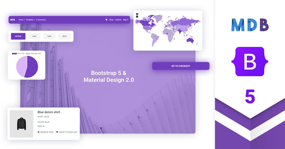
About Material Design for Bootstrap 5 & Vanilla JavaScript
Created by 


Trusted by 2 000 000+ developers & designers. Used by companies & institutions like
 |
 |
 |
 |
 |
 |
 |
 |
 |
 |
 |
 |
 |
 |
|
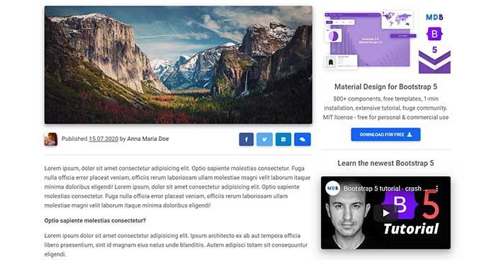
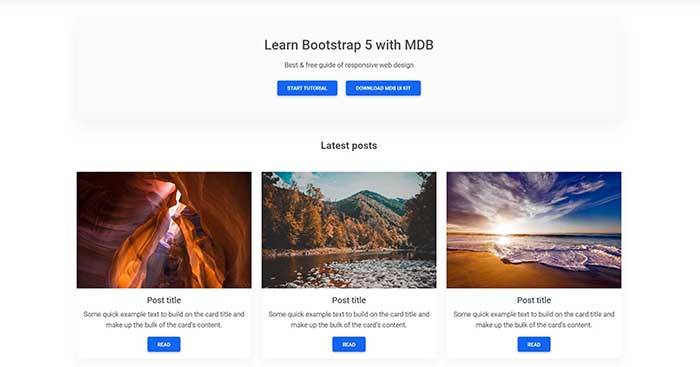
Bootstrap 5 tutorial
>> Learn more about Bootstrap 5
>> Subscribe to our YouTube channel with dozens of Bootstrap tutorials
 |
 |
| Start learning from Basics  |
Learn Bootstrap 5 | Crash Course for Beginners in 1.5H |
Demo
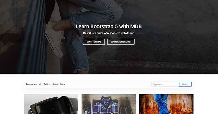
Simplicity and ease of use are key features of MDB 5 UI Kit. You need only one minute to install and run it.
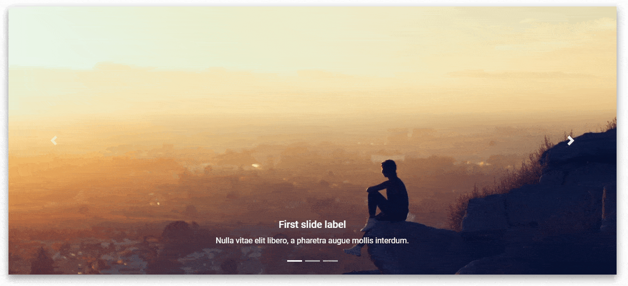
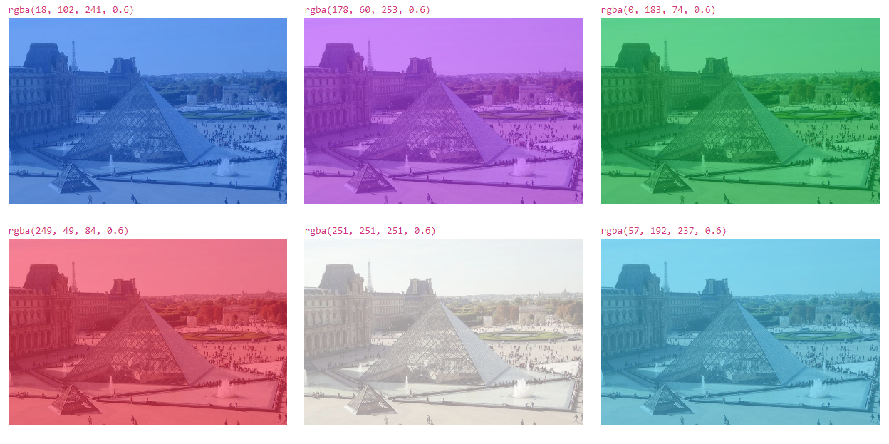
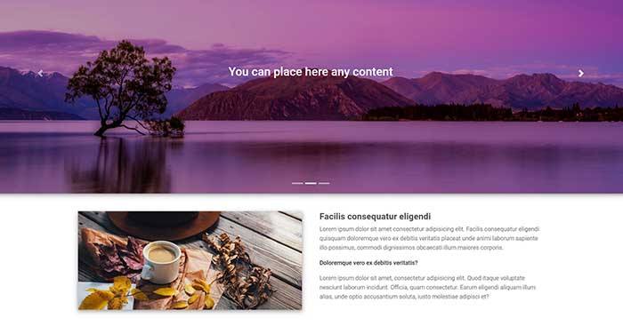
Carousel
A slideshow component for cycling through elements—images or slides of text—like a carousel.
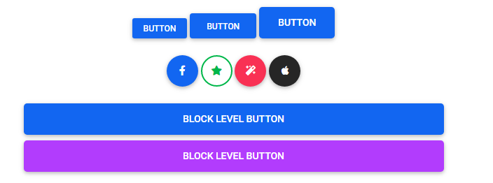
Buttons
Use MDB custom button styles for actions in forms, dialogs, and more with support for multiple sizes, states, and more.


Spinners
Indicate the loading state of a component or page with MDB spinners, built entirely with HTML, CSS, and no JavaScript.


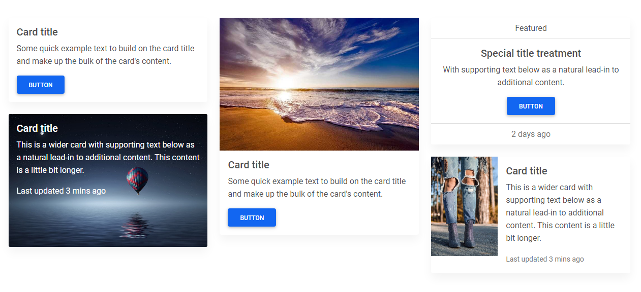
Cards
A card is a flexible and extensible content container. It includes options for headers and footers, a wide variety of content, contextual background colors, and powerful display options.
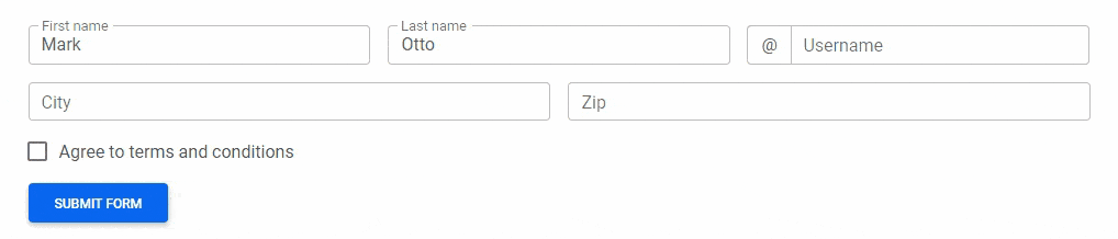
Validation
Provide valuable, actionable feedback to your users with HTML5 form validation, via browser default behaviors or custom styles and JavaScript.
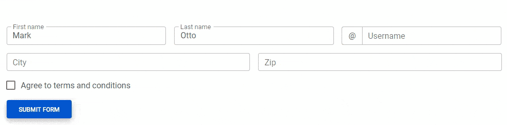
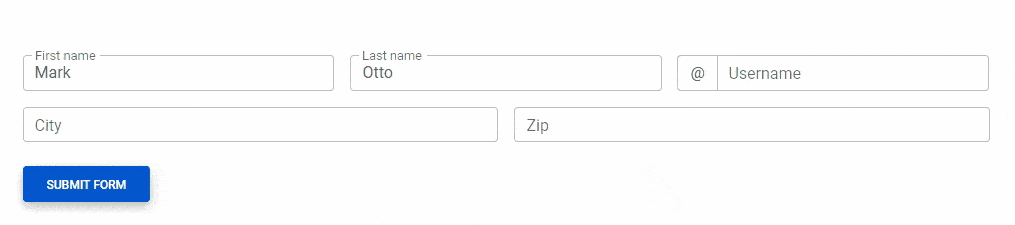
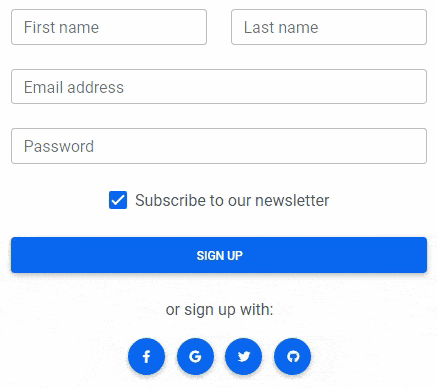
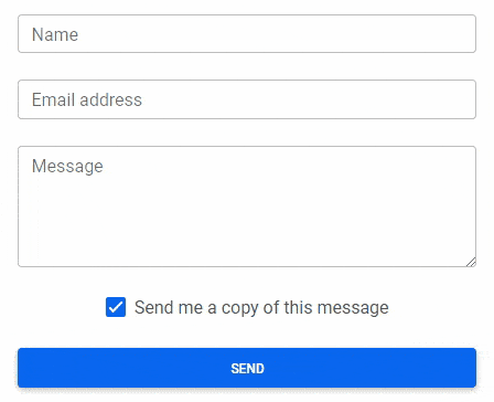
Forms
Examples and usage guidelines for form control styles, layout options, and custom components for creating a wide variety of forms.
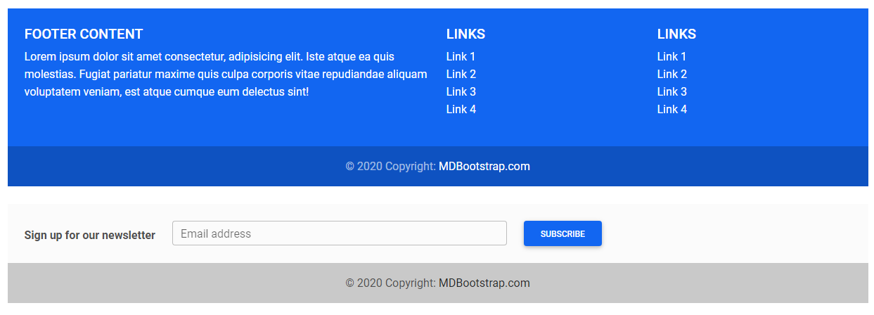
Footer
A footer is an additional navigation component. It can hold links, buttons, company info, copyrights, forms, and many other elements.
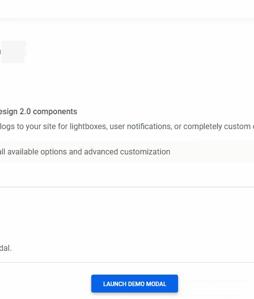
Modal
Use MDB modal plugin to add dialogs to your site for lightboxes, user notifications, or completely custom content.
Hover
MDB hover effect appears when the user positions the computer cursor over an element without activating it. Hover effects make a website more interactive.

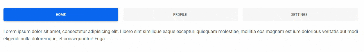
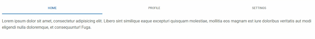
Tabs
Tabs are quasi-navigation components which can highly improve website clarity and increase user experience.
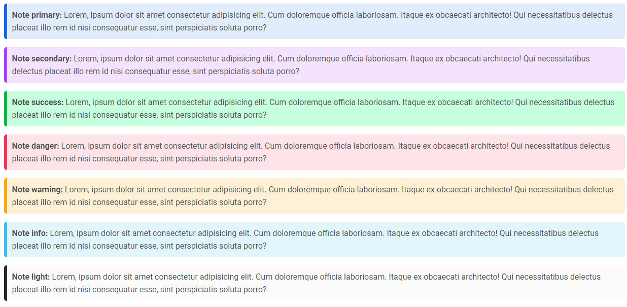
Notes
Notes are small components very helpful in inserting an additional piece of information.
ScrollSpy
Automatically update Bootstrap navigation or list group components based on scroll position to indicate which link is currently active in the viewport.
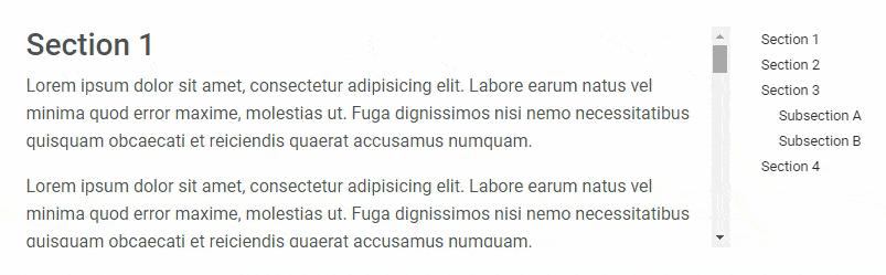
Also check out our standalone project Perfect Scrollbar which is included in MDB.
Free Bootstrap 5 templates
All of the templates were created with MDB 5 UI KIT (Material Design for Bootstrap 5).
MDB is a free (MIT license) library, that provides extra features and significantly extends Bootstrap's capabilities.
 Ecommerce |
 Carousel Full Cover |
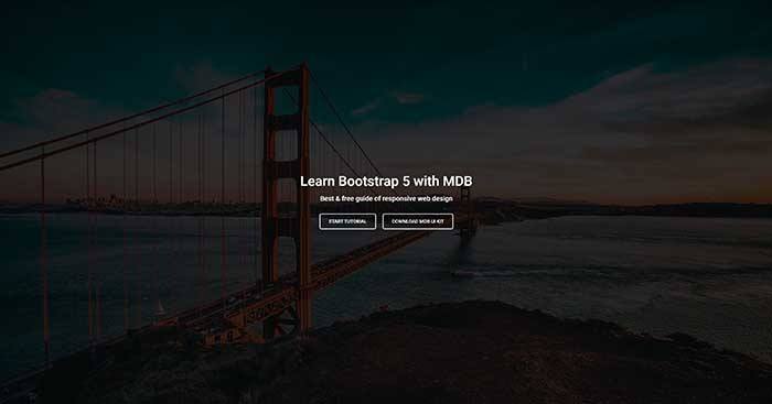 Image Full Cover |
 Portfolio |
 Post |
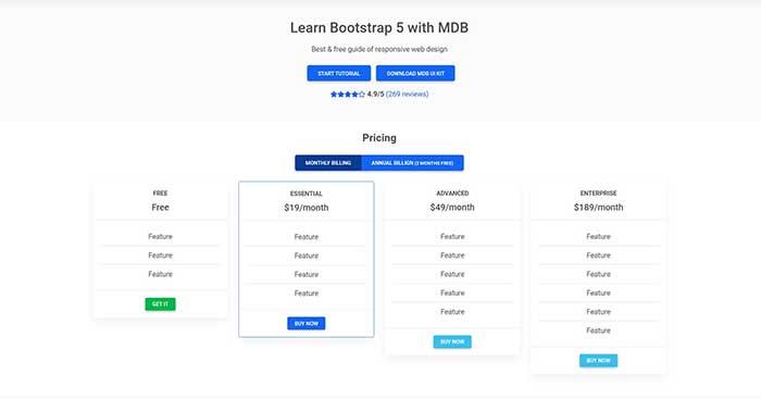 Pricing |
 Video Full Cover |
 Carousel Half Cover |
 Video Half Cover |
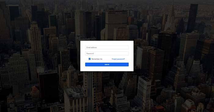 Login |
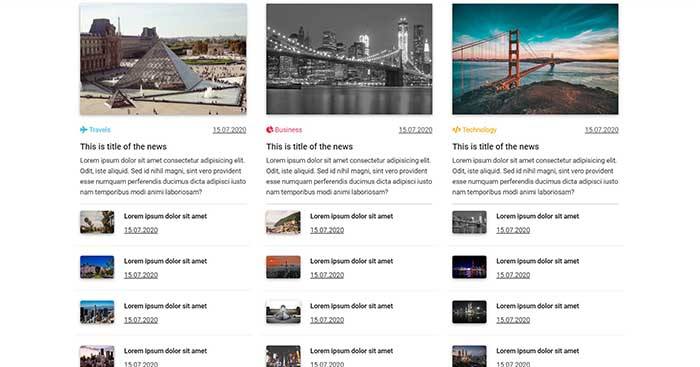 Magazine |
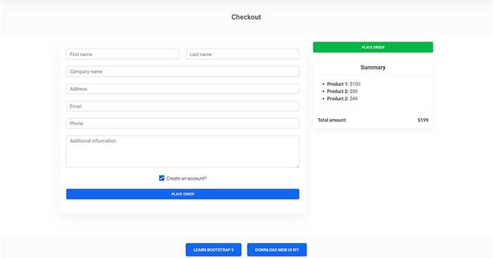 Checkout |
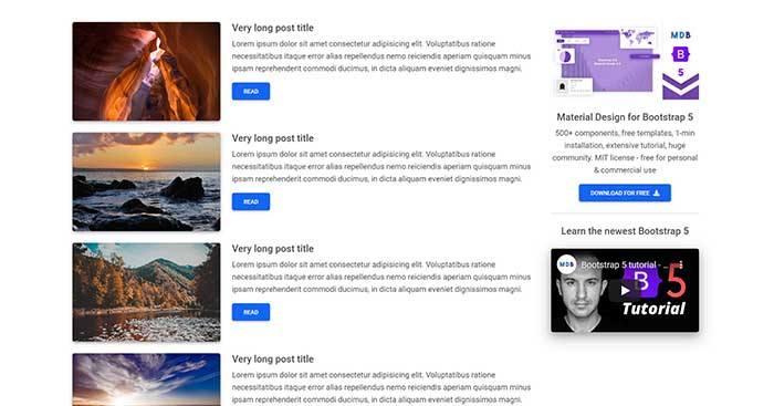
 Blog |
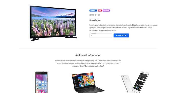 Product |
 Category |
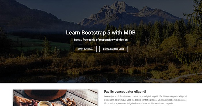 Landing Page |
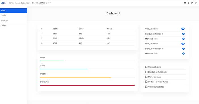 Admin |
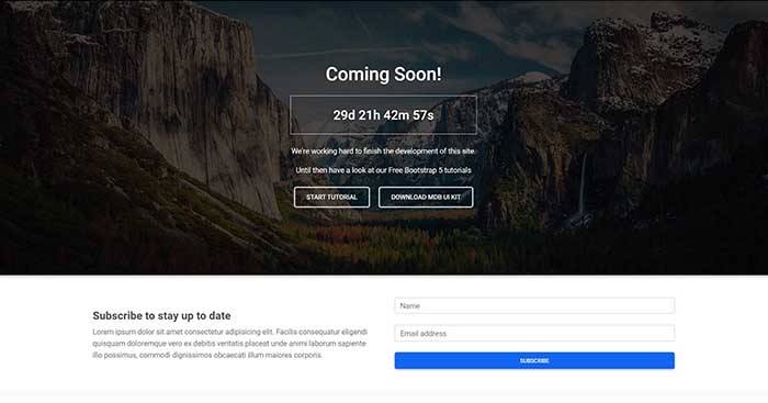 Coming Soon |
 Classic Jumbotron |
 One Column |
 Two Columns |
 Three Columns |
Extended documentation
- Bootstrap Address Form
- Bootstrap Avatar
- Bootstrap Back To Top Button
- Bootstrap Carousel Slider with Thumbnails
- Bootstrap Chat
- Bootstrap Code Blocks
- Bootstrap Comments
- Bootstrap Comparison Table
- Bootstrap Credit Card Form
- Bootstrap Drawer
- Bootstrap Nested Dropdown
- Bootstrap FAQ component / section
- Bootstrap Gallery
- Bootstrap Hamburger Menu
- Bootstrap Invoice
- Bootstrap Jumbotron
- Bootstrap Login Form
- Bootstrap Maps
- Bootstrap Media Object
- Bootstrap Mega Menu
- Bootstrap Multiselect
- Bootstrap News Feed
- Bootstrap Offcanvas
- Bootstrap Order Details
- Bootstrap Page Transitions
- Bootstrap Payment Forms
- Bootstrap Product Cards
- Bootstrap Profiles
- Bootstrap Quotes
- Bootstrap Registration Form
- Bootstrap Expanding Search Bar
- Bootstrap Shopping Carts
- Bootstrap Side Navbar
- Bootstrap Sidebar
- Bootstrap Social Media Icons & Buttons
- Bootstrap Square Buttons
- Bootstrap Survey Form
- Bootstrap Testimonial Slider
- Bootstrap Testimonials
- Bootstrap Textarea
- Bootstrap Timeline
- Bootstrap To Do List
- Bootstrap Video Carousel / Gallery
- Bootstrap Weather
- Bootstrap Dark Mode
- Bootstrap Padding
- Bootstrap Modal Size
- Bootstrap Modal Show, Close, Hide & Toggle
- Bootstrap Backdrop
- Bootstrap Card Deck
- Bootstrap Table Filter
- Bootstrap Slider
- Bootstrap Logo
- Bootstrap Popup
- Bootstrap Max Width
- Bootstrap Hero
- Bootstrap Select Dropdown
- Bootstrap Labels
- Bootstrap Dialog
- Bootstrap Screen Sizes
- Bootstrap Dropdown Button
- Bootstrap Widgets


 14 Feb 10, 2022
 138 Jan 2, 2023
 4.3k Dec 25, 2022
 8 Mar 4, 2022
 110 Nov 14, 2022
 25 Jan 1, 2023
 4 Oct 16, 2022
 83.6k Dec 30, 2022
 10 Nov 24, 2022
 71 Dec 16, 2022
 1.4k Dec 22, 2022
 41 Dec 9, 2022
 2 Oct 11, 2022
 7 May 17, 2022
 6 Sep 7, 2022
 3 Feb 19, 2022
 80 Dec 18, 2022
 5 Nov 3, 2022
 189 Jan 3, 2023