room-card


Show multiple entity states, attributes and icons in a single card in Home Assistant's Lovelace UI
NOTE: This card is base on the multiple-entities-card
NOTE: This is not a standalone lovelace card, but a row element for the entities card.
Installation
Manually add room-card.js to your
folder and add the following to the configuration.yaml file:
lovelace:
  resources:
    - url: /local/room-card.js
      type: module
OR install using HACS and add this (if in YAML mode):
lovelace:
  resources:
    - url: /hacsfiles/room-card/room-card.js
      type: module
The above configuration can be managed directly in the Configuration -> Lovelace Dashboards -> Resources panel when not using YAML mode, or added by clicking the "Add to lovelace" button on the HACS dashboard after installing the plugin.
Configuration
This card produces an room-card and must therefore be configured as an entity in an entities card.
| Name | Type | Default | Description |
|---|---|---|---|
| type | string | Required | custom:room-card |
| entity | string | Required | Entity ID (domain.my_entity_id) |
| attribute | string | Show an attribute instead of the state value | |
| name | string/bool | friendly_name |
Override entity friendly name |
| unit | string/bool | unit_of_measurement |
Override entity unit of measurement |
| icon | string | icon |
Override entity icon or image |
| image | string | Show an image instead of icon | |
| toggle | bool | false |
Display a toggle (if supported) instead of state |
| show_state | bool | true |
Set to false to hide the main entity |
| state_color | bool | false |
Enable colored icon when entity is active |
| column | bool | false |
Show entities in a column instead of a row |
| styles | object | Add custom CSS styles to the state element | |
| format | string | Formatting | Format main state/attribute value |
| entities | list | Entity Objects | Additional entity IDs or entity object(s) |
| info_entities | list | Entity Objects | Custom info_entities entity |
| tap_action | object | Actions | Custom tap action on entity row and state value |
| hold_action | object | Custom hold action on entity row | |
| double_tap_action | object | Custom double tap action on entity row |
Entity Objects
Similarly as the default HA entities card, each entity can be specified by an entity ID string, or by an object which allows more customization and configuration.
If you define entities as objects, either entity, attribute or icon needs to be specified. entity is only required if you want to display data from another entity than the main entity specified above. attribute is necessary if you want to display an entity attribute value instead of the state value. icon lets you display an icon instead of a state or attribute value (works well together with a custom tap_action).
| Name | Type | Default | Description |
|---|---|---|---|
| entity | string | A valid entity_id (or skip to use main entity) | |
| attribute | string | A valid attribute key for the entity | |
| name | string/bool | friendly_name |
Override entity friendly name (or false to hide) |
| unit | string/bool | unit_of_measurement |
Override entity unit of measurement (or false to hide) |
| toggle | bool | false |
Display a toggle if supported by domain |
| icon | string/bool | false |
Display default or custom icon instead of state or attribute value |
| state_color | bool | false |
Enable colored icon when entity is active |
| hide_unavailable | bool | false |
Hide entity if unavailable or not found |
| hide_if | object/any | Hiding | Hide entity if its value matches specified value or criteria |
| styles | object | Add custom CSS styles to the entity element | |
| format | string | Formatting | Format entity value |
| tap_action | object | Actions | Custom entity tap action |
Note that hold_action and double_tap_action are currently not supported on additional entities.
Actions
This card supports all the default HA actions. See Lovelace Actions for more detailed descriptions and examples.
| Name | Type | Default | Description |
|---|---|---|---|
| action | string | Required | more-info, toggle, call-service, url, navigate, fire-dom-event, none |
| entity | string | Override entity-id when action is more-info |
|
| service | string | Service to call when action is call-service |
|
| service_data | object | Optional data to include when action is call-service |
|
| url_path | string | URL to open when action is url |
|
| navigation_path | string | Path to navigate to when action is navigate |
|
| confirmation | bool/object | false |
Enable confirmation dialog |
| haptic | string | none |
Haptic feedback (success, warning, failure, light, medium, heavy, selection) |
Formatting
The format option supports the following values:
| Value | Type | Description |
|---|---|---|
| relative | timestamp |
Convert value to relative time (5 minutes ago) |
| total | timestamp |
Convert value to relative time (5 minutes) |
| date | timestamp |
Convert timestamp value to date |
| time | timestamp |
Convert timestamp value to time |
| datetime | timestamp |
Convert timestamp value to date and time |
| brightness | number |
Convert brightness value to percentage |
| duration | number |
Convert number of seconds to duration (5:38:50) |
| duration-m | number |
Convert number of milliseconds to duration (5:38:50) |
| invert | number |
Convert number from positive to negative or vice versa |
| kilo | number |
Divide number value by 1000 (ex. 1500 W -> 1.5 kW) |
| position | number |
Reverses a position percentage (ex. 70% open -> 30% closed) |
| precision<0-9> | number |
Set decimal precision of number value (precision3 -> 18.123) |
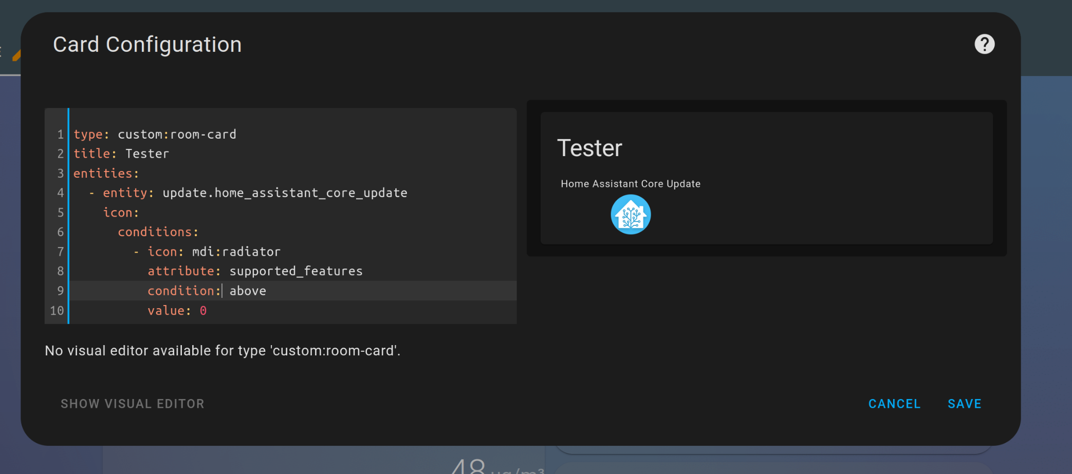
Hiding
The hide_if option can be used to hide an entity if its state or attribute value matches the specified criteria. It can be used directly with a string, number or boolean value (i.e. hide_if: 'off'), as a list with several values, or as an object with one or more of the options listed below.
| Name | Type | Description |
|---|---|---|
| above | number | Hidden if entity number value is above the specified value |
| below | number | Hidden if entity number value is below the specified value |
| value | list/any | Hidden if value matches specified value or any value in a list |
Examples
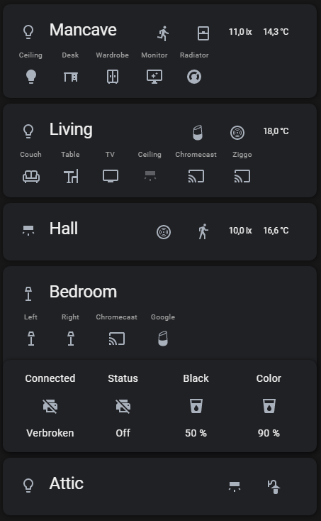
- type: custom:room-card
  title: Mancave
  entity: group.mancave_lights
  icon: mdi:lightbulb-outline
  tap_action:
    action: toggle
  entities:
    - entity: light.mancave
      name: Ceiling
      tap_action:
        action: toggle
    - entity: light.desk
      name: Desk
      icon: mdi:desk
      tap_action:
        action: toggle
    - entity: light.wardrobe
      name: Wardrobe
      icon: mdi:wardrobe-outline
      tap_action:
        action: toggle
    - entity: light.monitor
      name: Monitor
      icon: mdi:monitor-shimmer
      tap_action:
        action: toggle
    - entity: climate.radiator
      name: Radiator
      tap_action:
        action: toggle
  info_entities:
    - entity: binary_sensor.motion_sensor
      show_icon: true
    - entity: binary_sensor.window
      show_icon: true
      icon: mdi:window-closed
    - sensor.motion_sensor_illuminance
    - sensor.motion_sensor_temperature
  cards:
    - type: custom:simple-thermostat
      entity: climate.radiator_mancave
      show_states:
        - heat
      name: Radiator
      title: Mancave
      control:
        _headings: true
        _icons: true
        _names: true
        hvac:
          heat:
            icon: mdi:fire
            name: On
          'off':
            icon: mdi:power
            name: Off

- type: custom:room-card
  title: Living
  entity: group.living_lights
  tap_action:
    action: toggle
  icon: mdi:lightbulb-outline
  entities:
    - entity: light.couch
      name: Couch
      icon: mdi:sofa-outline
      tap_action:
        action: toggle
    - entity: light.table
      name: Table
      icon: mdi:table-chair
      tap_action:
        action: toggle
    - entity: light.tv
      name: TV
      icon: mdi:television
      tap_action:
        action: toggle
    - entity: light.living_ceiling
      name: Ceiling
      icon: mdi:wall-sconce-flat
      tap_action:
        action: toggle
    - entity: media_player.chromecast_living
      name: Chromecast
    - entity: media_player.stb_arris_uhd
      name: Ziggo
  info_entities:
    - entity: media_player.googlehome
      show_icon: true
      icon: mdi:google-home
    - entity: binary_sensor.smoke_sensor
      show_icon: true
    - sensor.smoke_sensor_air_temperature
  cards:
    - type: custom:mini-media-player
      entity: media_player.chromecast_living
      show_states:
        - playing
        - paused
    - type: custom:mini-media-player
      entity: media_player.stb_arris_uhd
      show_states:
        - playing
        - paused
    - type: custom:mini-media-player
      entity: media_player.googlehome
      show_states:
        - playing
        - paused

- type: custom:room-card
  title: Hall
  icon: mdi:wall-sconce-flat
  entity: light.lamp_overloop
  tap_action:
    action: toggle
  info_entities:
    - entity: binary_sensor.smoke_sensor
      show_icon: true
    - entity: binary_sensor.motion_sensor
      show_icon: true
    - sensor.motion_sensor_illuminance_2
    - sensor.motion_sensor_air_temperature_2
- type: custom:room-card
  title: Bedroom
  entity: group.bedroom_lights
  icon: mdi:floor-lamp-outline
  tap_action:
    action: toggle
  entities:
    - entity: light.left
      name: Left
      icon: mdi:floor-lamp-outline
      tap_action:
        action: toggle
    - entity: light.right
      name: Right
      icon: mdi:floor-lamp-outline
      tap_action:
        action: toggle
    - entity: media_player.chromecast
      name: Chromecast
    - entity: media_player.google_home
      icon: mdi:google-home
      name: Google
  cards:
    - type: custom:mini-media-player
      entity: media_player.chromecast
      show_states:
        - playing
    - type: custom:mini-media-player
      entity: media_player.google_home
      show_states:
        - playing
        - paused
    - title: null
      type: glance
      entity: binary_sensor.hp_printer_connectivity
      entities:
        - entity: binary_sensor.hp_printer_connectivity
          name: Connected
        - entity: sensor.hp_printer_status
          name: Status
        - entity: sensor.hp_printer_inkcartridge_black
          name: Black
        - entity: sensor.hp_printer_inkcartridge_cyanmagentayellow
          name: Color

- type: custom:room-card
  title: Attic + Garden
  entity: light.attic
  icon: mdi:lightbulb-outline
  tap_action:
    action: toggle
  info_entities:
    - entity: light.attic
      icon: mdi:wall-sconce-flat
      show_icon: true
      tap_action:
        action: toggle
    - entity: light.garden
      icon: mdi:outdoor-lamp
      show_icon: true
      tap_action:
        action: toggle


![[Feature Request] Set a different icon if a condition is met](https://avatars.githubusercontent.com/u/40715497?v=4)


 16.1k Jan 4, 2023
 200k Jan 4, 2023
 28k Jan 9, 2023
 5.4k Jan 4, 2023
 2.5k Jan 1, 2023
 2.7k Dec 27, 2022
 14.7k Jan 4, 2023
 10.2k Jan 4, 2023
 11.3k Jan 4, 2023
 24.5k Jan 4, 2023
 28 Nov 9, 2022
 1 Dec 27, 2021
 7.7k Jan 1, 2023
 5 Mar 21, 2022
 18 Jun 27, 2022
 3 Apr 29, 2022
 27 Dec 30, 2022
 6 Jul 25, 2022
 6.8k Jan 5, 2023
 5 Sep 6, 2022