Clarity is a scalable, accessible, customizable, open source design system built with web components

Overview

Clarity

Clarity Design System

Build

Clarity is an open source design system that brings together UX guidelines, design resources, and coding implementations with Web Components. This repository includes everything you need to build, customize, test, and deploy Clarity. For complete documentation, visit the Clarity website.

If you are looking for Clarity Angular, our previous implementation of Clarity built in Angular, please see the angular branch for the latest version there.

Getting Started

Clarity is published as five npm packages:

  • npm version core Contains the Web Components that work in any JavaScript framework.
  • npm version cds angular Contains shims for core usage in Angular environment
  • npm version cds react Contains shims for core usage in React environment
  • npm version clarity city Our open source sans-serif typeface.

Installing Clarity

Visit our documentation at https://clarity.design/get-started/

Documentation

For documentation on the Clarity Design System, including a list of components and example usage, see our website.

Contributing

The Clarity project team welcomes contributions from the community. For more detailed information, see our contribution guidances.

Licenses

  • The Clarity Design System is licensed under the MIT license.

Feedback

If you find a bug or want to request a new feature, please open a GitHub issue.

Include a link to the reproduction scenario you created by forking one of the Clarity Stackblitz Templates for the version you are using at Clarity StackBlitz templates.

Support

For our support policies please visit https://clarity.design/get-started/support/

For questions, ideas, or just reaching out to the team feel free to open a discussion in our GitHub Disscussion section.

Comments
  • Date & Time Picker component (new)

    Date & Time Picker component (new)

    Description

    A Date or Time Picker is a component used to quickly select a date, dates, time, or date and time value in an input field.

    Use cases under consideration

    • a "basic” option with the ability to enable features
    • calendar selector
    • month selector
    • year selector
    • time selector
    • date and time selector
    • letter (day) labels above dates
    • large touch points
    • internationalization (and localization)
      • local date/time formats
      • first day of the week (Sunday or Monday)
    • preset date/time options, 1 day, 7 days, 4 weeks, etc.

    Future use cases under consideration

    • two calendars, side by side
    • recognize values not formatting: 01.04.2017 vs 1-4-17
    • input masking

    Documentation

    Date Picker

    • use when a user needs to input a date
    • today’s date is identified by 000000 and semi bold text
    • default view of the Date Picker is today’s date; day, month and year
    • default view of weekday indicators is Sunday through Saturday
    • weekday indicators can be set to show Monday through Sunday
    • Date Picker will show when the focus is on the date input field
    • Date Picker will hide when a date is selected or focus has left the input field
    • date selected indicator is an action-blue box with white text
    • manually typing a date value into the input field will change in the Date Picker
    • selecting a new date from the Date Picker will update any previous input field entry
    • previous and next month’s date will show in grey, but are selectable
    • if the Date picker has been hidden, it can be shown again by clicking in the input field

    date picker

    • to select a different month, click the month label and see the Month selector
    • you can scroll/swipe up and down to choose different months
    • to select a different year, click the year label and see the Year selector
    • additional year can be scrolled/swiped to up and down depending on the data set
    • making a month or year selection will return the user to the calendar view
    • selecting a currently selected value will keep that selection and return to the calendar

    month year pickers

    Date Range Picker

    • use when a user needs to select a range of dates
    • selected date indicator shows on the first and last selected dates
    • dates in between the first and last dates will be filled with #D9E4EA and can span rows
    • range can be selected by clicking and dragging or by clicking one date and then a second
    • clicking and dragging either the start or end date will change the range
    • after a range has been selected:
      • clicking on a date after the start date will update the end date
      • clicking on a date before the start date will update the start date

    date range picker

    Time Picker

    • clicking an up caret will change the value up by one increment: 10 to 11
    • clicking a down caret will change the value down by one increment: 10 to 9
    • default increments are 1 hour and 1 minute
    • scrolling/swiping on a value will change it up and down
    • minute increments can be set to 5, 10, 15, 30 or a custom value
    • Time Picker recognizes locale and will swap to 24 hour, or 24 hour can be chosen
    • time value will select current time by default, or can be overridden by a custom value
    • clicking the AM or PM will switch the selection, action-blue being the selected value

    digital pickers

    • touching any hour or minute indicator will select that value
    • selected values turn active-blue
    • touch and drag in a circular motion will move the indicator from one increment to the next
    • Time Picker recognizes locale and selecting PM will change hour values to 24 hour values
    • time value will select current time by default, or can be overridden by a custom value
    • clicking the AM or PM will switch the selection, action-blue being the selected value

    analog picker

    Date & Time Picker

    • use when the user needs to input a date and time value for something
    • has all of the normal functionality of Date and Time Picker combined into one
    • used with one input field
    • updating either component will update the value in the input field

    date time picker

    Quick Picker

    • use when a user needs to pick a date or time from a small set of values
    • using this component retains date/time stamp data formatting vs using a Dropdown

    quick picker

    References

    • Material Design, iOS, Mac Mail, Outlook, Southwest, Homeaway

    Documentation is subject to change

    type: new component Epic ux: ready component: forms @clr/angular type: design resolution: enhancement request 
    opened by reddolan 122
  • Combobox component (new)

    Combobox component (new)

    Description

    • a Select component that allows for typing as well as scrolling through options
    • similar to autocomplete or combobox

    Use cases under consideration

    • type into field and filter down to options matching query
    • click something to show the options available
    • scroll through list and select an option
    • multi-select
    • option grouping (or categories)
    • accessible navigation, option selection and option deletion
    • system status for slow responding option list
    • highlight value matches in options

    Documentation

    Basic

    Default view

    • will look like a standard Select
    • caret will be grey and have an circle around it to distinguish it from a standard Select
    • the input field will show the standard input focus style (blue underline) while being interacted with

    inactive

    Active view

    • clicking the caret will show the Options dropdown
    • with the dropdown showing, the arrow keys can navigate up or down through options
    • hitting Enter will select the option and display it in the input field
    • show up to 10 options at a time
    • if more than 10 options exist, user will be able to scroll down through them
    • hover or highlight while scrolling will be the hover grey (#EEE)

    active - hover

    Selections

    • selected option will be the row selection blue (#D9E4EA)

    active - selected

    Typing

    • tabbing into the field will show the cursor in the input field
    • options are displayed after 1 character has been typed
    • query values are highlighted bold within each matching option
    • pressing the down arrow key shows the dropdown
    • user can tab to the caret and activate the dropdown
    • tabbing out, clicking outside of, or hitting Escape will close the dropdown

    active - typing

    Searching message

    • if the options come back quickly (< 100ms), show the Options dropdown
    • if the options load slowly (> 100ms), show the Searching dropdown
    • Searching message will use the Select's label value

    searching

    Multiselect

    • includes all Basic interactions
    • user can select more than one option by clicking on it or hitting Enter
    • holding Shift and selecting two separate options will select all options in between them
    • hitting Enter or clicking outside of the dropdown will make the option visible in the input field as a Label
    • the Label will have an “X” in it for easy removal
    • selecting the Label and deleting it will remove it from the selected options

    labels

    • Labels will fill the space available in the inut field and over flow will wrap vertically

    many labels

    Option Groups

    • options can be displayed on groups with a title

    option groups

    Custom Option Format

    • option can be formatted in a custom way
    • can be used to include additional useful data such as images or other data

    custom options

    References

    type: new component component: forms @clr/angular type: design 
    opened by reddolan 99
  • Syntax Error in @clr/core when using Jest

    Syntax Error in @clr/core when using Jest

    Describe the bug

    After the @clr/core dependency of @clr/angular was introduced in 3.0, Jest is now throwing a syntax error coming from the new package.

    node_modules\@clr\core\fesm2015\clr-core.js:1
        ({"Object.<anonymous>":function(module,exports,require,__dirname,__filename,global,jest){import { __decorate, __metadata, __awaiter } from 'tslib';
                                                                                                        ^
    
        SyntaxError: Unexpected token {
    
          at ScriptTransformer._transformAndBuildScript (node_modules/@jest/transform/build/ScriptTransformer.js:471:17)    
          at ScriptTransformer.transform (node_modules/@jest/transform/build/ScriptTransformer.js:513:25)
          at node_modules/@clr/angular/bundles/clr-angular.umd.js:2:156
          at Object.<anonymous> (node_modules/@clr/angular/bundles/clr-angular.umd.js:5:2)
    
    Test Suites: 2 failed, 4 passed, 6 total
    Tests:       16 passed, 16 total
    

    How to reproduce

    Please provide a link to a reproduction scenario using one of the Clarity Stackblitz templates. Reports without a clear reproduction may not be prioritized until one is provided.

    Steps to reproduce the behavior:

    1. Go to '...'
    2. Click on '....'
    3. Scroll down to '....'
    4. See error

    Expected behavior

    A clear and concise description of what you expected to happen.

    Versions

    App

    • Angular: [e.g. 6]
    • Node: [e.g. 8.10.0]
    • Clarity: [e.g. 0.12.5]

    Device:

    • Type: [e.g. MacBook]
    • OS: [e.g. iOS]
    • Browser [e.g. chrome, safari]
    • Version [e.g. 22]

    Additional notes

    Add any other notes about the problem here.

    flag: has workaround 
    opened by whizkidwwe1217 45
  • Datagrid Enhancement: Filtering

    Datagrid Enhancement: Filtering

    Description

    Filtering in the datagrid component has been enhanced to include:

    • Cross-column filtering
    • Ability to easily clear filters
    • Key:value filtering behavior
    • Filter visibility

    documentaiton

    Documentation*

    Filters (new section)

    Filters are text-input based and are represented by dynamic labels above the datagrid. Filtering can be performed both on a per-column and cross-column level. Since this method of filtering is unique, explanations of how to add, clear, and edit filters are detailed below. Built-in filters currently include string filters—see Custom Filters [link to Custom Filters section] to find out how to build your own filters.

    demoo

    Adding filters

    Filters can be added on a per-column or cross-column level. A dropdown of filtering suggestions will appear when the input is activated.

    Per-column filters

    per_column

    Per-column filters are added by first typing or selecting the desired column to filter by, adding a “Key”. Any input typed or selected after the “Key:” is the “value” that will filter the column. Selecting an item from the dropdown or pressing enter will generate a filter.

    Cross-column filters

    cross_column

    Cross-column filters are added by directly typing the desired string to filter by into the input. Selecting an item from the dropdown or pressing enter will generate a filter. These filters are indicated with a globe icon.

    Clearing filters

    clear_filters

    Individual filters can be cleared by clicking on the close icon of each filter.

    When more than three filters are applied, a “Clear all” option will appear at the end of the filters to clear all active filters at once. A modal asking to confirm this destructive action will help prevent accidentally clearing all filters.

    Info: Filters that exceed the width of the datagrid will overflow to a new row, which will push down the entire datagrid. While this behavior is not optimal, this design decision was made on the grounds that most users typically filter by only 1-3 filters.

    Editing filters

    edit_filters

    Filters can be edited by clicking on the text portion of the filter label. This will open the same input that was used to add the filter.

    pintip

    Built-in filters

    String filter

    String filters offer users a text input, and the rows will be filtered based on a string-matching function you provide. You should now be familiar with our use of interfaces for this, so here is the interface your string matcher should implement:

    code examples here

    String filter with preset value

    preset

    Info: More of these built-in filters will be available in future releases, including a date filter and value selection filter. If the one you are looking for isn't implemented yet, you can absolutely write it yourself using custom filters [link to Custom Filters section]. And if you think it's good, feel free to contribute back to Clarity and add it for everyone to use!

    Custom Filters (existing section)

    If the built-in filters introduced in the Filters section did not meet your needs, you can write your own filter with a fully custom template and controller, and both wrap it in and pass it to a component in your column declaration. This can be done whether or not your column is declared as a clrDgField, and will always take precedence over it if it is.

    code examples here

    In our example, we can create a “color picker" filter, rather than have to search by color name.

    colorpicker

    Full datagrid demo (existing section)

    actions

    Info: Filters appear to the right of datagrid actions, with a line divider separating actions and filters. Filters that overflow the width of the datagrid will wrap below to the next row.

    *To be included with the current documentation for datagrids

    Note: This design was adapted from Symphony's UI. Thank you to the Symphony team for contributing their solution to Clarity.

    Related/original issues: #753

    type: enhancement ux: ready component: datagrid type: design resolution: enhancement request 
    opened by gracesnoh 42
  • Datagrid Master Detail View Design

    Datagrid Master Detail View Design

    Select one ... (check one with "x")

    [ ] bug
    [ ] feature request
    [x] enhancement
    

    Description

    The datagrid master detail view allows users to dive into the details of particular items in the datagrid and quickly navigates between them. Today the Clarity provides the expandable row solution to show the details of particular items in the datagrid. However, we've heard use cases of using tabs, table, datagrid, stackview, etc. in the expandable view and the current solution might not scale well in these scenarios. The following paragraphs will describe our proposal to solve this problem.

    Use cases under consideration

    • View the detail of an item in the datagrid
    • Quickly navigates between the detail views of different items
    • Select an item in its detail view and take actions
    • Select multiple items in their detail views and take actions
    • View datagrid/table/stackview in the detail view
    • Switch between tabs in the detail view
    • Drill down to one more level of detail of the detail view

    Future use cases under consideration

    Drill down to more levels of details

    Single Select

    Click the detail view icon to bring up the detail view. image image

    Clicking on the icon again or clicking on the close button on right upper corner will close the detail view. image image

    Demo

    mdv-single select demo

    Multi-select

    Similar to single-select, click the detail view icon to bring up the detail view. Clicking on the icon again or clicking on the close button on right upper corner will close the detail view. image image

    Demo

    mdv-multi select demo

    Show tabs, datagrid, table, stackview, etc. in the detail view

    Tabs

    Sometimes the detail view contains a lot of information and tabs are used to categorize it: image

    Datagrid/table/stackview

    Sometimes the detial view contains datagrid, table or stackview: image

    If the items in the datagrid/table/stackview contains more details for the users to dive into, show the details in a pop-up: image image

    When there are very few items in the master view

    image Expand the height of the first column to the height of the detail view, with a maximum height specified. Show blank space below the rows: image

    The Title of the Detail View

    The title of the detail view doesn't have to match the content in the first column of the master view. It's defined by the product. image

    Expandable Datagrid

    This is an available component of Clarity: https://vmware.github.io/clarity/documentation/v0.11/datagrid/expandable-rows

    When the item has not much detail to show and it's text-only, expandable datagrid will be a quick and neat solution. image image

    Documentation is subject to change

    status: in progress component: datagrid 
    opened by vmwareux-vivian 41
  • Timeline component (Static)

    Timeline component (Static)

    Summary

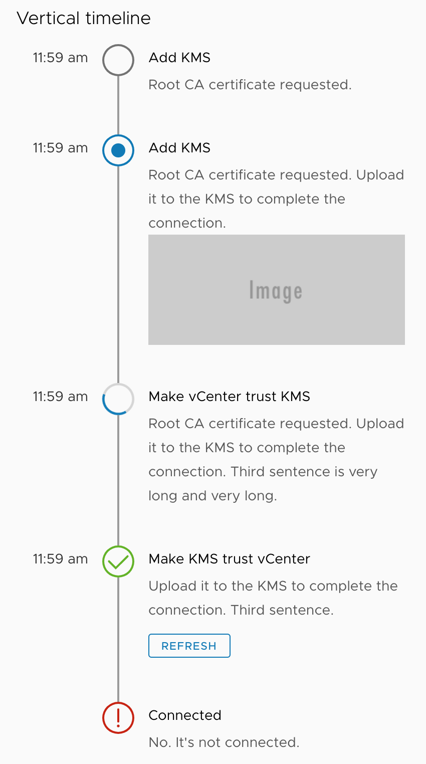
    I'm proposing a timeline component implementation based on existing design spec from https://github.com/vmware/clarity/issues/1633. This change introduces a static version of the timeline using HTML/CSS. Accessibility will require some further evaluation as I'm not sure about the expectations on this topic.

    Use case

    The use case of a timeline component is to have visualized way of presenting a serious of pre-defined steps and show the current progress/status.

    Examples

    See demo at: https://clarity-timeline-demo-v3.stackblitz.io (Latest)

    ~~https://clarity-timeline-demo-v2.stackblitz.io~~ (Center justified horizontal, depricated)

    ~~https://clarity-light-theme-v1-0-xeza1u.stackblitz.io~~ (Embedded SVG icons, depricated)

    Screenshots of demo: timeline_horizontal_v3

    timeline_vertical_v3

    API

    The following HTML sample code demonstrates how the timeline component can be consumed from user side. Highlights are:

    • The .clr-timeline contains a number of .clr-timeline-step blocks.
    • Each .clr-timeline-step contains .clr-timeline-step-header (Optional), clr-icon and .clr-timeline-step-body.
    • Each .clr-timeline-step-body contains clr-timeline-step-title and clr-timeline-step-description.
    • .clr-timeline-horizontal or .clr-timeline-vertical class is added to .clr-timeline to specify timeline type (direction).
    • ~~Different classes .not-started, .is-current, .in-progress, .is-completed and .is-error can be added to each .clr-timeline-step to indicate the step status.~~ (Replaced by specifying different clr-icon shapes).
    • aria-label is added to each clr-icon to show their meaning for screen reader.
    • aria-current="true" is added to current step icon.
    <h4>Horizontal timeline</h4>
    
    <ul class="clr-timeline clr-timeline-horizontal">
      <li class="clr-timeline-step">
        <div class="clr-timeline-step-header">11:59 am</div>
        <clr-icon shape="circle" aria-label="Not started"></clr-icon>
        <div class="clr-timeline-step-body">
          <span class="clr-timeline-step-title">Add KMS</span>
          <span class="clr-timeline-step-description">Root CA certificate requested.</span>
        </div>
      </li>
      <li class="clr-timeline-step">
        <div class="clr-timeline-step-header">11:59 am</div>
        <clr-icon shape="dot-circle" aria-current="true" aria-label="Current"></clr-icon>
        <div class="clr-timeline-step-body">
          <span class="clr-timeline-step-title">Add KMS</span>
          <span class="clr-timeline-step-description">
            Root CA certificate requested. Upload it to the KMS to complete the connection.
            <button class="btn btn-sm">Action</button>
          </span>
        </div>
      </li>
      <li class="clr-timeline-step">
        <div class="clr-timeline-step-header">11:59 am</div>
        <clr-icon shape="spinner" aria-label="In progress"></clr-icon>
        <div class="clr-timeline-step-body">
          <span class="clr-timeline-step-title">Make vCenter trust KMS</span>
          <span class="clr-timeline-step-description">
            Root CA certificate requested. Upload it to the KMS to complete the connection. Third sentence is very long
            and very long.
          </span>
        </div>
      </li>
      <li class="clr-timeline-step">
        <div class="clr-timeline-step-header">11:59 am</div>
        <clr-icon shape="success-standard" aria-label="Completed"></clr-icon>
        <div class="clr-timeline-step-body">
          <span class="clr-timeline-step-title">Make KMS trust vCenter</span>
          <span class="clr-timeline-step-description">Upload it to the KMS to complete the connection. Third
            sentence.
            <button class="btn btn-sm btn-link">Action</button>
          </span>
        </div>
      </li>
      <li class="clr-timeline-step">
        <div class="clr-timeline-step-header">11:59 am</div>
        <clr-icon shape="error-standard" aria-label="Error"></clr-icon>
        <div class="clr-timeline-step-body">
          <span class="clr-timeline-step-title">Connected</span>
          <span class="clr-timeline-step-description">No. It's not connected.</span>
        </div>
      </li>
    </ul>
    

    Implementation plan

    Describe how you plan to implement the feature, answering questions among the following or anything else you deem relevant.

    • What parts of the code are affected?
      • clr-angular/timeline/[_timeline.clarity.scss, _variables.timeline.scss] (created for the component)
      • dev/src/app/timeline (for dev app demo)
    • Will you introduce new services, components or directives?
      • See above. Only new static styles for now.
    • Can you describe the basic flow of information between classes? - N/A.
    • Does this introduce asynchronous behaviors? - No.
    • Will you need to refactor existing Clarity code? - No.
    • Will reasonable performance require optimizations? - No.
    • Will it need to access native elements (and be incompatible with server-side rendering)? - No.

    Conclusion

    The current implementation follows the design spec and are mostly done from feature perspective. Some of the remaining items are: ~~- Some code cleanup.~~

    • Discuss a few minor topics regarding the UX design spec. ~~- Test out browser compatibility.~~ (Tested in Chrome, Firefox, Safari, Edge and IE11)
    • Accessibility support. (Will have further discussion if required)
    • Dark theme support. (Missing UX design).
    • Testing (What testing are required here?)
    • Documentation (When will this be required?)

    Timelines (Yes, timelines of the timeline component):

    • Static timeline UI style: preferably in a few weeks to a month.
    • Angular component: TBD.
    Dev 
    opened by yaooluu 35
  • TypeError: Class constructor CommonStringsService cannot be invoked without 'new'

    TypeError: Class constructor CommonStringsService cannot be invoked without 'new'

    Describe the bug

    After updating to version 3.0.0-next.4 just running ng serve will result in no compile errors. But you get a runtime error with CommonStringsService.

    Error: Uncaught (in promise): TypeError: Class constructor CommonStringsService cannot be invoked without 'new'
    TypeError: Class constructor CommonStringsService cannot be invoked without 'new'
        at new ClrCommonStringsService (clr-angular.js:707)
        at ClrCommonStringsService_Factory (clr-angular.js:709)
        at _callFactory (core.js:20068)
        at _createProviderInstance (core.js:20026)
        at resolveNgModuleDep (core.js:20001)
        at NgModuleRef_.push../node_modules/@angular/core/fesm5/core.js.NgModuleRef_.get (core.js:20677)
        at resolveNgModuleDep (core.js:20006)
        at NgModuleRef_.push../node_modules/@angular/core/fesm5/core.js.NgModuleRef_.get (core.js:20677)
        at resolveDep (core.js:21048)
        at createClass (core.js:20922)
        at resolvePromise (zone.js:852)
        at resolvePromise (zone.js:809)
        at zone.js:913
        at ZoneDelegate.push../node_modules/zone.js/dist/zone.js.ZoneDelegate.invokeTask (zone.js:423)
        at Object.onInvokeTask (core.js:25977)
        at ZoneDelegate.push../node_modules/zone.js/dist/zone.js.ZoneDelegate.invokeTask (zone.js:422)
        at Zone.push../node_modules/zone.js/dist/zone.js.Zone.runTask (zone.js:195)
        at drainMicroTaskQueue (zone.js:601)
    

    Is clarity 3.x intended to work with angular versions pre 9.x, e.g. 8.2.0?

    How to reproduce

    Run ng serve and and open browser console.

    Expected behavior

    It should just work?

    Versions

    App

    • Angular: 8.2.0
    • Node: 13.3.0
    • Clarity: 3.0.0-next.4
    flag: has workaround resolution: fixed @cds/core 
    opened by spitfjre 33
  • [NG] Disable checkboxes in tree view

    [NG] Disable checkboxes in tree view

    Add the ability to dynamically disable selection of tree node checkboxes.

    closes the issue: https://github.com/vmware/clarity/issues/1458

    Signed-off-by: Prudhvi Simhadri [email protected]

    opened by ps37 31
  • Vertical Navigation component (new)

    Vertical Navigation component (new)

    Description

    A Vertical Navigation is a component used to navigate users between pages of an application or site. Links within the navigation run down the side of a page versus across the top like Header or Subnav. Also known as side navigation or sidenav.

    Use cases under consideration

    • layout
    • icons
    • hierarchy
    • collapse and expand navigation
    • combinations of above

    Documentation

    • key features are: group links together, icons, hierarchy, and ability to collapse and expand
    • we recommend using vertical navigation with a header
    • we do not recommend using vertical navigation with a header and subnav

    Layout Options

    • 3 options: basic, with dividers, with dividers and section headers
    • active link has white background
    • the touch target is the entire width of the navigation, similar to the space of the active indicator
    • touch targets are 36px high, making them easier to interact with on touch screens

    vertnav-layout-options

    Icons

    • icons are to the left of navigation labels
    • icons are 16x16
    • the touch target is the entire width of the navigation, including the icon
    • use icons that describe the navigation label, it’s helpful when using collapsable navigation
    • we recommend either all links have icons or none have them, it makes it is easier for scanning
    • active link will display the icon as blue

    vertnav-icons

    Hierarchy - basic

    • navigation items that have nested links are indicated with semibold font weight and a caret icon on the right side of the navigation
    • clicking on the navigation label, caret or anywhere in between will expand the selection
    • if a nested link is active it will display active while the parent is expanded
    • if the the parent is collapsed, the active indicator will be shown on the parent instead
    • hierarchy supports two levels: parent level and one nested level
    • top level items with no nested links, are semibold and are expected to link to a page

    vertnav-hierarchy-basic

    Hierarchy - icons

    • same rules apply with icons as without them (See Hierarchy - Basic above)
    • icons are also clickable targets that will expand and collapse the selection

    vertnav-hierarchy-icons

    Collapse/Expand - basic

    • clicking the double caret icon in the upper-right corner will collapse and expand the navigation
    • if no icons are in the navigation, when collapsed, the bar will only show the double caret
    • the whitespace below the double caret can be clicked to expand the navigation
    • if icons are in the navigation, when collapsed, the bar will show the double caret and all other icons
    • the active navigation item will also show as an active icon when collapsed
    • clicking on one of the icons will navigate the user, and the navigation will stay collapsed

    vertnav-collapseexpand-basic

    Collapse/Expand - hierarchy

    • all Hierarchy rules apply from above
    • in the collapsed navigation, any icon with hierarchy has a small caret next to it
    • clicking the icon will expand the navigation and expand the parent navigation item
    • clicking on an icon with no hierarchy will navigate the user to a page

    vertnav-collapseexpand-hierarchy

    Long labels

    • for labels that exceed the width available, the label will be appended with an ellipses
    • we recommend that navigation labels remain short and concise to prevent an ellipses from showing

    vertnav-long-labels

    type: new component 
    opened by reddolan 31
  • [Datagrid] Update and refresh for a data grid row breaks select all toggle functionality

    [Datagrid] Update and refresh for a data grid row breaks select all toggle functionality

    Select one ... (check one with "x")

    [ x ] bug
    [ ] feature request
    [ ] enhancement
    

    Expected behavior

    Checkbox for each row on data grid should be checked.

    Actual behavior

    Checkbox for each row on data grid appears unchecked.

    Reproduction of behavior

    Stackblitz : https://stackblitz.com/edit/clr-datagrid-server-driven-demo-n4hqd3 (updated)

    1. Select an item on the data grid.
    2. On item selection “Update and Refresh” button will be shown on the top of grid.
    3. Click the “Update and Refresh” button, here the expectation is to update a field in the row and get the updated values from back end.
    4. Now try selecting all rows by clicking the select all toggle on grid header.

    Environment details

    • Angular version: 5.2.0 and 6.0.1

    • Clarity version: 0.11.16

    • OS and version: Windows Server 2012

    • Browser: all

    Note

    If the trackBy option is not used then the grid works as expected. Stackblitz : https://stackblitz.com/edit/clr-datagrid-server-driven-demo-geauyd

    type: bug flag: has workaround component: datagrid 
    opened by gitnarendra 29
  • Tree view is not considering the states when collapsed state

    Tree view is not considering the states when collapsed state

    Select one ... (check one with "x")

    [ X] bug
    [ ] feature request
    [ ] enhancement
    

    Expected behavior

    In collpased state, if i uncheck or check that state will be consider.

    Actual behavior

    In collpse mode, if we change the state that state is not considering , it holds the previous ste only(it means, in expand mode what we selected i.e)

    Reproduction of behavior

    • Include a link to the reproduction scenario you created by forking one of the Clarity Plunker Templates:

    Environment details

    • Angular version: 2.0.X

    • Clarity version:

    • OS and version:

    • Browser: [all | Chrome XX | Firefox XX | IE XX | Safari XX | Mobile Chrome XX | Android X.X Web Browser | iOS XX Safari | iOS XX UIWebView | iOS XX WKWebView ]

    type: bug priority: 5 high flag: breaking change 
    opened by girijaa 29
  • Why is this repository archived?

    Why is this repository archived?

    This repository contained the code for both the Core (cds) and Angular (clr) versions of the design system and component library. The two code bases existed in separate branches.

    To make it easier to contribute, we have split the source code into two new repositories. If your issue has been closed, but continues to exist, please recreate the issue in the appropriate repository:

    opened by ashleyryan 0
Releases(v5.4.1)
Simple build system and CLI for AMX Mod X projects

?? AMXXPack Simple build system and CLI for AMX Mod X projects. ?? About This system will be useful for projects with multiple plugins and assets. Usi

Hedgehog Fog 11 Nov 15, 2022
This is time-saving pre-built Webpack-initialization template

This is time-saving pre-built Webpack-initialization template. Users can take advantage of the power of Webpack to dynamically load CSS, Html, and js files complete with server. Built with JavaScript/WEBPACK/HTML/CSS.

Steve 14 Jun 27, 2022
📦🚀 Blazing fast, zero configuration web application bundler

Features ?? Blazing fast bundle times - multicore compilation, and a filesystem cache for fast rebuilds even after a restart. ?? Out of the box suppor

Parcel 41.8k Jan 4, 2023
:fork_and_knife: Web applications made easy. Since 2011.

Brunch Web applications made easy. Since 2011. Fast front-end web app build tool with simple declarative config and seamless incremental compilation f

Brunch 6.8k Jan 2, 2023
Clarity is a scalable, accessible, customizable, open-source design system built with web components.

Clarity is an open source design system that brings together UX guidelines, design resources, and coding implementations with Web Components

VMware Clarity 90 Dec 30, 2022
Clarity Angular is a scalable, accessible, customizable, open-source design system built for Angular.

Getting Started Clarity Angular is published as two npm packages: Contains the static styles for building HTML components. Contains the Angular compon

VMware Clarity 145 Dec 29, 2022
Material-UI is a simple and customizable component library to build faster, beautiful, and more accessible React applications. Follow your own design system, or start with Material Design.

Material-UI Quickly build beautiful React apps. Material-UI is a simple and customizable component library to build faster, beautiful, and more access

Material-UI 83.6k Dec 30, 2022
Duet Date Picker is an open source version of Duet Design System’s accessible date picker. Try live example at https://duetds.github.io/date-picker/

Duet Date Picker Duet Date Picker is an open source version of Duet Design System’s accessible date picker. Duet Date Picker can be implemented and us

Duet Design System 1.6k Jan 6, 2023
Inventory App - a SPA project developed with Angular using Reactive Forms and VMware's Clarity components.

Inventory App - a SPA (Single Page Application) project developed with Angular using Reactive Forms and VMware's Clarity components.

null 11 Oct 5, 2022
Providing accessible components with Web Components & Material You

tiny-material Still on developing, DO NOT use for production environment Run well on Google Chrome, Firefox, Chrome for Android, Microsoft Edge (Chrom

HugePancake 11 Dec 31, 2022
Macaron is an open-source design tool to visually create Web Components, which can be used in most Web frameworks, or in vanilla HTML/JavaScript

Macaron is an open-source design tool to visually create Web Components, which can be used in most Web frameworks, or in vanilla HTML/JavaScript

Macaron 334 Dec 29, 2022
The Frontend of Escobar's Inventory Management System, Employee Management System, Ordering System, and Income & Expense System

Usage Create an App # with npx $ npx create-nextron-app my-app --example with-javascript # with yarn $ yarn create nextron-app my-app --example with-

Viver Bungag 4 Jan 2, 2023
Modular and customizable Material Design UI components for the web

Material Components for the web Material Components for the web helps developers execute Material Design. Developed by a core team of engineers and UX

Material Components 16.6k Jan 3, 2023
Accessible, unstyled, open-sourced, and fully functional react component library for building design systems

DORAI UI Accessible, unstyled, open-sourced and fully functional react component library for building design systems Documentation site coming soon St

Fakorede Boluwatife 38 Dec 30, 2022
Customizable Angular UI Library based on Eva Design System

Nebular Documentation | Stackblitz Template | UI Bakery - Angular UI Builder | Angular templates Nebular is a customizable Angular 10 UI Library with

Akveo 7.7k Dec 31, 2022
`raaghu-mfe` is an opensource micro front end framework built on top of `raaghu-elements`, Bootstrap 5 and Storybook offering highly customizable UI components and built-in pages

`raaghu-mfe` is an opensource micro front end framework built on top of `raaghu-elements`, Bootstrap 5 and Storybook offering highly customizable UI components and built-in pages. Raaghu mfe can be used as a base to build complex components and UI layouts whilst maintaining a high level of reusability,flexibility with ease of maintenance.

Wai Technologies 160 Dec 30, 2022
The one DAO to rule them all. A modular DAO written in Clarity for the Stacks blockchain.

ExecutorDAO The one DAO to rule them all. ExecutorDAO is designed to be completely modular and flexible, leveraging Clarity to the fullest extent. The

Marvin 31 Oct 5, 2022
A visual, interactive outline map that combines the clarity of the outline with the intuitive overview of the minimap. Alternative Minimap.

Outline Map EN | 中文 A visual, interactive outline map that combines the clarity of the outline with the intuitive overview of the minimap. Alternative

null 97 Dec 21, 2022
Free, open-source crypto trading bot, automated bitcoin / cryptocurrency trading software, algorithmic trading bots. Visually design your crypto trading bot, leveraging an integrated charting system, data-mining, backtesting, paper trading, and multi-server crypto bot deployments.

Free, open-source crypto trading bot, automated bitcoin / cryptocurrency trading software, algorithmic trading bots. Visually design your crypto trading bot, leveraging an integrated charting system, data-mining, backtesting, paper trading, and multi-server crypto bot deployments.

Superalgos 3.1k Jan 1, 2023