
A complete media query framework for CSS, to apply specific properties in specific screen
Note: Size of every media query is `50px, 100px, 150px, 200px, 250px ....... 2500px`
CDN
All-in-one
This is all-in-one CSS, its may make your site slow, We recommanded to use single css for each class. see below.
<link rel="stylesheet" href="https://cdn.jsdelivr.net/gh/rohit-chouhan/screen.css/dist/screen.css" type="text/css"/>
For Single
screen-max-show-hide.css, screen-min-show-hide.css, screen-max-color.css,screen-min-color.css,screen-max-font-size.css, screen-min-font-size.css, screen-max-height-width.css, screen-min-height-width.css
<link rel="stylesheet" href="https://cdn.jsdelivr.net/gh/rohit-chouhan/screen.css/dist/<css-file-here>" type="text/css"/>
Usage
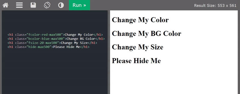
Always use type with dash scope (max or min) in the last of class with size, -max300, -min600.
{class}{type}
hide-{type}{width-size}
<!-- example for max -->
hide-max900
<!-- example for min -->
hide-min900
Classes for Hide & Show
| Class | Example | Description |
|---|---|---|
| hide-{type}{width} | hide-max600 | hide specific content |
| show-{type}{width} | show-min600 | show specific content |
Classes for Color
| Class | Example | Description |
|---|---|---|
| fcolor-{color} | fcolor-red-max400 | Color the font |
| bcolor-{color} | bcolor-red-max400 | Color on Background |
Classes for Size
All size will denotes as pixel (px) only. font max size is 854px. height-width max size is 1193px.
| Class | Example | Description |
|---|---|---|
| fsize-{size} | fsize-20-max700 | Resize font |
| height-{size} | height-400-min400 | Resize Height of elements |
| weight-{size} | width-300-max400 | Resize Width of elements |
Note
In the first version this framework is only have classes for show & hide, font-color, font-size, height, width, background, text-align, align-contents, align-items.
Create an issue if you want more feature or any property, thank you.
Created by Rohit Chouhan
.png)

 4 May 3, 2022
 14 Jan 3, 2023
 1 Feb 3, 2022
 4 Nov 20, 2022
 6 Feb 12, 2022
 8 Dec 20, 2022
 340 Dec 17, 2022
 4 Nov 21, 2022
 3 Oct 11, 2022
 5 Oct 9, 2022