Full Changelog: https://github.com/Elius94/console-gui-tools/compare/v1.2.0...v1.2.1
MILESTONE 1.2.x releases
since 1.x.x is the current stable release. After many months of development, I'm now ready to release the first 1.2.x release. This release is a major milestone for the project, as it brings many new features and improvements. I'm very excited to share this release with you, and I hope you will enjoy using it as much as I enjoyed developing it.
What's new in 1.2.x
New features and improvements since 1.1.x
1.2.0 (Nov 2022) 
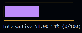
#ADDED IN PAGE WIDGET
And cleaned code
Control ⇐ EventEmitter
Kind: global class
Extends: EventEmitter
new Control(id, visible, attributes, children)
This class is used to create a custom control (widget) with That is showed in a
absolute position on the screen. It's a base class for all the controls (widgets).
Emits the following events:
- "mouse": It carries the pure mouse event, but it fires only if the mouse is over the control.
- "relativeMouse": It's like the "mouse" event, but it carries the relative mouse X and Y (relative to the control).

Emits the following events:
| Param | Type | Description |
| --- | --- | --- |
| id | string |
The id of the popup.
|
| visible | boolean | If the popup is visible. Default is false (make it appears using show()).
|
| attributes | PhisicalValues | The phisical values of the control (x, y, width, height).
|
| children | InPageWidgetBuilder | The content of the control.
|
Example
const widget1 = new InPageWidgetBuilder()
widget1.addRow({ text: "┌────────┐", color: "yellow", style: "bold" })
widget1.addRow({ text: "│ START! │", color: "yellow", style: "bold" })
widget1.addRow({ text: "└────────┘", color: "yellow", style: "bold" })
const button1 = new Control("btn1", false, { x: 30, y: 18, width: 10, height: 3 }, widget1)
button1.on("relativeMouse", (event) => {
// The relative mouse event is triggered with the mouse position relative to the widget
//console.log(`Mouse event: x: ${event.data.x}, y: ${event.data.y}`)
if (event.name === "MOUSE_LEFT_BUTTON_RELEASED") {
GUI.log("Button 1 clicked!")
if (valueEmitter) {
clearInterval(valueEmitter)
valueEmitter = null
} else {
valueEmitter = setInterval(frame, period)
}
}
})
button1.show()
Button ⇐ Control
Kind: global class
Extends: Control
new Button(id, text, width, height, x, y, style, visible, enabled, onClick, onRelease)
This class is an overload of Control that is used to create a button.
Emits the following events:
- "click" when the user confirm
- "relese" when the user cancel
| Param | Type | Description |
| --- | --- | --- |
| id | string |
The id of the button.
|
| text | string | The text of the button.
|
| width | number | The width of the button.
|
| height | number | The height of the button.
|
| x | number | The x position of the button.
|
| y | number | The y position of the button.
|
| style | ButtonStyle | To set the style of the button.
|
| visible | boolean | If the button is visible. Default is true (make it hide using hide()).
|
| enabled | boolean | If the button is enabled. Default is true (make it disabled using disable()).
|
| onClick | function | The function to call when the button is clicked.
|
| onRelease | function | The function to call when the button is released.
|
Example
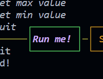
new Button("btnRun", "Run me!", 10, 3, 21, 18,
     {
         color: "magentaBright",
         bold: true,
         italic: true,
         borderColor: "green"
     },
     () => {
         GUI.log("Button clicked!")
     })
1.1.40 (Nov 2022) 
What's Changed
- Elius94/issue43 by @Elius94 in https://github.com/Elius94/console-gui-tools/pull/44
New Feature:
options.enableMouse
Enable mouse support. It works well on most linux terminals, but it doesn't work on Windows 10 and 11 unless you use WSL (Windows Subsystem for Linux).
Full Changelog: https://github.com/Elius94/console-gui-tools/compare/v1.1.32...v1.1.40
1.1.31 (May 2022) 
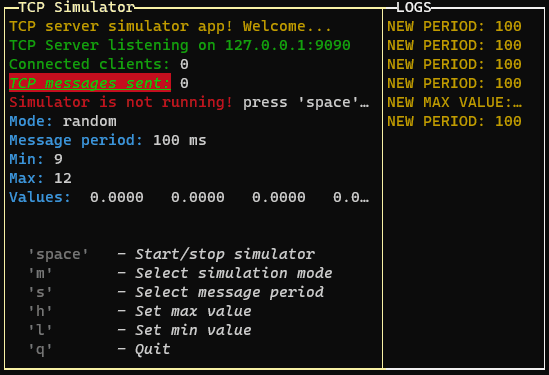
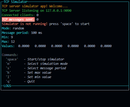
Changed Layouts
The application instance needs to output the content through a layout class.
In the "layoutOptions" provided to the ConsoleManager, we can set the layout:
- boxed: Set to true to enable boxed layout mode (default: true)
 "boxed"
 "not boxed"
- showTitle: Set to false to hide titles (default: true, on title per page)
- changeFocusKey: The key or the combination that will change the focus between the pages of the layout (default: 'ctrl+l')
- type: Can be "single", "double" or "quad" to choose the layout type (default: "double")
 "single"
"double"
"single"
"double"
 "quad"
- direction: Set to 'horizontal' to enable horizontal layout (only for "double" layout)
 "horizontal" example
- boxColor: The color of the box (default: 'yellow')
- boxStyle: The style of the box (default: 'bold')
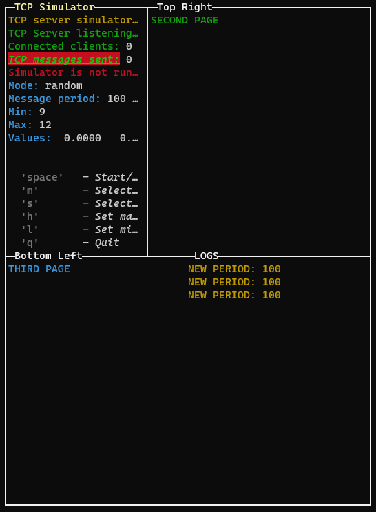
To draw multiple pages, we need to use the setPage or setPages methods:
GUI.setPage(p, 0) // Add the first page without explicit name (default: application title)

const p1 = new PageBuilder()
p1.addRow({ text: "SECOND PAGE", color: "green" })

const P2 = new PageBuilder()
P2.addRow({ text: "THIRD PAGE", color: "cyan" })

GUI.setPage(p1, 1, "Top Right")
GUI.setPage(P2, 2, "Bottom Left")

// Or if we want to add the pages in the same order (only one render):
GUI.setPages([p, p1, P2], ["App Title", "Top Right", "Bottom Left"])
If we are in quad layout mode or double horizontal layout, we can change the aspect ratio of the layout rows by pressing the "left" and "right" keys:
If you are using the quad layout mode the arrow keys will change the aspect ratio of the layout selected row (the top or the bottom row, depending on the selected page)
1.1.16 (May 2022) 
What's Changed
- InputPopup numeric should be able to manage decimal numbers by @Elius94 in https://github.com/Elius94/console-gui-tools/pull/31
- In PageBuilder Class: getPageHeight returns the exact number of rows but not the visible rows. Need to fix by @Elius94 in https://github.com/Elius94/console-gui-tools/pull/32
- GUI.log(), GUI.warn(), GUI.info(), GUI.error() functions have issues when the input is a number by @Elius94 in https://github.com/Elius94/console-gui-tools/pull/34
Full Changelog: https://github.com/Elius94/console-gui-tools/compare/v1.1.15...v1.1.16
1.1.11 (Apr 2022) 
What's Changed
- New widget: Filemanager by @Elius94 in https://github.com/Elius94/console-gui-tools/pull/26
Full Changelog: https://github.com/Elius94/console-gui-tools/compare/1.1.10...1.1.11
Classes
- FileSelectorPopup ⇐
EventEmitter
Constants
- CM :
ConsoleManager
the instance of ConsoleManager (singleton)
FileSelectorPopup ⇐ EventEmitter
Kind: global class
Extends: EventEmitter
new FileSelectorPopup(id, title, basePath, [limitToPath], [allowedExtensions], visible)
This class is used to create a popup with a file input to select a file or a directory.
It will run a promise with fs.readdir to get the list of files and directories.
The user can select a file or a directory and the popup will be closed.
Emits the following events:
- "confirm" when the user confirm the file or directory selection. The file or directory path is passed as parameter like this: {path: "path/to/file", name: "file.ext"}
- "cancel" when the user cancel the file or directory selection.
- "exit" when the user exit
| Param | Type | Default | Description |
| --- | --- | --- | --- |
| id | string | | The id of the popup. |
| title | string | | The title of the popup. |
| basePath | string | | The main path of the popup. re case sensitive. |
| [limitToPath] | boolean | false | If true, the user can select a directory. Otherwise, only files are selectable. When true, to enter a directory, the user must press the space key instead of the enter key. |
| [allowedExtensions] | Array.<string> | [] | The allowed extensions. If not set, all extensions are allowed. The extensions a can only select files in the path. If false, the user can select files in the path and parent directories. |
| visible | boolean | | If the popup is visible. Default is false (make it appears using show()). |
Example
const popup = new FileSelectorPopup("popup1", "Choose the file", "./examples").show().on("confirm", (selected) => { console.log(selected) }) // show the popup and wait for the user to confirm
fileSelectorPopup.listDir(path) ⇒ Promise.<Array.<object>>
This function is used to load the list of files and directories in the current path.
it return a promise with the list of files and directories. The list is an array of objects like this:
[{text: "📄 file.ext", name: "file.ext", type: "file", path: "path/to/file.ext"}, {text: "📁 dir/", name: "dir", type: "dir", path: "path/to/dir"}]
Kind: instance method of FileSelectorPopup
Returns: Promise.<Array.<object>> - The list of files and directories.
| Param | Type | Description |
| --- | --- | --- |
| path | string | The path to load the list. |
fileSelectorPopup.updateList(path)
This function calls the updateList function and store the result to this.options, it also refresh the list of files and directories.
Kind: instance method of FileSelectorPopup
| Param | Type | Description |
| --- | --- | --- |
| path | string | The path to load the list. |
fileSelectorPopup.keyListner(str, key)
This function is used to make the ConsoleManager handle the key events when the popup is showed.
Inside this function are defined all the keys that can be pressed and the actions to do when they are pressed.
Kind: instance method of FileSelectorPopup
| Param | Type | Description |
| --- | --- | --- |
| str | string | The string of the input. |
| key | Object | The key object. |
fileSelectorPopup.getSelected() ⇒ string | number
This function is used to get the selected option.
Kind: instance method of FileSelectorPopup
Returns: string | number - The selected value of the popup.
fileSelectorPopup.setSelected(selected) ⇒ FileSelectorPopup
This function is used to change the selection of the popup. It also refresh the ConsoleManager.
Kind: instance method of FileSelectorPopup
Returns: FileSelectorPopup - The instance of the FileSelectorPopup.
| Param | Type | Description |
| --- | --- | --- |
| selected | string | number | The new value of the selection. |
This function is used to show the popup. It also register the key events and refresh the ConsoleManager.
Kind: instance method of FileSelectorPopup
Returns: FileSelectorPopup - The instance of the FileSelectorPopup.
This function is used to hide the popup. It also unregister the key events and refresh the ConsoleManager.
Kind: instance method of FileSelectorPopup
Returns: FileSelectorPopup - The instance of the FileSelectorPopup.
fileSelectorPopup.isVisible() ⇒ boolean
This function is used to get the visibility of the popup.
Kind: instance method of FileSelectorPopup
Returns: boolean - The visibility of the popup.
This function is used to add the FileSelectorPopup key listener callback to te ConsoleManager.
Kind: instance method of FileSelectorPopup
Returns: FileSelectorPopup - The instance of the FileSelectorPopup.
fileSelectorPopup.unManageInput() ⇒ FileSelectorPopup
This function is used to remove the FileSelectorPopup key listener callback to te ConsoleManager.
Kind: instance method of FileSelectorPopup
Returns: FileSelectorPopup - The instance of the FileSelectorPopup.
This function is used to draw the FileSelectorPopup to the screen in the middle.
Kind: instance method of FileSelectorPopup
Returns: FileSelectorPopup - The instance of the FileSelectorPopup.
CM : ConsoleManager
the instance of ConsoleManager (singleton)
Kind: global constant
1.1.10 (Apr 2022) 
What's Changed
- Elius94/issue21 by @Elius94 in https://github.com/Elius94/console-gui-tools/pull/25
Full Changelog: https://github.com/Elius94/console-gui-tools/compare/1.1.9...1.1.10
New widget: Free content popup
Fixes #21
Added new widget: CustomPopup
See the example using
npm test
and press "1"
Usage
const p = new PageBuilder(5) // Add a scroll limit so it will be scrollable with up and down
p.addRow({ text: `Example of a custom popup content!`, color: 'yellow' })
p.addRow({ text: `This is a custom popup!`, color: 'green' })
p.addRow({ text: `It can be used to show a message,`, color: 'green' })
p.addRow({ text: `or to show variables.`, color: 'green' })
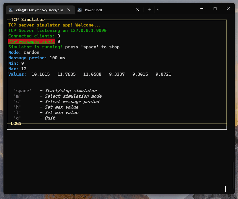
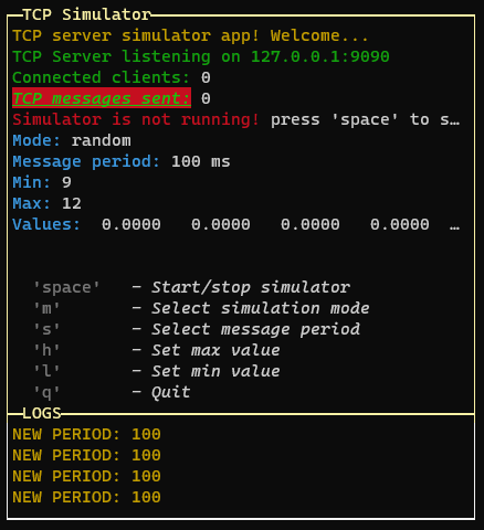
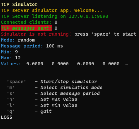
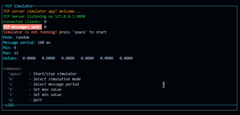
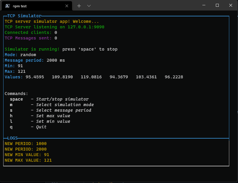
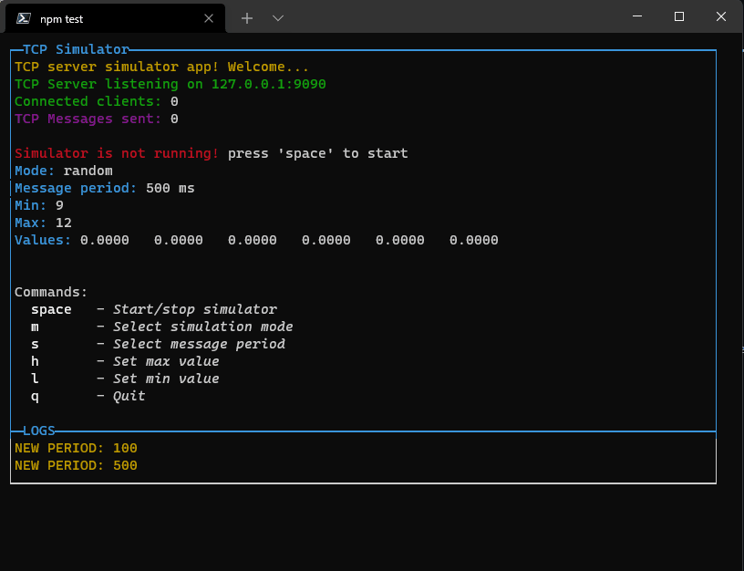
p.addRow({ text: `TCP Message sent: `, color: 'green' }, { text: `${tcpCounter}`, color: 'white' })
p.addRow({ text: `Connected clients: `, color: 'green' }, { text: `${connectedClients}`, color: 'white' })
p.addRow({ text: `Mode: `, color: 'green' }, { text: `${mode}`, color: 'white' })
p.addRow({ text: `Message period: `, color: 'green' }, { text: `${period} ms`, color: 'white' })
new CustomPopup("popupCustom1", "See that values", p, 32).show()
Description
Draws a popup that allows to pass a PageBuilder class to be drawed
inside it.
Docs
Classes
- CustomPopup ⇐
EventEmitter
Constants
- CM :
ConsoleManager
the instance of ConsoleManager (singleton)
CustomPopup ⇐ EventEmitter
Kind: global class
Extends: EventEmitter
new CustomPopup(id, title, content, width, visible)
This class is used to create a popup with a free content built- "data" when the user send custom event - the data is an object with the data and the event name
| Param | Type | Description |
| --- | --- | --- |
| id | string | The id of the popup. |
| title | string | The title of the popup. |
| content | PageBuilder | The content of the popup. |
| width | number | The width of the popup. |
| visible | boolean | If the popup is visible. Default is false (make it appears using show()). |
Example
const popup = new CustomPopup("popup1", "Choose the number", selectedNumber, true).show().on("confirm", (value) => { console.log(value) }) // show the popup and wait for the user to confirm
customPopup.keyListner(str, key)
This function is used to make the ConsoleManager handle the keInside this function are defined all the keys that can be pressed and the actions to do when they are pressed.
Kind: instance method of CustomPopup
| Param | Type | Description |
| --- | --- | --- |
| str | string | The string of the input. |
| key | Object | The key object. |
customPopup.getContent() ⇒ PageBuilder
This function is used to get the content of the popup.
Kind: instance method of CustomPopup
Returns: PageBuilder - The content of the popup.
customPopup.setContent(newContent) ⇒ CustomPopup
This function is used to change the content of the popup. It also refresh the ConsoleManager.
Kind: instance method of CustomPopup
Returns: CustomPopup - The instance of the CustomPopup.
| Param | Type | Description |
| --- | --- | --- |
| newContent | PageBuilder | The new content of the popup. |
customPopup.setWidth(newWidth) ⇒ CustomPopup
This function is used to change the popup width. It also refresh the ConsoleManager.
Kind: instance method of CustomPopup
Returns: CustomPopup - The instance of the CustomPopup.
| Param | Type | Description |
| --- | --- | --- |
| newWidth | number | The new width of the popup. |
This function is used to show the popup. It also register the key events and refresh the ConsoleManager.
Kind: instance method of CustomPopup
Returns: CustomPopup - The instance of the CustomPopup.
This function is used to hide the popup. It also unregister the key events and refresh the ConsoleManager.
Kind: instance method of CustomPopup
Returns: CustomPopup - The instance of the CustomPopup.
customPopup.isVisible() ⇒ boolean
This function is used to get the visibility of the popup.
Kind: instance method of CustomPopup
Returns: boolean - The visibility of the popup.
customPopup.manageInput() ⇒ CustomPopup
This function is used to add the CustomPopup key listener callback to te ConsoleManager.
Kind: instance method of CustomPopup
Returns: CustomPopup - The instance of the CustomPopup.
customPopup.unManageInput() ⇒ CustomPopup
This function is used to remove the CustomPopup key listener callback to te ConsoleManager.
Kind: instance method of CustomPopup
Returns: CustomPopup - The instance of the CustomPopup.
customPopup.drawLine(line) ⇒ void
This function is used to draw a single line of the layout to the screen. It also trim the line if it is too long.
Kind: instance method of CustomPopup
| Param | Type | Description |
| --- | --- | --- |
| line | Array.<object> | the line to be drawn |
This function is used to draw the CustomPopup to the screen in the middle.
Kind: instance method of CustomPopup
Returns: CustomPopup - The instance of the CustomPopup.
CM : ConsoleManager
the instance of ConsoleManager (singleton)
Kind: global constant
1.1.7 (Apr 2022) 
What's Changed
- Add PageDown and PageUp function in scrollable OptionPopup by @Elius94 in https://github.com/Elius94/console-gui-tools/pull/18
- Add new widget: Confirm Popup (Yes, no) by @Elius94 in https://github.com/Elius94/console-gui-tools/pull/19
Full Changelog: https://github.com/Elius94/console-gui-tools/compare/1.1.6...1.1.7
Added two Widgets
ButtonPopup

Classes
- ButtonPopup ⇐
EventEmitter
Constants
- CM :
ConsoleManager
the instance of ConsoleManager (singleton)
Functions
- key)(str, key)
This function is used to make the ConsoleManager handle the key events when the popup is showed.
Inside this function are defined all the keys that can be pressed and the actions to do when they are pressed.
ButtonPopup ⇐ EventEmitter
Kind: global class
Extends: EventEmitter
new ButtonPopup(id, title, message, buttons, visible)
- "exit" when the user exitncelrmpup with That asks for a confirm.
| Param | Type | Description |
| --- | --- | --- |
| id | string | The id of the popup. |
| title | string | The title of the popup. |
| message | string | The message of the popup. |
| buttons | Array.<string> | The buttons of the popup (default is ["Yes", "No"]). |
| visible | boolean | If the popup is visible. Default is false (make it appears using show()). |
Example
const popup = new ButtonPopup("popup1", "Choose the option", ["YES", "NO", "?"]).show().on("confirm", (answer) => { console.log(answer) }) // show the popup and wait for the user to confirm
This function is used to show the popup. It also register the key events and refresh the ConsoleManager.
Kind: instance method of ButtonPopup
Returns: ButtonPopup - The instance of the ButtonPopup.
This function is used to hide the popup. It also unregister the key events and refresh the ConsoleManager.
Kind: instance method of ButtonPopup
Returns: ButtonPopup - The instance of the ButtonPopup.
buttonPopup.isVisible() ⇒ boolean
This function is used to get the visibility of the popup.
Kind: instance method of ButtonPopup
Returns: boolean - The visibility of the popup.
buttonPopup.manageInput() ⇒ ButtonPopup
This function is used to add the ButtonPopup key listener callback to te ConsoleManager.
Kind: instance method of ButtonPopup
Returns: ButtonPopup - The instance of the ButtonPopup.
buttonPopup.unManageInput() ⇒ ButtonPopup
This function is used to remove the ButtonPopup key listener callback to te ConsoleManager.
Kind: instance method of ButtonPopup
Returns: ButtonPopup - The instance of the ButtonPopup.
This function is used to draw the ButtonPopup to the screen in the middle.
Kind: instance method of ButtonPopup
Returns: ButtonPopup - The instance of the ButtonPopup.
CM : ConsoleManager
the instance of ConsoleManager (singleton)
Kind: global constant
ConfirmPopup

ConfirmPopup ⇐ ButtonPopup
Kind: global class
Extends: ButtonPopup
new ConfirmPopup(id, title, message, visible)
This class is an overload of ButtonPopup that is used to create a popup wi- "exit" when the user exitncelrmNo].
| Param | Type | Description |
| --- | --- | --- |
| id | string | The id of the popup. |
| title | string | The title of the popup. |
| message | string | The message of the popup. |
| visible | boolean | If the popup is visible. Default is false (make it appears using show()). |
Example
const popup = new ConfirmPopup("popup1", "Are you shure").show().on("confirm", (answer) => { console.log(answer) }) // show the popup and wait for the user to confirm
1.1.5 (Apr 2022) 
Full Changelog: https://github.com/Elius94/console-gui-tools/compare/1.1.2...1.1.5
NEW DRAWING ALGORYTM
Now there's no more flickering in the screen! all the page is prerendered before printing on the console.
Introduced new styling design pattern:
Each page need to be created with the new class
const p = new PageBuilder()
and to add a styled row it's neccessary to call:
p.addRow({ text: ` 'm'`, color: 'gray', bold: true }, { text: ` - Select simulation mode`, color: 'white', italic: true })
The arguments of that function is an array of object (function arguments syntax, no []!), so in a row you can add different phrases with different styles.
The styles are converted to the Chalk modificator:
colors:
- black
- red
- green
- yellow
- blue
- magenta
- cyan
- white
- blackBright (alias: gray, grey)
- redBright
- greenBright
- yellowBright
- blueBright
- magentaBright
- cyanBright
- whiteBright
Background colors ('bg')
- bgBlack
- bgRed
- bgGreen
- bgYellow
- bgBlue
- bgMagenta
- bgCyan
- bgWhite
- bgBlackBright (alias: bgGray, bgGrey)
- bgRedBright
- bgGreenBright
- bgYellowBright
- bgBlueBright
- bgMagentaBright
- bgCyanBright
- bgWhiteBright
Formatters (Each is a prop):
- italic
- bold
- dim
- underline
- overline
- inverse
- hidden
- strikethrough
eg:
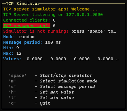
p.addRow({ text: `TCP messages sent:`, color: 'green', bg: 'bgRed', bold: true, italic: true, underline: true }, { text: ` ${tcpCounter}`, color: 'white' })
And so, we can add the PageBuilder to the home page
GUI.setHomePage(p)
The new Screen class is used internally by the ConsoleManager.
Source code(tar.gz)
Source code(zip)


 10 Dec 26, 2022
 24 Feb 14, 2022
 103 Dec 16, 2022
 7 Nov 2, 2022
 17 Sep 24, 2022
 29 Dec 4, 2022
 4 Jun 23, 2022
 12 Dec 7, 2022
 2 Mar 7, 2022
 331 Jan 3, 2023
 13 Dec 7, 2022
 4 Jul 2, 2022
 5 Jun 2, 2022
 528 Dec 30, 2022
 4 May 13, 2021
 5 Dec 20, 2022
 2 Mar 24, 2022
 14 Jun 14, 2022