tb-grid
Lightweight (<1kb gzipped) 12 column grid system, built with css grid.

👉
Demos & Playground
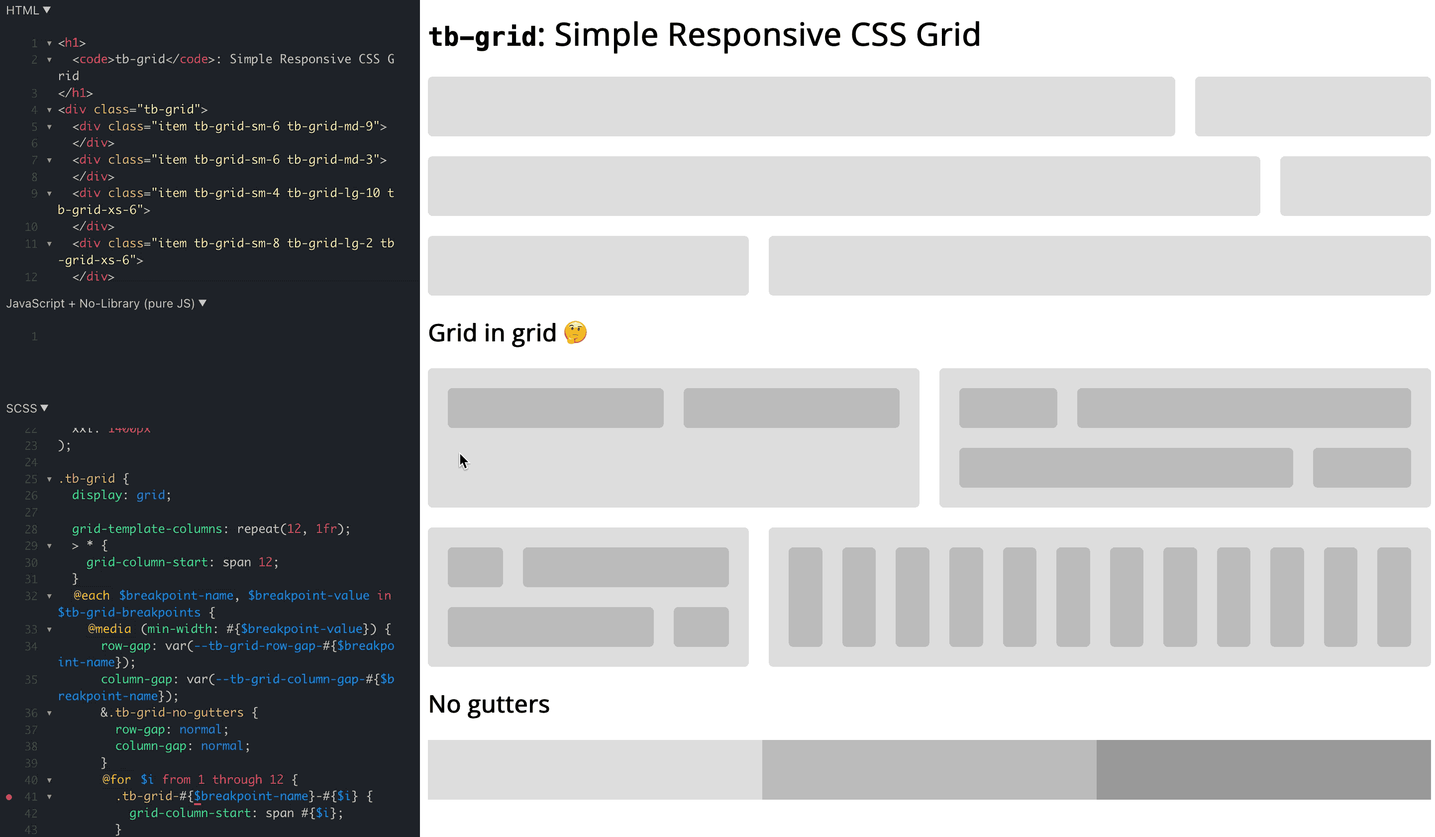
Have a look at those examples:
- Main Demo: https://jsfiddle.net/bersling/t3uq9jnf/3/
- Demo with Cars & Cards: https://jsfiddle.net/bersling/n2tqd85h/41/
- Bootstrap example, where grid is replaced with
tb-grid: https://codepen.io/bersling/pen/RwKzdgV (Original: https://codepen.io/WeeHorse/pen/PQydzW)
Simply fork the demos if you want to play around with tb-grid.
🤔
Why tb-grid?
Bootstrap's grid system is awesome. With very little code you can add responsiveness to your html in a declarative manner. The use of 12 columns make the grid system extremely versatile since you can divide it into nice fractions (12/2, 12/3, 12/4, 12/6 - they all produce integers!).
However, there are also some things bootstrap didn't get right.
- It requires too much nesting:
.container>.row>.col. It would be great if we could drop the.container. - Being able to change gutters (aka. gaps) on a case-by-case basis is important, but it's a bit cumbersome in bootstrap.
- The classes aren't scoped or namespaced. Furthermore
.containerand.rowaren't that exotic that there would be no accidental collisions. - While at 50kb minified the grid system isn't huge, it's not exactly tiny either.
tb-grid addresses all those gripes with bootstrap and frankly with all other grid systems we know (foundation, skeleton, ...).
🤯
What is tb-grid?
tb-grid is a reverse engineered bootstrap 12 column grid built with CSS grid. CSS grid allows us to build a solution in around 50 lines of scss, which translates into less than 500 lines of css (~1kb gzipped). It also allows us to drop one level of nesting that was required in bootstrap, since css grid supports gutters out of the box. Finally we made sure that everything lives under the tb-grid- prefix, so you'd have to be really unlucky for someone to accidentally use a class declared by this library.
🚀
How can I install tb-grid?
There are a couple of ways how you can get tb-grid, choose what suits you best.
Option 1: SCSS
Copy the code from tb-grid.scss to your project.
Option 2: CSS
Copy the code from tb-grid.css to your project.
Option 3: npm
npm install tb-grid and include the scss or css file from there. (node_modules/tb-grid/tb-grid.scss or node_modules/tb-grid/tb-grid.css)
Option 4: npm CDN (unpkg)
You could use unkpg to get the file: <link rel="stylesheet" href="https://unpkg.com/[email protected]/tb-grid.css">
🎨
How can I use tb-grid?
It is pretty similar to bootstrap, with the exception that it's simpler yet with better scoping:
- Add the class
.tb-gridto an HTML element. - Add classes of the form
.tb-grid-<breakpoint>-<cols>, like.tb-grid-sm-6or.tb-grid-md-8to the direct children. The breakpoints are the same ones as in bootstrap (sm: 576px, md: 768px, lg: 992px, xl: 1200px, xxl: 1400px). The column argument can be between1and12. - Add
.tb-grid-gap-<gap size>to define thegap size. Here,<gap-size>can be a value between (and including)1and50.
Complete example:
<div class="tb-grid tb-grid-gap-10">
  <div class="tb-grid-sm-6">
    Item 1
  </div>
  <div class="tb-grid-sm-6">
    Item 2
  </div>
  <div class="tb-grid-sm-4 tb-grid-lg-6">
    Item 3
  </div>
  <div class="tb-grid-sm-8 tb-grid-lg-6">
    Item 4
  </div>
</div>
No tb-grid-gap-<px> value means no gaps / gutters, since that's the only default that is not arbitrary, and it's really easy to add a gap. We currently only support symmetrical gaps up to 50px to keep the bundle size small, but you can easily add your own classes to extend the functionality. For example .custom-gap {row-gap: 60px; column-gap: min(20px, 8%)}.
Note: When the tb-grid parent is smaller than column-gap * 12, the column-gap will be squished together to prevent overflows. For example, a column-gap of 30px becomes problematic when the tb-grid parent is 360px. That's why the tb-grid-gap-<px> classes use column-gap: min(<px>, 8%), to squish the column gutters when it gets too tight.
✋
What limitations does tb-grid have?
- It doesn't support old browsers (IE): https://caniuse.com/?search=grid . 95% of people are using browsers that support CSS grid as of April 2021. It's up to you to decide whether this is sufficient for your project.
🤨
Do you really need tb-grid?
It is also fair to ask yourself whether you even want a 12 column grid system after all. It is really simple to add the grid on a per occasion basis, something like this:
.dashboard {
  display: grid;
  grid-gap: 10px;
  grid-template-columns: 1fr;
  @media(min-width: $my-breakpoint-sm) {
    grid-template-columns: 1fr 1fr;
  }
}
You can easily use low level css to achieve the same thing and avoid introducing too much clutter into the html. Over the years the actual CSS grid API might also be more well known amongst devs than the "bootstrap API", which tb-grid builds upon. It even solves the problem of the squished gutters and might be computationally more efficient, even though I haven't tested if there's any actual difference.
You can even achieve a cool responsive experience without media queries:
.car-grid {
  display: grid;
  grid-gap: 10px;
  grid-template-columns: repeat(auto-fill, minmax(200px, 1fr));
}
Demo: https://jsfiddle.net/bersling/d3hjs5zv/3/
However, to achieve a consistent layout across a page, the 12 column grid system is a really easy-to-use and powerful tool. We've found it especially helpful on things like landing pages, where you often have different sections, jumbos etc. that should be aligned with one another but still responsive. So in our opinion, yes, tb-grid does make your life easier
💯
What's the status of the project?
- The project is to be considered experimental and non-battle tested at this point
- The API (class names) is not to be considered stable. Rather it is a working draft, and we'd love to receive feedback on it. This is also reflected in the npm version below
1.0.0. - Initial prototype is working well, see demos / playground above.
- We would be thrilled to hear your opinions & suggestions on
tb-grid! Why don't you just give it a spin and let us know what you think? You can just open an issue or drop us an email atdaniel@taskbase.com

 223 Dec 31, 2022
 845 Dec 22, 2022
 4 Jan 2, 2023
 8 Jun 9, 2022
 123 Dec 24, 2022
 331 Jan 4, 2023
 18 Nov 6, 2022
 28 Jul 27, 2023
 80 Dec 28, 2022
 21 Jun 28, 2022