English | 简体中文 | Русский | Türkçe | 日本語 | Français | Português | العربية
Ant Design Pro
An out-of-box UI solution for enterprise applications as a React boilerplate.


- Preview: http://preview.pro.ant.design
- Home Page: http://pro.ant.design
- Documentation: http://pro.ant.design/docs/getting-started
- ChangeLog: http://pro.ant.design/docs/changelog
- FAQ: http://pro.ant.design/docs/faq
- Mirror Site in China: http://ant-design-pro.gitee.io
5.0 is ready for trial!
🎉
🎉
🎉
Translation Recruitment
📢
We need your help: https://github.com/ant-design/ant-design-pro/issues/120
Features
-
💡 TypeScript: A language for application-scale JavaScript -
📜 Blocks: Build page with block template -
💎 Neat Design: Follow Ant Design specification -
📐 Common Templates: Typical templates for enterprise applications -
🚀 State of The Art Development: Newest development stack of React/umi/dva/antd -
📱 Responsive: Designed for variable screen sizes -
🎨 Theming: Customizable theme with simple config -
🌐 International: Built-in i18n solution -
⚙️ Best Practices: Solid workflow to make your code healthy -
🔢 Mock development: Easy to use mock development solution -
✅ UI Test: Fly safely with unit and e2e tests
Templates
- Dashboard
  - Analytic
  - Monitor
  - Workspace
- Form
  - Basic Form
  - Step Form
  - Advanced From
- List
  - Standard Table
  - Standard List
  - Card List
  - Search List (Project/Applications/Article)
- Profile
  - Simple Profile
  - Advanced Profile
- Account
  - Account Center
  - Account Settings
- Result
  - Success
  - Failed
- Exception
  - 403
  - 404
  - 500
- User
  - Login
  - Register
  - Register Result
Usage
Use bash
$ mkdir <your-project-name>
$ cd <your-project-name>
$ yarn create umi  # or npm create umi

# Choose ant-design-pro:
 Select the boilerplate type (Use arrow keys)
❯ ant-design-pro  - Create project with an layout-only ant-design-pro boilerplate, use together with umi block.
  app             - Create project with a simple boilerplate, support typescript.
  block           - Create a umi block.
  library         - Create a library with umi.
  plugin          - Create a umi plugin.

$ git init
$ npm install
$ npm start         # visit http://localhost:8000
Use Gitpod
Open the project in Gitpod (free online dev environment for GitHub) and start coding immediately.

More instructions at documentation.
Browsers support
Modern browsers and IE11.
 IE / Edge |
 Firefox |
 Chrome |
 Safari |
 Opera |
|---|---|---|---|---|
| IE11, Edge | last 2 versions | last 2 versions | last 2 versions | last 2 versions |
Contributing
Any type of contribution is welcome, here are some examples of how you may contribute to this project:
- Use Ant Design Pro in your daily work.
- Submit issues to report bugs or ask questions.
- Propose pull requests to improve our code.


![🐛[BUG] 从服务端请求菜单时 icon 和 access 不生效](https://avatars.githubusercontent.com/u/58337359?v=4)

![🧐[问题 | question]登录后不管进那个界面,刷新下浏览器,就又回到登录界面了,有人清楚是什么情况吗](https://avatars.githubusercontent.com/u/120540501?v=4)
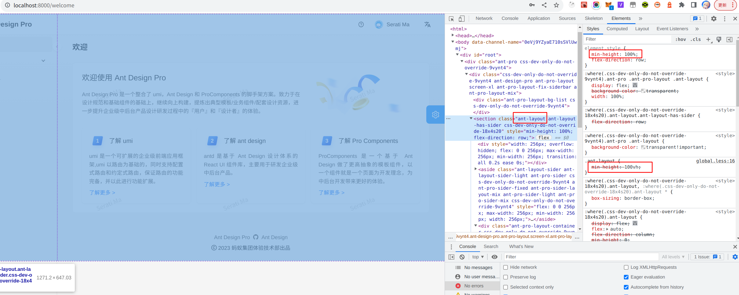
![🐛 [BUG] global.less中 .ant-layout min-height:100vh 不生效,被内联样式覆盖](https://avatars.githubusercontent.com/u/66669483?v=4)

![🐛 [BUG]控制台一直有多个警告](https://avatars.githubusercontent.com/u/84836275?v=4)


 83.6k Dec 30, 2022
 53 Aug 30, 2022
 19 Feb 22, 2022
 21.2k Dec 30, 2022
 12.3k Jan 7, 2023
 8.7k Dec 30, 2022
 8.1k Dec 29, 2022
 98 Oct 29, 2022
 25 Jan 5, 2023
 4 May 9, 2022
 1 Jan 3, 2022
 4.6k Dec 31, 2022
 148 Dec 17, 2021
 121 Mar 1, 2022
 2.2k Dec 26, 2022
 281 Dec 25, 2022
 38 Dec 30, 2022
 3 Dec 15, 2022
 5 Jun 3, 2022