The sx prop is used by some UI libraries to allow users to apply inline, ad-hoc styles to a component while still making the styles theme-aware. I experimented a bit this afternoon and was able to come up with a proof-of-concept:
You can see the basic implementation in this PR, which is based around @styled-system/css, but it is essentially the following:
const withSx = Component => {
return function SxWrapper({sx, children, ...props}) {
const ctxTheme = useTheme()
if (!sx) {
return <Component {...props}>{children}</Component>
}
const extraProps = {}
const compiled = css(sx)(props.theme || ctxTheme)
if (props.style) {
extraProps.style = Object.assign({}, props.style, compiled)
} else {
extraProps.style = compiled
}
return (
<Component {...props} {...extraProps}>
{children}
</Component>
)
}
}
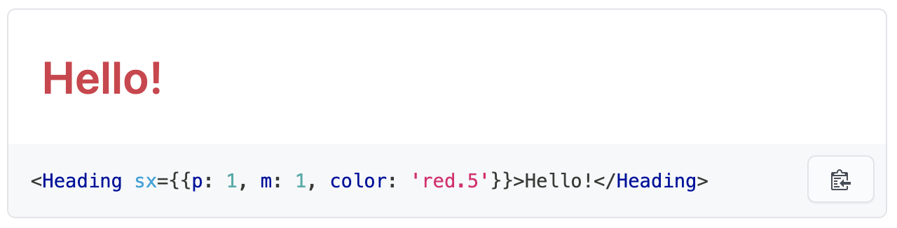
const Heading = WithSx(styled.h1`
// ... normal styled-component stuff here
While exploring this PoC and the implementations from other libraries, I've identified the following constraints and challenges:
Compatibility with plain DOM nodes
This implementation only works for components explicitly wrapped with the HoC, so it wouldn't be possible to do something like <span sx={{color: 'red.5'}}>...</span>. To enable that, we'd have to create a JSX pragma, similar to Theme UI, which would need to be used in all our components and any JS file a consumer writes that wants to use the sx prop on a plain DOM node. This pragma function would then generate the correct element tree to power the prop. This would of course need some JSX intrinsics types for TypeScript.
Another option is to introduce a hook that can produce style-prop-compatible objects with themeable values, à la useStyles({ color: 'red.5' }).
However, neither option addresses the following concern:
Nested styles
styled-systems's css utility, which powers this implementation, allows for more than just plain CSS properties in the sx prop object. For example, this is a valid value for the prop:
{
  fontSize: [ 4, 5, 6 ],
  color: 'primary',
  bg: 'gray',
  '&:hover': {
    color: 'secondary',
  },
}
However, since this generates style objects with media queries and selectors, it can't be passed directly to any DOM node.
One solution is to use styled-component's css prop; however, the use of this prop necessitates the use of the Babel plugin (or macro) to work, and as a result, I don't think we'd be able to implement the sx prop in Primer Components (because the Babel plugin won't run). Instead, a user could use the option that @styled-system/css demonstrates:
import React from 'react'
import css from '@styled-system/css'

// ...

<div
  css={css({
  fontSize: [ 4, 5, 6 ],
  color: 'primary',
  bg: 'gray',
  '&:hover': {
    color: 'secondary',
  },
})}
/>
Since the user would have to set up the Babel plugin anyway in this case, they could simply write the above code themselves, instead of us providing a special sx prop.
Part of me wonders if one could generate a styled-components-wrapped component on the fly using the sx prop, but my guess is no, because if so then why does styled-components require a Babel plugin for the css prop?
status: wip


![[Suggestion][QoL] Add a rhythm property to FlexProps](https://avatars.githubusercontent.com/u/4821111?v=4)


 |
|  |
|
 121 Mar 1, 2022
 7 Dec 13, 2022
 21.2k Dec 30, 2022
 27 Dec 10, 2022
 1 Mar 13, 2022
 130 Dec 9, 2022
 1.7k Dec 10, 2022
 5 Feb 18, 2022
 79 Dec 28, 2022
 12.3k Jan 7, 2023
 8.7k Dec 30, 2022
 8.1k Dec 29, 2022
 208 Jan 8, 2023
 1 Jan 3, 2022
 38 Dec 30, 2022
 19 Dec 2, 2022
 18.2k Jan 8, 2023
 7.9k Dec 31, 2022
 111 Dec 31, 2022