🌲 Evergreen React UI Framework by Segment

Overview
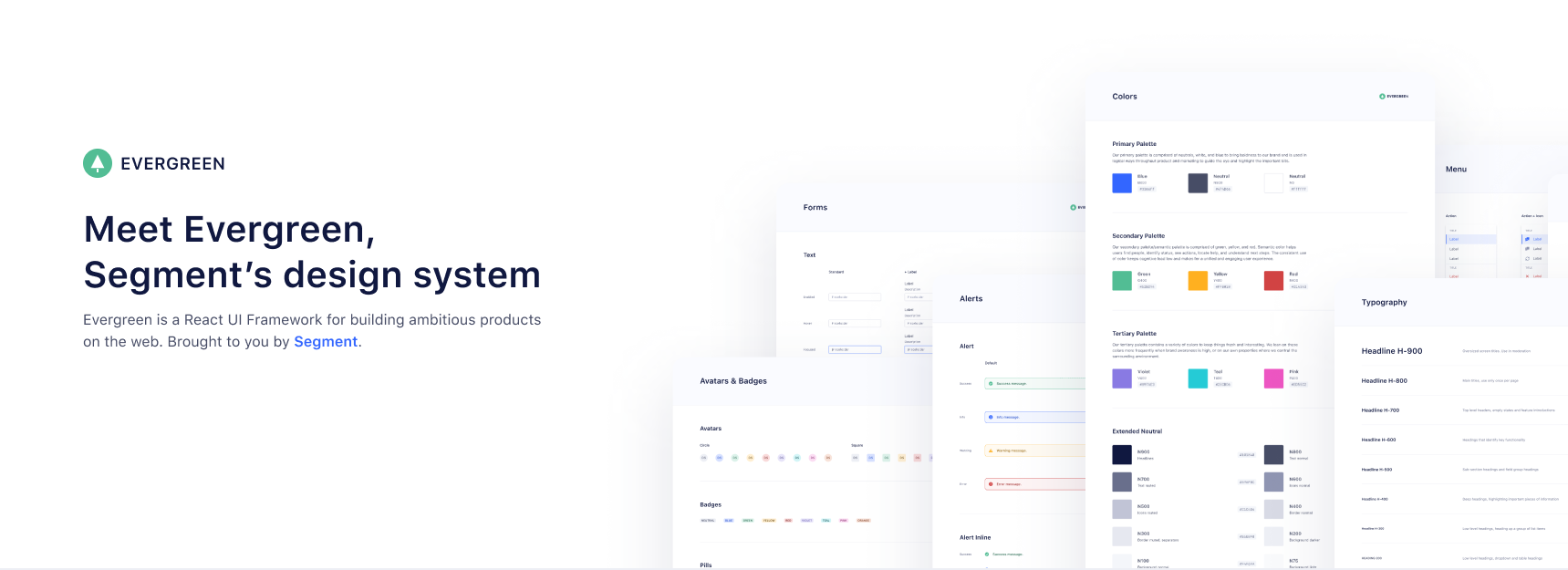
  • Works out of the box. Evergreen contains a set of polished React components that work out of the box.

  • Flexible & composable. Evergreen components are built on top of a React UI Primitive for endless composability.

  • Enterprise-grade. Evergreen features a UI design language for enterprise-grade web applications.

Documentation & Community

Evergreen v4 to v5 Migration guide

Evergreen v4 to v5 migration guide

Install and use components

🌲 Evergreen is made up of multiple components and tools which you can import one by one. All you need to do is install the evergreen-ui package:

$ yarn add evergreen-ui
# or
$ npm install --save evergreen-ui

A working version, assuming you are using something like Create React App, might look like this:

import React from 'react'
import ReactDOM from 'react-dom'
import { Button } from 'evergreen-ui'

ReactDOM.render(
  <Button>I am using 🌲 Evergreen!</Button>,
  document.getElementById('root')
)

Core values of 🌲 Evergreen

  • Evergreen is built on the belief that you can never predict all future requirements, only prepare for it. Instead of creating fixed configurations that work today, Evergreen promotes building systems that anticipate new and changing design requirements.

  • Evergreen is built on the belief that things should work out of the box with smart defaults, but also offer full control when needed. For example, Evergreen uses CSS-in-JS and builds on top of the Box component in ui-box.

  • Evergreen is built on the belief that using Evergreen and contributing to Evergreen should be a pleasant experience. We prioritize documentation and all the tools for a solid developer experience. We advocate respect and inclusivity in our writings and interactions.

FAQ

Theming support?

Evergreen v5 supports theming partially. It is still complex to theme Evergreen. We have done exploratory work to make theming more powerful and accessible, and hope to release a new theming api in Evergreen v6.

See these docs for more information regarding theming in Evergreen.

How does Server Side Rendering (SSR) work?

Evergreen offers easy Server Side Rendering (SSR) and automatic hydration.

Evergreen bundles 2 CSS-in-JS solutions, from glamor and ui-box. To make it super easy to do server side rendering and hydration, Evergreen exposes a extractStyles() function that will do SSR for both at once.

Contributing to Evergreen

🍴 Step 1. Fork this repository

In order to contribute to Evergreen, you need to fork this repo, and develop on your own local clone.

If you don't know how to do so, follow this guide!

📖 Step 2. Get storybook up and running

First, move into your local cloned repository with the help of cd, after that install your node_modules with:

$ yarn

To actually start seeing the components you have to run React Storybook with the command:

$ yarn dev

Now go to http://localhost:6006 in your browser.

🛠 Step 3. Make your change

Now you can start developing! All of the components are under the src directory and associated code changes will automatically be reflected in StoryBook.

If necessary, we encourage you to update the documentation so Evergreen users will be aware of your new features/changes.

In order to run the documentation page locally, run these commands in your terminal:

$ yarn build
$ cd docs
$ yarn install
$ yarn dev

Now you can visit http://localhost:8000/ in your browser.

Documentation code is under the docs directory. A big portion of these docs are written in MDX, if you've never used MDX before, check out these docs.

🏆 Step 4. Making your pull request

Once you're done with making your changes, push everything to your local repository's branch.

From here, you can open up a pull request from your forked repository's branch into segmentio/evergreen's master branch.

In your PR description, explain the changes you made, why you made them, how to test them, and anything that might be a point of interest.

Once you create your PR, it will be reviewed and hopefully merged quickly!

🥂 Step 5. Pat yourself on the back

Congrats, you're officially an Evergreen contributor!

🤓 Scripts explained

Inside the package.json there are a bunch of scripts that this repo uses to run the project in development and to build the project.

Below you can read a description of each script.

  • yarn dev: Starts the development React Storybook.

  • yarn test: Lints the JavaScript files using XO and then runs the unit tests using AVA.

  • yarn build: Builds all of the JavaScript files using Babel.

  • yarn clean: removes all untracked files (git clean -Xdf).

  • yarn release: Releases new version of Evergreen (requires MFA via npm as a collaborator)

  • yarn create-package: This command scaffolds a package with no specific boilerplate. It's useful for creating utilities.

For the following command:

yarn create-package utils

The following file tree will be generated:

/src/utils
├── /src/
└── index.js
  • yarn create-package:components: This command scaffolds a package with React component(s) boilerplate.

You can pass one or more components to this command.

For the following command:

yarn create-package:components typography Text Heading

The following file tree will be generated:

/src/typography
├── /src/
|   │── Text.js
|   └── Heading.js
├── /stories/
│   └── index.stories.js
└── index.js

🎉 Contributors

We will add you to the list if you make any meaningful contribution!

  • Jeroen Ransijn
  • Roland Warmerdam
  • Ben McMahon
  • Matt Shwery
  • Colin Lohner
  • Allen Kleiner
  • Chris Chuck
  • ... many other on the Segment team and open-source contributors

This project is maintained by Segment

Please take a look at the contributing guide to better understand what to work on.

👏 Respect earns Respect

Please respect our Code of Conduct, in short:

  • Using welcoming and inclusive language
  • Being respectful of differing viewpoints and experiences
  • Gracefully accepting constructive criticism
  • Focusing on what is best for the community
  • Showing empathy towards other community members

License

Evergreen is released under the MIT license. The BlueprintJS icons are licensed under a custom Apache 2.0 license.

Copyright © 2017 Segment.io, Inc.

Comments
  • [WIP] Migrate to typescript

    [WIP] Migrate to typescript

    Hi all, sorry in advance for the unfinished PR. I tagged it as WIP but felt like opening it already because I didn't want this work to go to waste.

    I was able to setup the bulk of the components with TS definitions already, and just got XO and storybook to make good with typescript (the latter being the final checkpoint I wanted to touch before opening this PR).

    There's still a few things to do:

    • [x] move css definition to ui-box
    • [x] add props back in (I deleted them at first but they're critical for non-TS projects, as Evergreen is a component library)
    • [ ] migrate all remaining components to TS
    • [ ] migrate all stories to TSX
    • [x] fix tests (would love help with this, not used to AVA)
    • [ ] migrate all tests to Typescript
    • [ ] fix build process for both CJS and ESM (would love help with this, I'm guessing 2 different tsconfig that extend from a base tsconfig) as per @jaredpalmer this would easily be solved by using TSDX
    • [ ] add husky and lint-staged hooks back in

    Hope you all appreciate the help, it's pretty new for me - contributing to a component library - helping out at this scale. But, I really dig Evergreen as a design language! I made the move to TS last year and would love to continue it in all its glory (but with the typescript upgrade!)

    If you have any feedback be sure to leave it in this PR, I can update as I go 🙌

    opened by jeroenptrs 31
  • Icon Tree Shaking not working

    Icon Tree Shaking not working

    Version: 4.26 Bundler: Create-React-App default (Webpack)

    Hello, I updated to the latest version to take advantage of tree-shaking but am still seeing all of the icons in my bundle:

    image

    I am not using the Icon component anywhere in my app. I do, however, use Menu and Menu.Item and am wondering if the icon prop on Menu.Item is causing all icons to be included.

    opened by seanemmer 26
  • add left, right, top, bottom anchors to side-sheet

    add left, right, top, bottom anchors to side-sheet

    a quick pr for #252 . Managing all of the different styles for the different anchors is a bit ugly and there's probably a better way of going about it. I've added the "top" and "bottom" anchor position because it's sometimes useful and is often included with other "drawer" components (like material design). For these views the "close" button feels a bit odd, though.

    I also wonder if it might be nice to have an option to remove the close button.

    Another thing is that the width prop only really makes a different for the left and right anchored sheets. If we want to keep the top and bottom anchored sheets it might be useful to add a height prop.

    Quick gif:

    side-sheet

    opened by bmcmahen 20
  • Large bundle size with webpack v4

    Large bundle size with webpack v4

    I may be missing something, but the only way I was able to get the bundle size own in v4 was to import the components like this: import Pane from 'evergreen-ui/esm/layers';.

    Also, why is @blueprintjs a dependency, I am not using it at all in the components I am importing and it is still a part of my bundle.

    screen shot 2018-11-27 at 2 39 44 pm screen shot 2018-11-27 at 2 40 44 pm

    Unfortunately this doesn't do anything about evergreen-ui/esm/icon/Icon.js. It still contains all of @blueprintjs/icons

    I had to edit the Icon.js file and do the same thing to reduce the bundle.

    screen shot 2018-11-27 at 2 36 06 pm screen shot 2018-11-27 at 2 35 54 pm

    Originally posted by @epitaphmike in https://github.com/segmentio/evergreen/issues/311#issuecomment-442190755

    opened by epitaphmike 18
  • Table issue with header row not aligning with content rows.

    Table issue with header row not aligning with content rows.

    Unsure if I am doing something wrong, but I can't ever get my header row to align with the content rows. It is always off... either too far left or right. Even copying the example code from the documentation I can't get it to align:

    image

    https://codesandbox.io/s/evergreen-table-position-bug-i2el8

    I've tried wrapping the table in a but that doesn't seem to help.

    In the code-sandbox linked above, how can I fix that alignment issue? Any ideas?

    In this one, I've removed the search header and added more columns, still not working.

    https://codesandbox.io/s/evergreen-table-position-bug-more-columns-ffgjd

    image

    The red boxes are just drawn on top and aren't exact - but you can see the gap changes with each column, typically getting more exaggerated with the distance from the left.

    opened by cstrat 15
  • Warning: Prop `htmlFor` did not match.

    Warning: Prop `htmlFor` did not match.

    Bug report 🐞

    Hello! I'm using next.js with evergreen-ui and I get this error on development server:

    index.js:1 Warning: Prop `htmlFor` did not match. Server: "TextInputField-2" Client: "TextInputField-0"
    

    I'm new to next.js and wonder if this something I should care about? I'm sorry the code is closed source and I can't share it, but I will include minimal snippets which should be enough to reproduce the issue:

    .babelrc

    {
      "presets": ["next/babel"],
      "plugins": [
        [
          "styled-components",
          { "ssr": true, "displayName": true, "preprocess": false }
        ]
      ]
    }
    

    _document.tsx

    import * as React from "react"
    import Document, { DocumentContext } from "next/document"
    import { ServerStyleSheet } from "styled-components"
    import { extractStyles } from "evergreen-ui"
    
    export default class MyDocument extends Document {
      static async getInitialProps(ctx: DocumentContext) {
        const sheet = new ServerStyleSheet()
        const originalRenderPage = ctx.renderPage
        const { css, hydrationScript } = extractStyles()
    
        try {
          ctx.renderPage = () =>
            originalRenderPage({
              enhanceApp: App => props => sheet.collectStyles(<App {...props} />),
            })
    
          const initialProps = await Document.getInitialProps(ctx)
          return {
            ...initialProps,
            css,
            hydrationScript,
            styles: (
              <>
                {initialProps.styles}
                {sheet.getStyleElement()}
              </>
            ),
          }
        } finally {
          sheet.seal()
        }
      }
    }
    

    pages/sign-in.tsx

    import * as React from "react"
    import { NextPage } from "next"
    import { useFormik } from "formik"
    import Input from "components/ui/Input"
    import Button from "components/ui/Button"
    
    interface FormValues {
      email: string
      password: string
    }
    
    const initialValues: FormValues = {
      email: "",
      password: "",
    }
    
    const SignInPage: NextPage = () => {
      const formik = useFormik({
        initialValues,
        onSubmit: () => {},
      })
    
      return (
        <form onSubmit={formik.handleSubmit}>
          <Input
            required
            type="email"
            name="email"
            label="Email"
            placeholder="Enter your email address"
            autoComplete="username"
            value={formik.values.email}
            onChange={formik.handleChange}
            inputHeight={48}
          />
          <Input
            required
            type="password"
            name="password"
            label="Password"
            placeholder="Enter your password"
            value={formik.values.password}
            onChange={formik.handleChange}
            autoComplete="current-password"
            minLength="8"
            inputHeight={48}
          />
          <Button appearance="primary" intent="success" type="submit" height={40}>
            Sign in
          </Button>
        </form>
      )
    }
    
    export default SignInPage
    

    components/ui/Input.tsx

    import * as React from "react"
    import { TextInputField, TextInputFieldProps } from "evergreen-ui"
    
    const Input: React.FC<TextInputFieldProps> = props => {
      return <TextInputField {...props} />
    }
    
    export default Input
    

    Please consider the following items when filing a bug report:

    Steps to reproduce

    Go to sign-in page, refresh the page a couple of times, you should see the warning in the console.

    Versions

        "evergreen-ui": "4.23.0",
        "formik": "2.1.4",
        "isomorphic-unfetch": "3.0.0",
        "next": "latest",
        "react": "^16.10.1",
        "react-day-picker": "^7.4.0",
        "react-dom": "^16.10.1",
        "styled-components": "5.0.1",
    

    Expected.

    No warning?

    Actual

    index.js:1 Warning: Prop `htmlFor` did not match. Server: "TextInputField-2" Client: "TextInputField-0"
    

    is shown in the console.

    Browser name and version.

    Chrome Version 79.0.3945.130 (Official Build) (64-bit) Also reproduceable on Firefox 72.0.2 (64-bit)

    Operating system.

    macOS Catalina 10.15.3

    opened by mikhailxyz 15
  • Using custom fonts

    Using custom fonts

    Last month in #460, someone said Evergreen doesn't set fonts by default. But from what I understand, there's a default theme that sets base fonts: https://github.com/segmentio/evergreen/blob/master/src/theme/src/default-theme/typography/fontFamilies.js

    I'm having trouble overwriting them. I set a font-family for body, and it won't overwrite the themed styles, even when including !important. How do I use a custom font-family across all of the components supplied by Evergreen?

    opened by micleyman 15
  • Table Issues

    Table Issues

    @Chrischuck I actually figured that out a little while back to add another header. I did have some additional questions though.

    First off I notice some weird kind of offset between the last row and the table border, which is definitely kinda weird given that the styles don't show any indication of it.

    image

    Secondly, I noticed that at smaller widths tables can be come misaligned. I'm assuming this is probably due to the fact that the search header seems to have some kind of a min width. But definitely worth noting. That being said, I know evergreen isn't really supposed to be responsive, but I was just wondering what layout do you guys use to ensure that this doesn't happen? I see a 1024px min width and some auto margins but I'm not sure on the specifics and I'm not sure when and why.

    image

    Originally posted by @jibberishclient in https://github.com/segmentio/evergreen/issues/774#issuecomment-615375858

    opened by ghost 13
  • Adds Icon code splitting

    Adds Icon code splitting

    Takes from what Rowno built a while back. The only changes are rebasing off current master and to use hooks since it'd be going to v5. It still ends up breaking size-limit and I'd assume that's the only reason it wasn't merged a while ago.

    Maybe we should go the way of material and make icons a separate package? or just increase our size limit.

    opened by Chrischuck 12
  • Complete Theming Support in v4

    Complete Theming Support in v4

    Theming Support in Evergreen 🌲

    note: I apologize for the size of this pull request. Getting all of the components updated to support theming beyond the theme.get___ convention ended up being a lot of work. However, there's no really effective way to change a single intent's color in the theme.

    Problem Statement

    I found that it was incredibly difficult to change only small pieces of Evergreen's theme. Specifically, I couldn't update theme.colors.intent for a specific project. Everything else about the theme was awesome. The primary button just needed to be purple, not blue.

    Unfortunately, v5's create theme branch was last updated October 2018.

    Summary of Changes/Commits

    These changes introduce complete theming to all v4 Evergreen components in a backwards compatible manner. We do this by passing the theme object into all of our theme helpers. Since this is adding functionality by passing an additional argument, it only results in a bump to minor. 🎉

    New Features

    • defaultTheme.extend() - You can create your own custom theme by importing the defaultTheme from evergreen and calling the new extend() method. extend will create a copy of the theme using lodash.deepclone. The resulting theme can be passed into Evergreen's ThemeProvider. If you don't use Evergreen's ThemeProvider, Evergreen will fall back to the default styles.

    New Stories

    • A new story was created for theme which demonstrates the use of a custom theme without affecting the main storybook site.

    Related Issues

    • #379 (v5 roadmap) may be impacted by this, but it's more likely that if theming goes a different direction in v5, things would be backwards incompatible anyway
    • #542, #179, #470 (custom theme properties) are solved with this approach to theming using const customTheme = defaultTheme.extend()
    • #688 (remove blueprint) this is a first step. Since icons are not explicitly bound anymore, we can explore making blueprint a peerDependency and throw an error if (A) blueprint is missing and (B) getIcon is unchanged
    • #617 (custom icons) are now supported. Obviously most icons not custom-built for evergreen will need some adjustments. I've put an example in a comment further down on getIcon usage.

    Todo Tracking

    • [x] ~Currently the lodash.deepclone addition puts us at 215.65, which is over the self-imposed bundle limit of 212k. We could go with a shallow copy approach, but that can cause issues if someone uses multiple ThemeProvider objects in the React tree. Additional bloat came from needing to create objects for all of our colors in the theme.~ The size limit was increased to 220kb in this PR
    • [x] ~Themer continues to be a challenge. When we're using the neutral scales for shadowing, but Button makes use of scales.blue.* for minimal buttons and color specific linear gradients. These colors probably need to be moved into the theme object as something like colors.button.minimal. The same is true for the linear gradients.~ We split all the colors out and attached them to the main defaultTheme object.
    • [x] ~The memoizer needs to handle objects if they are passed in. This is because many of our theme functions will now receive theme as their third parameter. The most efficient way is to keep an ID property attached to the object. While these should only be evergreen objects passed in, better safe than sorry.~ The __evergreen_uniqueid property allows us to tell theme objects apart during memoization. An additional story was added to show how evergereen can tell themes apart with multiple theme objects.
    • [x] ~Custom icons aren't a great story yet~ Custom icons are supported by overriding theme.getIcon(icon, theme). If not defined we return DefaultIcon, which is the regular evergreen icon suite. This doesn't unbundle icons, but it does get people unblocked.

    I know this is a huge PR for a first time contributor. I'm happy to make adjustments or talk through anything that seems gnarly. ❤️ We love how much time Evergreen and ui-box has saved us and this felt like a great way to give back.

    Type: Improvement 
    opened by jakobo 12
  • React 17 Support

    React 17 Support

    Are there any plans to bump the react and react-dom peer dependencies to allow react 17? With the npm version 7 reintroduction of installing peer dependencies it is making it tricky to use evergreen without the --legacy-peer-deps flag.

    opened by omonk 11
  • FileUploader shadows TextInput's borders

    FileUploader shadows TextInput's borders

    When both <FileUploader> and <TextInput> present, TextInput's border would disappear.

    Reproduction link: https://codesandbox.io/s/evergreen-ui-shadow-input-border-vveww1

    Type: Bug 
    opened by pot-code 1
  • chore: update dependencies

    chore: update dependencies

    Overview

    This PR bulk-updates dependencies for the several dependabot PRs out right now instead of merging them one-by-one.

    Screenshots (if applicable)

    Documentation

    • [ ] Updated Typescript types and/or component PropTypes
    • [ ] Added / modified component docs
    • [ ] Added / modified Storybook stories
    opened by brandongregoryscott 1
  • Difficulty Modifying Components

    Difficulty Modifying Components

    Its difficult to modify several of your components.

    Take tooltip for example I can't give it my own background color and text color or add borders or even remove border radius

    Same apply to dialog. can't change the default background color can't remove the initial padding on the modal. Cant increase the

    Your styling for button overrides CSS on build (React) always have to include important in CSS to override.

    would love to be able to do say position={Position.LEFT + 20} if needed

    opened by rnwonder 3
  • Add codemods for ejecting/replacing classic/deprecatedDefaultTheme objects

    Add codemods for ejecting/replacing classic/deprecatedDefaultTheme objects

    Overview

    This PR adds a few codemods for ejecting and replacing imports of the classicTheme or deprecatedDefaultTheme objects. I hadn't originally planned on adding such functionality, but it looks like we still have lots (200+) of references to the deprecatedDefaultTheme in our own app, so this seemed like the easiest way to migrate for now.

    Note: The theme objects have been exported as-is (basically a flattened JSON object from the latest version on Evergreen) - that means the selectors have not been updated for the new ui-box prop. These are being provided as-is, and should be migrated off of sooner rather than later. I was very surprised and disappointed to see so many references to the deprecatedDefaultTheme still lingering around in app 😢 I'm working with our designers to remap those colors to our modern color palette, so hopefully we can swap/remove it sooner rather than later.

    I'll be writing a follow-up PR to note these codemods and their limitations in the doc site as well!

    Screenshots (if applicable)

    Documentation

    • [ ] Updated Typescript types and/or component PropTypes
    • [ ] Added / modified component docs
    • [ ] Added / modified Storybook stories
    opened by brandongregoryscott 0
  • added 'tab' accessibility to modal with focus lock to prevent from fo…

    added 'tab' accessibility to modal with focus lock to prevent from fo…

    as of the documentation and thorough internet searching about "tab focusing" it is clear that creating tab focus from scratch is not applicable. (see stackoverflow)

    Library to add: react-focus-trap

    opened by simona1245 3
  • Bump qs from 6.5.2 to 6.5.3 in /codemods

    Bump qs from 6.5.2 to 6.5.3 in /codemods

    Bumps qs from 6.5.2 to 6.5.3.

    Changelog

    Sourced from qs's changelog.

    6.5.3

    • [Fix] parse: ignore __proto__ keys (#428)
    • [Fix] utils.merge: avoid a crash with a null target and a truthy non-array source
    • [Fix] correctly parse nested arrays
    • [Fix] stringify: fix a crash with strictNullHandling and a custom filter/serializeDate (#279)
    • [Fix] utils: merge: fix crash when source is a truthy primitive & no options are provided
    • [Fix] when parseArrays is false, properly handle keys ending in []
    • [Fix] fix for an impossible situation: when the formatter is called with a non-string value
    • [Fix] utils.merge: avoid a crash with a null target and an array source
    • [Refactor] utils: reduce observable [[Get]]s
    • [Refactor] use cached Array.isArray
    • [Refactor] stringify: Avoid arr = arr.concat(...), push to the existing instance (#269)
    • [Refactor] parse: only need to reassign the var once
    • [Robustness] stringify: avoid relying on a global undefined (#427)
    • [readme] remove travis badge; add github actions/codecov badges; update URLs
    • [Docs] Clean up license text so it’s properly detected as BSD-3-Clause
    • [Docs] Clarify the need for "arrayLimit" option
    • [meta] fix README.md (#399)
    • [meta] add FUNDING.yml
    • [actions] backport actions from main
    • [Tests] always use String(x) over x.toString()
    • [Tests] remove nonexistent tape option
    • [Dev Deps] backport from main
    Commits
    • 298bfa5 v6.5.3
    • ed0f5dc [Fix] parse: ignore __proto__ keys (#428)
    • 691e739 [Robustness] stringify: avoid relying on a global undefined (#427)
    • 1072d57 [readme] remove travis badge; add github actions/codecov badges; update URLs
    • 12ac1c4 [meta] fix README.md (#399)
    • 0338716 [actions] backport actions from main
    • 5639c20 Clean up license text so it’s properly detected as BSD-3-Clause
    • 51b8a0b add FUNDING.yml
    • 45f6759 [Fix] fix for an impossible situation: when the formatter is called with a no...
    • f814a7f [Dev Deps] backport from main
    • Additional commits viewable in compare view

    Dependabot compatibility score

    Dependabot will resolve any conflicts with this PR as long as you don't alter it yourself. You can also trigger a rebase manually by commenting @dependabot rebase.


    Dependabot commands and options

    You can trigger Dependabot actions by commenting on this PR:

    • @dependabot rebase will rebase this PR
    • @dependabot recreate will recreate this PR, overwriting any edits that have been made to it
    • @dependabot merge will merge this PR after your CI passes on it
    • @dependabot squash and merge will squash and merge this PR after your CI passes on it
    • @dependabot cancel merge will cancel a previously requested merge and block automerging
    • @dependabot reopen will reopen this PR if it is closed
    • @dependabot close will close this PR and stop Dependabot recreating it. You can achieve the same result by closing it manually
    • @dependabot ignore this major version will close this PR and stop Dependabot creating any more for this major version (unless you reopen the PR or upgrade to it yourself)
    • @dependabot ignore this minor version will close this PR and stop Dependabot creating any more for this minor version (unless you reopen the PR or upgrade to it yourself)
    • @dependabot ignore this dependency will close this PR and stop Dependabot creating any more for this dependency (unless you reopen the PR or upgrade to it yourself)
    • @dependabot use these labels will set the current labels as the default for future PRs for this repo and language
    • @dependabot use these reviewers will set the current reviewers as the default for future PRs for this repo and language
    • @dependabot use these assignees will set the current assignees as the default for future PRs for this repo and language
    • @dependabot use this milestone will set the current milestone as the default for future PRs for this repo and language

    You can disable automated security fix PRs for this repo from the Security Alerts page.

    dependencies 
    opened by dependabot[bot] 1
Releases(v6.13.2)
  • v6.13.2(Dec 5, 2022)

    What's Changed

    • Forward ref and box props to Pulsar to fix Tooltip rendering by @brandongregoryscott in https://github.com/segmentio/evergreen/pull/1565
    • Tooltip: User defined id for aria-describedBy by @harish-prakash in https://github.com/segmentio/evergreen/pull/1561

    Full Changelog: https://github.com/segmentio/evergreen/compare/v6.13.1...v6.13.2

    Source code(tar.gz)
    Source code(zip)
  • v6.13.1(Nov 21, 2022)

    What's Changed

    • Prevent Tooltip flickering by updating Positioner by @brandongregoryscott in https://github.com/segmentio/evergreen/pull/1550
    • Convert Portal to functional component, properly remove DOM element on unmount by @brandongregoryscott in https://github.com/segmentio/evergreen/pull/1549

    Full Changelog: https://github.com/segmentio/evergreen/compare/v6.12.0...v6.13.1

    Source code(tar.gz)
    Source code(zip)
  • v6.13.0(Nov 16, 2022)

    What's Changed

    • Update ui-box, rip out glamor where possible by @brandongregoryscott in https://github.com/segmentio/evergreen/pull/1543
    • Update ui-box, remove keyframes from bulk of remaining components by @brandongregoryscott in https://github.com/segmentio/evergreen/pull/1547

    Full Changelog: https://github.com/segmentio/evergreen/compare/v6.12.0...v6.13.0

    Source code(tar.gz)
    Source code(zip)
  • v6.12.0(Oct 31, 2022)

    What's Changed

    • Changed image storybook url. Previous link doesn't work. by @quentinneal in https://github.com/segmentio/evergreen/pull/1540
    • feat(FilePicker): props for i18n support by @KillerCodeMonkey in https://github.com/segmentio/evergreen/pull/1541

    New Contributors

    • @quentinneal made their first contribution in https://github.com/segmentio/evergreen/pull/1540
    • @KillerCodeMonkey made their first contribution in https://github.com/segmentio/evergreen/pull/1541

    Full Changelog: https://github.com/segmentio/evergreen/compare/v6.11.0...v6.12.0

    Source code(tar.gz)
    Source code(zip)
  • v6.11.0(Oct 26, 2022)

    • Add shouldAutoFocus prop to Overlay, SideSheet, and Dialog components (#1535) 37ec8bb1
    • Omit children, items, and onChange from Combobox.autocompleteProps (#1526) f16ca397
    • Add props for FileUploader i18n support (#1531) 0e772df9
    • Fix scaling issue with multi-line FormFieldValidationMessage (#1537) 83ad4ffc
    • FileUploader - Remove custom <Text /> wrapping validationMessage (#1532) 957160f8

    https://github.com/segmentio/evergreen/compare/v6.10.5...v6.11.0

    Source code(tar.gz)
    Source code(zip)
  • v6.10.5(Oct 10, 2022)

    What's Changed

    • Fix: allow OptionsList to not focus on the search bar (#1528) 7b518563

    New Contributors

    • @chenxzhang made their first contribution in https://github.com/segmentio/evergreen/pull/1528

    Full Changelog: https://github.com/segmentio/evergreen/compare/v6.10.4...v6.10.5

    Source code(tar.gz)
    Source code(zip)
  • v6.10.4(Sep 30, 2022)

    What's Changed

    • Various doc site bug fixes by @brandongregoryscott in https://github.com/segmentio/evergreen/pull/1518
    • Adds HTML name attribute support for RadioGroup by @fs-nathan in https://github.com/segmentio/evergreen/pull/1524
    • Set Autocomplete input value based on selected item when allowOtherValues is true by @brandongregoryscott in https://github.com/segmentio/evergreen/pull/1506
    • fix: fixed nextjs/react hydration error when using portals by @oxala in https://github.com/segmentio/evergreen/pull/1517

    New Contributors

    • @fs-nathan made their first contribution in https://github.com/segmentio/evergreen/pull/1524
    • @oxala made their first contribution in https://github.com/segmentio/evergreen/pull/1517

    Full Changelog: https://github.com/segmentio/evergreen/compare/v6.10.3...v6.10.4

    Source code(tar.gz)
    Source code(zip)
  • v6.10.3(Jul 18, 2022)

    What's Changed

    • Fix MenuItem disabled colors/styling by @brandongregoryscott in https://github.com/segmentio/evergreen/pull/1503

    Full Changelog: https://github.com/segmentio/evergreen/compare/v6.10.2...v6.10.3

    Source code(tar.gz)
    Source code(zip)
  • v6.10.2(Jul 14, 2022)

    What's Changed

    • fix(example)Next JS _document error by @TIMMLOPK in https://github.com/segmentio/evergreen/pull/1490
    • Unrequired length check in autocomplete by @cogwizzle in https://github.com/segmentio/evergreen/pull/1489
    • Adds suport to react 18 to toaster component by @JesuHrz in https://github.com/segmentio/evergreen/pull/1494
    • Update documentation for Tooltip.isShown prop by @brandongregoryscott in https://github.com/segmentio/evergreen/pull/1500

    New Contributors

    • @TIMMLOPK made their first contribution in https://github.com/segmentio/evergreen/pull/1490
    • @cogwizzle made their first contribution in https://github.com/segmentio/evergreen/pull/1489
    • @JesuHrz made their first contribution in https://github.com/segmentio/evergreen/pull/1494

    Full Changelog: https://github.com/segmentio/evergreen/compare/v6.10.1...v6.10.2

    Source code(tar.gz)
    Source code(zip)
  • v6.10.1(Jun 22, 2022)

    What's Changed

    • FormField: Label Property to Optional by @harish-prakash in https://github.com/segmentio/evergreen/pull/1486

    New Contributors

    • @harish-prakash made their first contribution in https://github.com/segmentio/evergreen/pull/1486

    Full Changelog: https://github.com/segmentio/evergreen/compare/v6.10.0...v6.10.1

    Source code(tar.gz)
    Source code(zip)
  • v6.10.0(Jun 21, 2022)

  • v6.9.12(Jun 17, 2022)

    • Update deploy-docs script to amend version commits (#1469) 0e8eb71e
    • Add missing components in type alias (#1475) 44fe319c
    • Associate library-generated description, hint and validationMessage nodes with aria-describedby (#1324) 46ab2ef2
    • [SSCX-592] Center EG Autocomplete for TagInput on the input (#1476) 13b67257
    • Update classnames version range to ^2.3.0 (#1480) 3bdef59a

    https://github.com/segmentio/evergreen/compare/v6.9.11...v6.9.12

    Source code(tar.gz)
    Source code(zip)
  • v6.9.11(May 25, 2022)

    What's Changed

    • fix(Text): extend propTypes by @pandurijal in https://github.com/segmentio/evergreen/pull/1471
    • fix esc on tagInput component by @pandurijal in https://github.com/segmentio/evergreen/pull/1473

    New Contributors

    • @pandurijal made their first contribution in https://github.com/segmentio/evergreen/pull/1471

    Full Changelog: https://github.com/segmentio/evergreen/compare/v6.9.10...v6.9.11

    Source code(tar.gz)
    Source code(zip)
  • v6.9.10(May 5, 2022)

    • update: typescript defnition for EmptyStateOwnProps (#1468) bfb5104e
    • Updated doc site evergreen version 108a5bc9

    https://github.com/segmentio/evergreen/compare/v6.9.9...v6.9.10

    Source code(tar.gz)
    Source code(zip)
  • v6.9.9(May 2, 2022)

    What's Changed

    • Disable sourcemaps (#1464) 0b0b5c0f

    🛠️ Package Upgrades/Maintenance

    • Bump minimist from 1.2.5 to 1.2.6 in /docs (#1437) 8856705e
    • Bump ansi-regex from 4.1.0 to 4.1.1 in /docs (#1438) cb404100
    • Bump minimist from 1.2.5 to 1.2.6 in /codemods (#1440) a3424308
    • Swap CircleCI badge with Github Actions badge (#1463) 328b679a
    • Bump async from 2.6.3 to 2.6.4 in /docs (#1455) 8ae0ea87
    • Bump next from 12.0.10 to 12.1.5 in /docs (#1456) a7971d15
    • Bump next from 11.1.3 to 12.1.0 in /examples/ssr-next (#1410) 7ad1e13e
    • Bump ajv from 6.12.2 to 6.12.6 in /codemods (#1407) addd1203
    • Updated doc site evergreen version bf6bc4ef

    https://github.com/segmentio/evergreen/compare/v6.9.8...v6.9.9

    Source code(tar.gz)
    Source code(zip)
  • v6.9.8(Apr 28, 2022)

    • Bump follow-redirects from 1.14.7 to 1.14.9 (#1416) 8a341688
    • Bump moment from 2.29.1 to 2.29.3 (#1457) 8eef4b48
    • Bump minimist from 1.2.5 to 1.2.6 (#1439) 747fbfaa
    • Forward SelectField ref, update ts definitions (#1462) 82749e62
    • fix(Paragraph): extend propTypes (#1461) 45021792

    https://github.com/segmentio/evergreen/compare/v6.9.7...v6.9.8

    Source code(tar.gz)
    Source code(zip)
  • v6.9.7(Apr 26, 2022)

    • description prop is set to accept the React.node and related tests added (#1460) 2242c585
    • Update deploy-docs script to update evergreen version (#1451) e6ada415
    • Bump evergreen from v6.9.0 to v6.9.6 in docs (#1446) e5198413
    • Proptypes - Pulsar Typos (#1443) 10e8e239

    https://github.com/segmentio/evergreen/compare/v6.9.6...v6.9.7

    Source code(tar.gz)
    Source code(zip)
  • v6.9.6(Apr 11, 2022)

    • Update package.json wtih correct version number 00380d4a
    • Swap with @faker-js/faker, update imports (#1421) a72c947d
    • Fix forwarded select ref (#1435) c87cd448

    https://github.com/segmentio/evergreen/compare/v6.9.5...v6.9.6

    Source code(tar.gz)
    Source code(zip)
  • v6.9.5(Mar 30, 2022)

    What's Changed

    • [SSCX-517] update positioner to check for dynamic children by @neztEx in https://github.com/segmentio/evergreen/pull/1430

    Full Changelog: https://github.com/segmentio/evergreen/compare/v6.9.4...v6.9.5

    Source code(tar.gz)
    Source code(zip)
  • v6.9.4(Mar 22, 2022)

    • added scroll listener to lock popovers from moving when scrolling (#1429) 521e9735

    https://github.com/segmentio/evergreen/compare/v6.9.3...v6.9.4

    Source code(tar.gz)
    Source code(zip)
  • v6.9.3(Mar 11, 2022)

    • Add window resize handler to update position in Positioner component (#1426) e73dffb5

    https://github.com/segmentio/evergreen/compare/v6.9.2...v6.9.3

    Source code(tar.gz)
    Source code(zip)
  • v6.9.2(Mar 8, 2022)

    • Remove actual File class reference from FileUploader src file (#1424) 1253aae1
    • Fix FileUploader thumbnail name 6df90481

    https://github.com/segmentio/evergreen/compare/v6.9.1...v6.9.2

    Source code(tar.gz)
    Source code(zip)
  • v6.9.1(Mar 7, 2022)

    • set default width on TagInput input element to 100% instead of auto (#1422) 505258cd
    • File uploader docs (#1418) 16d42bbd

    https://github.com/segmentio/evergreen/compare/v6.9.0...v6.9.1

    Source code(tar.gz)
    Source code(zip)
  • v6.9.0(Mar 3, 2022)

    FileUploader and FileCard components now available!

    Docs are now available here. See #1415 for examples in Storybook.

    • FileUploader tests + types (#1417) 9cc59a29
    • FileUploader, FileCard components (#1415) c78e1daf
    • update evergreen-ui and add docs for TagInput autocompleteItems prop (#1414) 490ca5c4

    https://github.com/segmentio/evergreen/compare/v6.8.2...v6.9.0

    Source code(tar.gz)
    Source code(zip)
  • v6.8.2(Feb 8, 2022)

    • Bump browserslist from 4.16.3 to 4.19.1 in /docs (#1402) 4a998492
    • Bump nanoid from 3.1.23 to 3.2.0 (#1396) c01b0fd4
    • Bump follow-redirects from 1.14.1 to 1.14.7 (#1388) 6962a91e
    • Bump next from 10.2.3 to 11.1.3 in /examples/ssr-next (#1380) cf76c082
    • Bump next from 10.0.8 to 12.0.10 in /docs (#1399) 0e106b2f

    https://github.com/segmentio/evergreen/compare/v6.8.1...v6.8.2

    Source code(tar.gz)
    Source code(zip)
  • v6.8.1(Feb 7, 2022)

    • [Fix] Popover imperative open/close can break due to dependency array. (#1397) fb60e188

    https://github.com/segmentio/evergreen/compare/v6.8.0...v6.8.1

    Source code(tar.gz)
    Source code(zip)
  • v6.8.0(Feb 4, 2022)

  • v6.7.2(Feb 1, 2022)

    • Add isInvalid field to tagInput (#1398) 8c600007
    • fix: MenuItems can accept String value now (#1394) 2f73d2d8

    https://github.com/segmentio/evergreen/compare/v6.7.1...v6.7.2

    Source code(tar.gz)
    Source code(zip)
  • v6.7.1(Jan 15, 2022)

  • v6.7.0(Jan 11, 2022)

    • Generic Theme types, strongly typed DefaultTheme + theme utilities (#1382) 98e49a41

    The theme types have been reworked to provide better direction on usage of the existing theme values or adding/overriding values.

    • Theme is a very generic interface defining the expected shape/tokens of a theme
    • DefaultTheme extends Theme and provides better direction on what appearances/sizes the defaultTheme has
    • useTheme() is now generic (set to DefaultTheme unless otherwise specified)
    • Similarly, ThemeContext is now generic, and a custom typed version of it can be retrieved with the new exported function getThemeContext() (set to DefaultTheme unless otherwise specified)
    • A new utility function, mergeTheme, has been provided to deeply merge properties onto a destination theme, which can be useful if you're only looking to add or override a few values from the defaultTheme

    For examples on usage, check out the index.d.ts test file or the description of #1382

    https://github.com/segmentio/evergreen/compare/v6.6.5...v6.7.0

    Source code(tar.gz)
    Source code(zip)
The React Framework

Next.js Getting Started Visit https://nextjs.org/learn to get started with Next.js. Documentation Visit https://nextjs.org/docs to view the full docum

Vercel 98.2k Dec 26, 2022
A frontend Framework for building B2B applications running in the browser on top of REST/GraphQL APIs, using ES6, React and Material Design

react-admin A frontend Framework for building data-driven applications running in the browser on top of REST/GraphQL APIs, using ES6, React and Materi

marmelab 21.2k Dec 30, 2022
🌋 Pluggable enterprise-level react application framework.

English | 简体中文 umi ?? Extensible enterprise-level front-end application framework. Please consider following this project's author, sorrycc, and consi

UmiJS 13.5k Jan 1, 2023
Mobile app development framework and SDK using HTML5 and JavaScript. Create beautiful and performant cross-platform mobile apps. Based on Web Components, and provides bindings for Angular 1, 2, React and Vue.js.

Onsen UI - Cross-Platform Hybrid App and PWA Framework Onsen UI is an open source framework that makes it easy to create native-feeling Progressive We

null 8.7k Jan 8, 2023
⚡️The Fullstack React Framework — built on Next.js

The Fullstack React Framework "Zero-API" Data Layer — Built on Next.js — Inspired by Ruby on Rails Read the Documentation “Zero-API” data layer lets y

⚡️Blitz 12.5k Jan 4, 2023
a react-based framework that provides accessibility, modularity, responsiveness, and theming in a tidy package

Grommet: focus on the essential experience Documentation Visit the Grommet website for more information. Support / Contributing Before opening an issu

grommet 8.1k Jan 5, 2023
Juka Official Website built on top of Docusaurus/React Framework. Help us make it better!

Juka Programming Language Juka Programming Language website is built on top of Docusaurus 2. Feel free to contribute to our website! Any help is appre

Juka Programming Language 5 Dec 24, 2022
The Tesla Clone built in React Native FrameWork

Tesla Clone The Tesla Clone built in React Native FrameWork Features Flat Infinite Scroll List View with animations. Design is responsive to different

LakhanKumawat ᵖ⁺ 2 Feb 10, 2022
A web application which is a clone of Google keep. Made it by using react framework.

A web application which is a clone of Google keep. Made it by using react framework.

Shreya Christiana Malogi 13 Oct 30, 2022
React Starter Kit — isomorphic web app boilerplate (Node.js, Express, GraphQL, React.js, Babel, PostCSS, Webpack, Browsersync)

React Starter Kit — "isomorphic" web app boilerplate React Starter Kit is an opinionated boilerplate for web development built on top of Node.js, Expr

Kriasoft 21.7k Dec 30, 2022
📋 React Hooks for forms validation (Web + React Native)

English | 繁中 | 简中 | 日本語 | 한국어 | Français | Italiano | Português | Español | Русский | Deutsch | Türkçe Features Built with performance and DX in mind

React Hook Form 32.4k Dec 29, 2022
:black_medium_small_square:React Move | Beautiful, data-driven animations for React

React-Move Beautiful, data-driven animations for React. Just 3.5kb (gzipped)! Documentation and Examples Features Animate HTML, SVG & React-Native Fin

Steve Hall 6.5k Jan 1, 2023
React features to enhance using Rollbar.js in React Applications

Rollbar React SDK React features to enhance using Rollbar.js in React Applications. This SDK provides a wrapper around the base Rollbar.js SDK in orde

Rollbar 39 Jan 3, 2023
🎉 toastify-react-native allows you to add notifications to your react-native app (ios, android) with ease. No more nonsense!

toastify-react-native ?? toastify-react-native allows you to add notifications to your react-native app (ios, android) with ease. No more nonsense! De

Zahid Ali 29 Oct 11, 2022
Soft UI Dashboard React - Free Dashboard using React and Material UI

Soft UI Dashboard React Start your Development with an Innovative Admin Template for Material-UI and React. If you like the look & feel of the hottest

Creative Tim 182 Dec 28, 2022
A web application to search all the different countries in the world and get details about them which can include languages, currencies, population, domain e.t.c This application is built with CSS, React, Redux-Toolkit and React-Router.

A web application to search all the different countries in the world and get details about them which can include languages, currencies, population, domain e.t.c This application is built with CSS, React, Redux-Toolkit and React-Router. It also includes a theme switcher from light to dark mode.

Franklin Okolie 4 Jun 5, 2022
Finished code and notes from EFA bonus class on building a React project without create-react-app

React From Scratch Completed Code This is the completed code for the EFA bonus class on building a React project from scratch. Included are also markd

Conor Broaders 3 Oct 11, 2021
Free Open Source High Quality Dashboard based on Bootstrap 4 & React 16: http://dashboards.webkom.co/react/airframe

Airframe React High Quality Dashboard / Admin / Analytics template that works great on any smartphone, tablet or desktop. Available as Open Source as

Mustafa Nabavi 6 Jun 5, 2022
React tooltip is a React.JS Component that brings usefull UX and UI information in selected elements of your website.

React Tooltip ✅ React tooltip is a React.JS Component that brings usefull UX and UI information in elements of your website. Installation ⌨️ React Too

Marc Ramos 1 Dec 22, 2021