Story Show Gallery - JS & React - minimalist, vertical photo gallery, mobile friendly
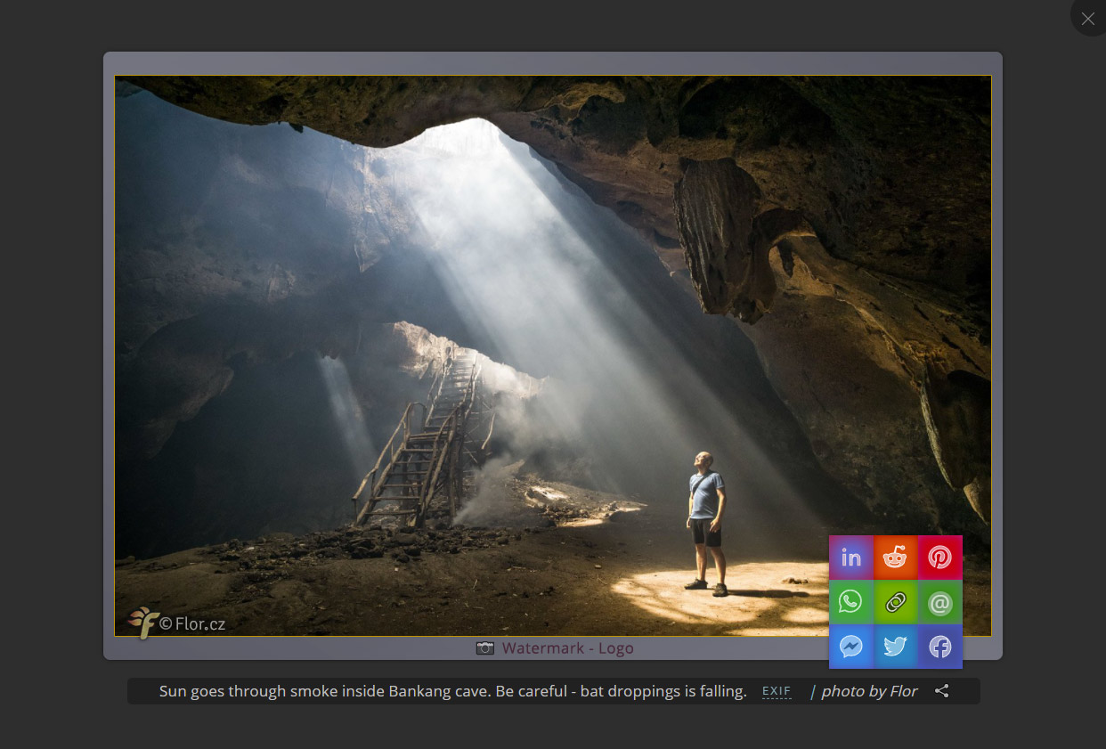
SSG nicely combines photos and captions to show a whole story in full screen, minimalist, non-distracting environment (no ugly arrows). SSG can support your brand and marketing. The gallery is vertical - optimized for use on smartphones.
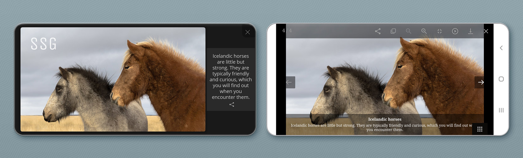
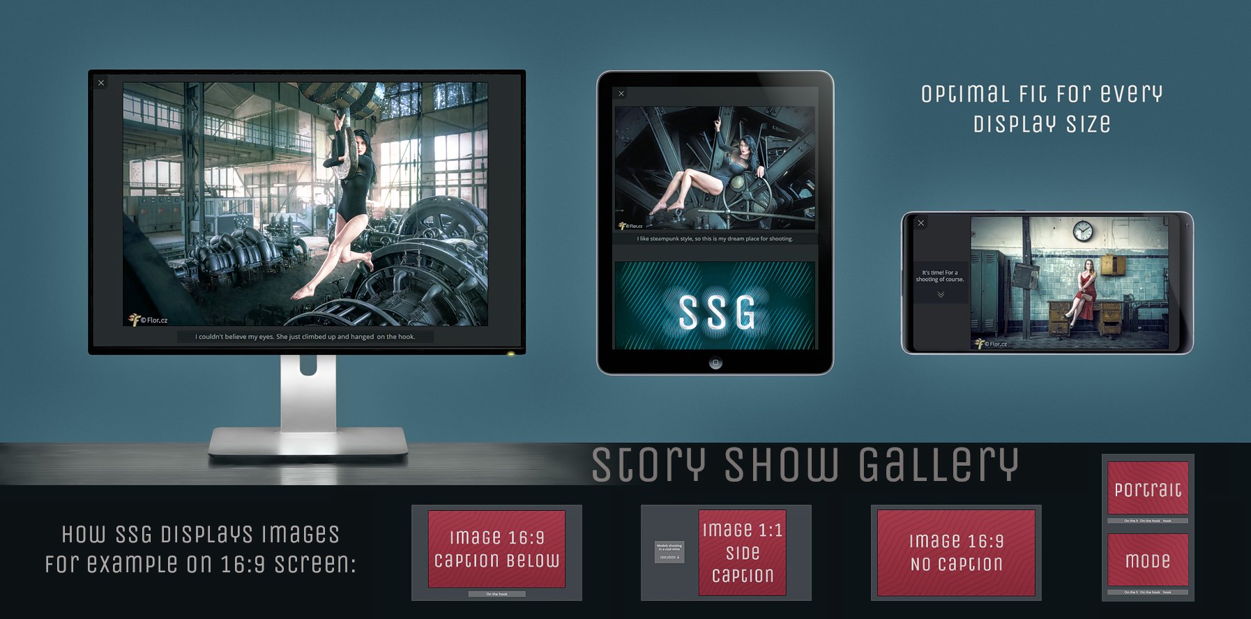
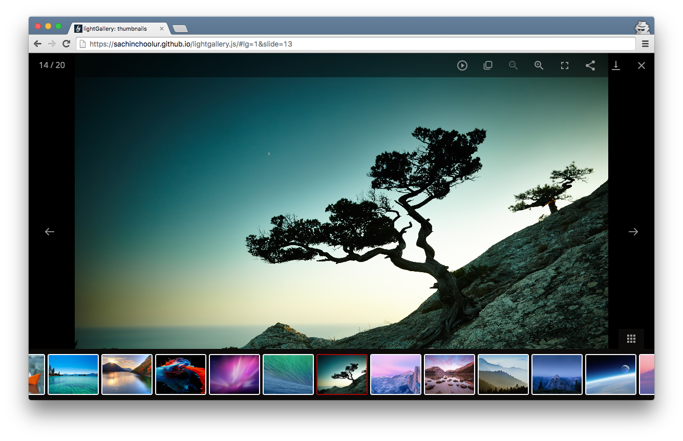
Story Show Gallery versus usual gallery lightbox. Do you want more icons or more from a photo? SSG use whole smartphone display - even notch area and even on iPhone.
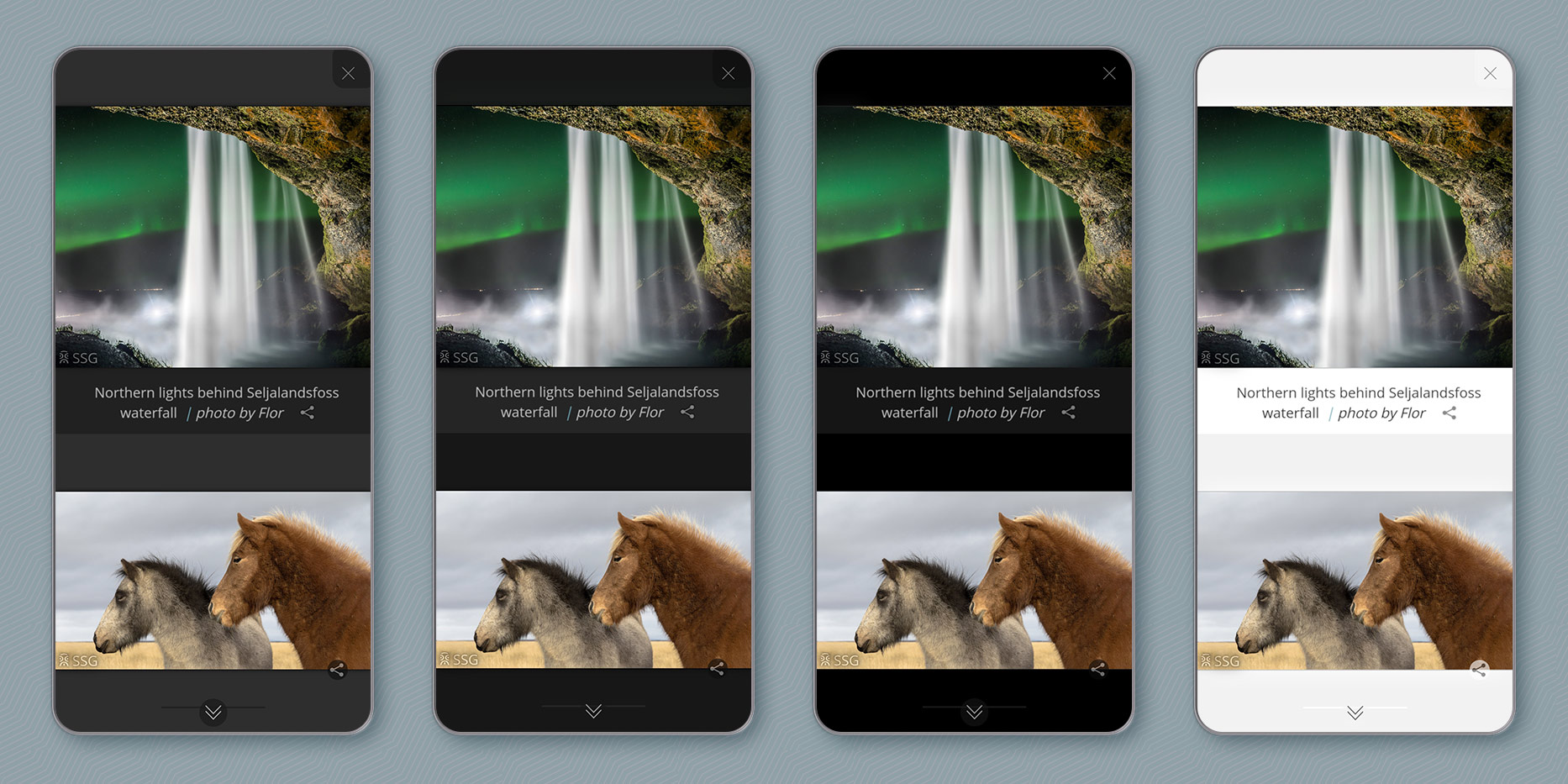
Portrait mode and four visual themes:
Story Show Gallery has very easy setup, it binds onto image hyperlinks on the page automatically. You can control this proccess by CSS classes. Define separate galleries, activate full screen mode, selectively deactivate SSG, etc. Story Show Gallery can also work as a React Component.
Not another photo gallery
On smartphones, full screen mode works like on YouTube. It triggers after rotating a phone into landscape mode.
Brand building (image or text), social sharing icon that can be hardly overlooked
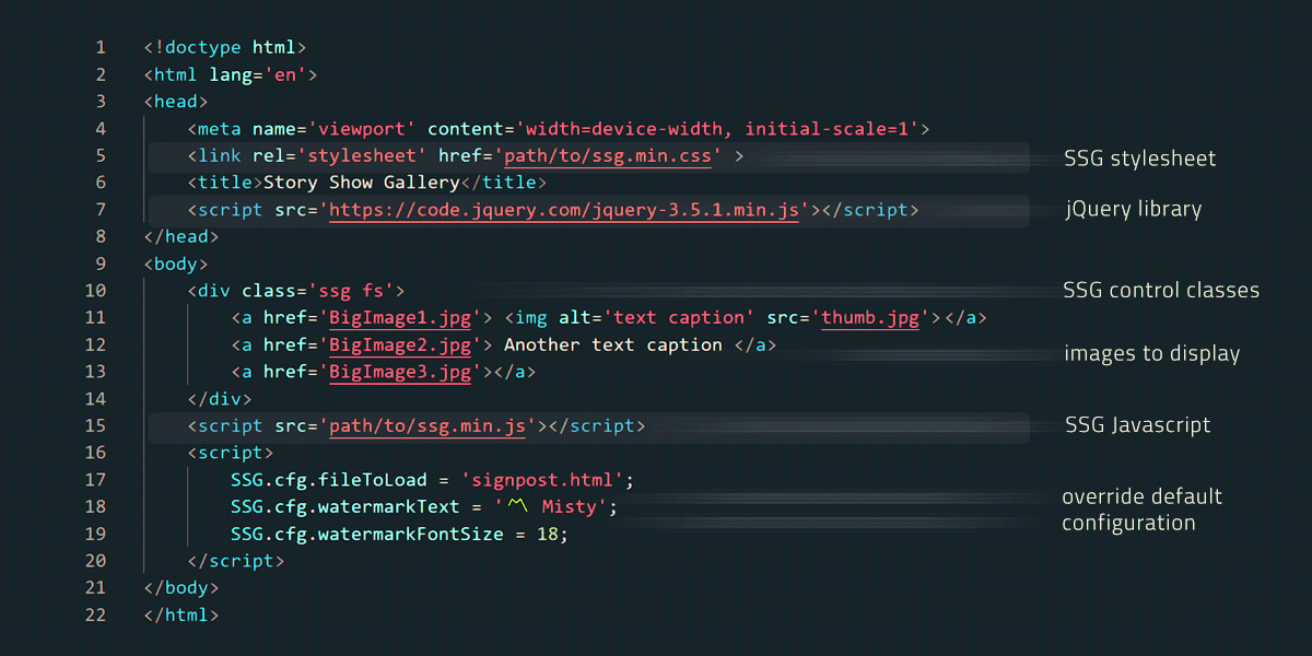
SSG binds onto image hyperlinks on the page automatically, BigImage1-4 will be in the gallery. You can control this proccess by CSS classes.
<divclass='ssg fs'><ahref='BigImage1.jpg'><imgalt='This text will appear under picture as a caption' src='thumbnail.jpg'>a><ahref='BigImage2.jpg' data-author='photo by Misty'> Also image caption a><ahref='BigImage3.jpg data-caption='thiscaptionhaspriorityoverlinktextoralt'> some text a><ahref='BigImage4.jpg'>a><ahref='BigImage5.jpg' class='nossg'> don't include me into SSG a>div>
The ssg class creates a separate gallery, the fs class will activate full screen mode. The BigImage4.jpg will open normally within a browser because of the nossg class. There are more control classes.
You can also run the gallery by calling SSG.run method and passing an JS array of images into SSG.
React Component (Next.js)
Story Show Gallery for React works the same way as it is described above. Just put in your React app StoryShowGallery component and every image hyperlink on the entire page will be asigned an onclick function, which opens image into the gallery. Image hyperlinks can be controled by CSS classes, as it is described above.
Or you can use SSG.run method with array of images.
How to install and use StoryShowGallery React component:
">
// install npm package:npmistory-show-gallery// import into React app:importStoryShowGallery,{SSG}from"story-show-gallery/src/react";// if you want EXIF support use:importStoryShowGallery,{SSG}from"story-show-gallery/src/react-exifr";// and also import CSS file:import"story-show-gallery/src/ssg.css";// if you use Next.js, you have to import it into _app.tsx as global CSS// use StoryShowGallery component and configure the gallery:<StoryShowGalleryconfig={{theme: 'light',watermarkText: 'xxx'}}/>
You can import story-show-gallery into root component (app.js or _app.js in case of Next.js) so the all aplication can use it. Or import it just into some component/page with a gallery. There is sample implementation (SsgReactExample.js) in the example directory.
Configuration
Default SSG configuration and language localization are at the begining of ssg.js file. You can edit source ssg.js file and then minify it. Or copy selected settings into your document to override default configuration. See all possible settings. Place the selected settings after ssg.min.js:
">
<scripttype="text/javascript" src="ssg.min.js">script><script>SSG.cfg.theme: 'light';// visual themeSSG.cfg.fileToLoad='signpost.html';// HTML file to load behind the gallerySSG.cfg.watermarkText='〽️ Misty';// watermark text overlaying a photoSSG.cfg.watermarkFontSize=18;SSG.cfg.captionExif='trim';// show EXIF with reduced lens infoscript>
Complete HTML5 example of SSG implementation and configuration:
Part of the configuration are also SSG events, you can use them to run your functions on the gallery start, on an image change, etc.
Minifying
If you modify source files (src folder), you will probably want to minify the result. Use existing npm script:
npminstall// it will install uglify-JS and uglify-CSS which are needed for minifyingnpmrun-scriptdist// it will minify the source files and put them into the dist directory.
License
You can use Story Show Gallery freely within open source GNU GPL-3.0 license.
There is one exception from the license: Distributing Story Show Gallery within a Wordpress plugin or theme is only allowed for the author of Story Show Gallery.
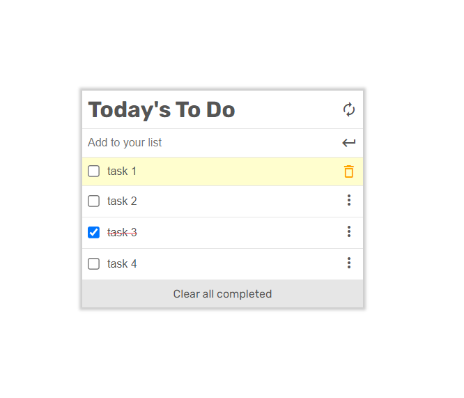
To-do list is a tool that helps to organize your day. It simply lists the things that you need to do and allows you to mark them as complete. We will build a simple website that allows for doing that, and we will do it using ES6 and Webpack!
The function, SSG.run, has an attribute named 'initImgID'.
I want to start SSG by clicking an img. But when I set the img's ID, I can't scroll to the previous img even the img I click is not the first img.
If I don't set initImgID, no matter what img I click, it would show the first img at the beginning.
It would be nice if SSG can init all the imgs while I can choose where to start
opened by kizuner-bonely 2
Releases(2.9.6)
2.9.6(Sep 24, 2020)
A deeplink into the gallery will run the gallery immediately and it will show the desired photo. Eg. https://roman-flossler.github.io/StoryShowGallery/#element
In this case SSG will stop loading of all images on the underlying page, so the desired photo can load much faster. It has all the bandwidth. When a user exits the gallery, the whole page will load.
When a webpage has the html tag styled with Scroll-behavior:smooth it totally messes up the gallery scrolling. So after the gallery initialization Scroll-behavior on the html and the body is set to auto and deactivated. After the gallery exit it is restored back.
New down arrow without any text and with the new cool animation.
Speed optimization of Jump scroll animation based on frame by frame analysis from Chrome performance.
Measures taken: Img.decode used for pre-decode images. Loading of the next image and setting pages's hash was postponed after the animation. Animation is much more fluent now.
GA sends image views to log just if the page is scrolled very slowly or not scrolled at all - if a user is really watching.
On tablet devices the gallery is directly switched into fullscreen mode, it solves problems with mobile browsers (height of address bar is changing).
There was some problems (mainly on Chrome mobile) with turning the gallery into full screen while the gallery was beeing created. So now the gallery is created after the full screen mode was activated (fullscreenchange event).
On smart phones full screen mode works like on YouTube, it activates after rotating a phone from portrait to landscape mode. It is much more smoother experience for a user. On mobile Chrome there is a lot of blinking, when the full screen is activated after a user tap. If a smart phone is already in landscape mode (not usual), then the gallery goes into full screen directly.
Redrawing of the gallery happens on different events for smart phones, desktops and iPhones.
Dealing with the multiple resize event in some browsers when the gallery is being switched into full screen mode.
Fixing the problem with orientation change on mobiles. The gallery reliably preserves an actual photo now.
Hint for a user how to browse through the gallery on touch devices
based on a little UX testing. SSG will show the hint if a user doesn't know he can use a jumps scroll to browse the gallery.
Notice "photos look better in landscape mode" was moved after the first photo, because the mobile chrome shows at the top of the screen notice about switching into the full screen mode
Newly there are 3 ways how a photo gallery can be created. Automatically from images on the page, by passing an Javascript array of images into SSG, or by combination of both.
Better positioning of final horizontal menu in case that there is no html signpost behind the gallery.
Preventing potential problems with too general CSS styles of underlaying webpage
Minding the notch on mobiles - to prevent the notch intervene into a caption, SSG swaps caption and photo if necessary. So photo is always next to notch regardless how a user holds his phone.
You can control gallery behaviour by assigning CSS classes to image links. The nossg class selectively deactivate SSG for some images or entire gallery. The gossg class will show image in the gallery only if a user activates the gallery through the image. The fs class activates fullscreen mode on selected image.
Added initImgID parameter which will activate the gallery with particular image.
Optimization and enhancement of scrolling. Faster code. Dealing with default passive event which came with Chrome 73 and broke scrolling. Better scrolling on touchpad. Scrolling to a right position when image is decentered by a user. Dark scrolling bar for new Firefox.
hi-res version of crosshair cursor It fixed problem with blurry interpolation of low res cursor in Chrome
code refactoring
Added the fsa parameter which also activates full screen mode. It is good to use when the gallery is initiate without an active click from a user. But that click is needed for entering fullscreen mode. So the gallery will ask if a user wants to switch into fullscreen mode.
Every image in Story Show Gallery has its own URL adress: www.site.com/dir/#photoname. As you are browsing through the gallery the #photoname is constantly changing in the browser's navigation bar. But the bar isn’t visible in the full-screen mode. So there is a little hack. If you hold alt key and click on a thumbnail the SSG won’t run into fullscreen and you can find out an URL of some image and use it as link into the gallery.
handling of broken link. SSG will show 'error loading image' image. So you will notice it before site visitors do.
Story Show Gallery has three landscape modes now - a text caption below an image, aside an image and with no caption. For each image SSG calculates which mode to use according to an image format vs. screen aspect ratio. This is recalculated on each window resize/rotate and animation centers the image after resizing.
change of class names activating fullscreen mode (in favor of Wordpress), class order doesn't matter anymore
better order of displaying photos, suitable even for several galleries on one page
Adding loading-wait icon for touch screen devices
the "next photo" link vertically centered and aside of the text caption.
Easy responsive tabs - is a lightweight jQuery plugin which optimizes normal horizontal or vertical tabs to accordion on multi devices like: web, tablets, Mobile (IPad & IPhone). This plugin adapts the screen size and changes its action accordingly.
TVMAZE API-based webapp, receives TV show episodes with all data about that TV show. The Webapp has two interfaces: A home page, showing a list of Tv show episodes you can like. And a popup window with more data about the TV show that you can comment on.


 600 Dec 8, 2022
 4 Jul 7, 2022
 4 May 23, 2022
 6 Dec 8, 2022
 3 Nov 6, 2022
 11 Sep 3, 2022
 5 Sep 6, 2022
 22.4k Dec 29, 2022
 4 Aug 9, 2022
 4 Nov 4, 2021