Tippy v5
The main goal of this version is to:
- Improve developer experience with warnings without bloating production bundle size
- Massively reduce core size and make the library more treeshake-able
- Allow new feature additions to be added separately without increasing bundle size
- Improve naming consistency and usage
Highlights
- ⬇️ 30%+ smaller download size (5.4 kB minzipped including core CSS)
- ⬇️ 50%+ smaller parse size (15.1 kB minified including core CSS)
- ⬇️ 60%+ smaller core CSS (0.6 kB minzipped) + smaller external animation files
- ⚙️ Development and production versions for better developer experience
- ✨ New animation variations
- ✨ New
touch: ["hold", delay] prop (for long press behavior)
- ✨ New
arrow: string | Element values to use your own shape
- ✨ New
createSingleton method, supersedes group()
- 🌸 Improved animations integration and documentation, namely fully dynamic transition dimensions when tippy content updates
- 🌸 Improved naming consistency
- ♿ Improved accessibility defaults for interactive tippys
- 🐛 Various minor behavior bug fixes
Development and production versions of Tippy.js
We're now adding helpful development warnings without bloating bundle size. Development files are .js, while production versions are .min.js.
Main filename was renamed from index.all to tippy.bundle for better DevTools display.
tippy.js/
├── dist/
│   ├── tippy.cjs.js              "main" file
│   ├── tippy.esm.js              "module" file
│   ├── tippy-bundle.iife.js
│   ├── tippy-bundle.iife.min.js         "unpkg" file
│   ├── tippy.iife.js
│   ├── tippy.iife.min.js
// This whole block will get stripped by minifiers/DCE for production builds
// When importing like `import tippy from 'tippy.js'`
if (process.env.NODE_ENV !== 'production') {
  if (somethingBad) {
    console.warn('You did somethingBad');
  }
}
Where's the umd folder? The browser format is now iife. Node is covered by cjs, and amd is dead and/or didn't work with popper.js/tippy.js anyway before because of the .js suffix apparently (which is what umd covered). Now it's not necessary.
iife development version includes the block without the Node-only process variable. In the .min version, it's stripped out entirely (like the other formats).
Drop Android 4.4 support
Remove all -webkit- prefixed transforms to save 200 minzipped bytes or so.
Force data-placement and data-out-of-boundaries attributes
The inconsistency between data-animation and x-placement has been annoying. Since 4.2.0, we've moved these attributes to the .tippy-tooltip node, so we can rename them.
Default is now arrow: true and animation: 'fade'
Having animateFill: true and animation: 'shift-away' animation as defaults add a lot of CSS bloat. By making the "bootstrap" tooltip default a lot of code is stripped away.
Further reasons listed here: https://github.com/atomiks/tippyjs/pull/499#issuecomment-504662996
import tippy from 'tippy.js';
import 'tippy.js/dist/backdrop.css';
import 'tippy.js/animations/shift-away.css';

tippy(targets, {
  content: 'tooltip',
  animateFill: true,
  animation: 'shift-away'
});
If using a custom SVG arrow, import the SVG arrow CSS
Again, for treeshaking reasons, not everyone cares about SVG arrows, so will need to import the CSS separately:
import 'tippy.js/dist/svg-arrow.css';
Delays are always 0 in touch and keyboard contexts
I don't see a reason to keep delay here, it's poor UX. If people require this to be configured then we can add it later.
Remove target option and tippy.group() from core
They've been moved into a file called "addons" to conserve core's size. createSingleton has replaced group since its behavior is better and allows transitions since a single tippy is being used.
Functions in this bundled file should be treeshaken by bundlers.
import {delegate, createSingleton} from 'tippy.js';

delegate('#parent', {
  target: 'button'
});

const singleton = createSingleton(tippy('button'), {
  delay: 500
});
Move followCursor to plugins
Like the "addons", props are being moved to separate parts because not everyone needs this behavior.
import tippy, {followCursor} from 'tippy.js';

tippy.use(followCursor);
Animations
A ton of work has been gone into considering animations more deeply.
This includes:
- CSS transitions (default)
- CSS animations (e.g.
animate.css)
- JavaScript and spring animations (e.g.
animejs)
- FLIP animations of tippy content (e.g.
react-flip-toolkit/core)
Default CSS animations: shift-toward, scale, perspective animations removed
Only fade will remain in tippy.css.
Extra CSS animations will be moved to a folder called animations/ (like themes/); there are now 3 variants of each animation expect for fade (subtle and extreme added).
Example import:
import 'tippy.js/animations/shift-away-subtle.css';
CSS animations (instead of transitions - e.g. animate.css)
We're now using use top/left/right/bottom: 10px as the base distance offset, rather than specifying it in the transform. Makes it more compatible with external animation CSS, FLIP libraries, and removes need for the notransition technique.
There's no need to think about distance anymore now due to this.
tippy('button', {
  // `fade` is now just an opacity transition, which is a good base for most
  // animations.
  animation: 'fade',
  onMount(instance) {
    const {tooltip} = instance.popperChildren;
    requestAnimationFrame(() => {
      tooltip.classList.add('animated', 'wobble');
    });
  },
  onHidden(instance) {
    const {tooltip} = instance.popperChildren;
    tooltip.classList.remove('animated', 'wobble');
  }
});
Dimensions transition
⚠️ Highly experimental code. There are tons of edge cases I've had to work out. Hopefully this can be wrapped in a simple addon API.
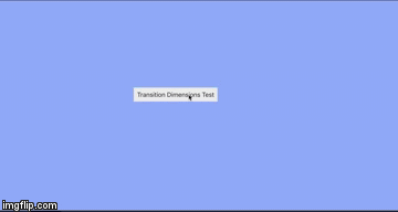
See demo/flip
Remaining problems:
- Work out the dynamic
clip-path based on the placement needed to prevent content overflowing when the tippy has an arrow (since it can't have overflow: hidden).
- Work out how to make it fully dynamic, considering
.setProps() method.
Themes
google theme was renamed to material, to remove the association with Google.- Prevent the need to specify
.tippy-tooltip[data-animatefill] .tippy-backdrop selector (to make background-color transparent)
New lifecycle functions
onCreateonUntriggeronPropsUpdatedonDestroy
Virtual reference elements
Plain objects are not supported anymore - instead, you just pass a placeholder element like this:
const placeholderElement = document.createElement('div');

// IE9+ supports overriding this method. That's all that's needed for
// Popper.js to position the tippy.
//
// `client{Width,Height}` when 0 (i.e. not appended to the document) do not have an effect,
// as Popper.js falls back to the dimensions instead
placeholderElement.getBoundingClientRect = () => ({ ... });

tippy(placeholderElement, options);
This conserves size since we don't need to polyfill element methods in the plain object.
Auto built index.d.ts
Internal types don't live in types.ts so now index.d.ts gets generated on build, which is just a copy of src/types.ts.
Naming
The term "options" is being completely ditched in favor of "props" everywhere. And now consistent methods:
instance.set() was renamed to instance.setProps()tippy.defaults was renamed to tippy.defaultPropstippy.setDefaults() was renamed to tippy.setDefaultProps()
This directly aligns with the React component model since every prop is dynamic and updateable. Options are now Partial, or termed "optional props". The merged interface is Props as it was before.
showOnInit -> showOnCreate to match lifecycle hook
New static property
tippy.currentInput is a mutable object with a single property isTouch. This moves the internal isUsingTouch flag to this object so that users can access it, as it's sometimes useful in rare cases.
i.e. tippy.currentInput.isTouch
New accessibility defaults for interactive tippys
By default if interactive: true, then: {aria: null, appendTo: "parent"}
There's also a warning in DEV if the tippy is not directly after the ref/triggerTarget node. If the user specifies a different appendTo, then it gets ignored as it assumes there are clipping issues and they need a custom focus management solution to handle it.
aria-expanded attribute also addedaria-describedby handles multiple tippys
TODO
5.1.0 goals:
- Wrap animejs logic in an addon wrapper
- Wrap FLIP animation library logic in an addon wrapper, hopefully solve the 2 remaining problems
Current experimental React wrapper
![[WIP] V5](https://avatars.githubusercontent.com/u/22450188?v=4)


 7.7k Dec 30, 2022
 138 Sep 27, 2022
 927 Dec 14, 2022
 19 Sep 26, 2022
 8k Jan 3, 2023
 35 Dec 12, 2022
 2.6k Dec 27, 2022
 1.5k Jan 2, 2023
 4 May 6, 2022
 4 Jan 24, 2022
 103 Dec 16, 2022
 1 Apr 29, 2021
 170 Dec 30, 2022
 4 Mar 17, 2022
 44 Oct 21, 2022
 7 Nov 2, 2022
 24 Feb 14, 2022
 17 Sep 24, 2022