I13e.ButtonEditor
Button editor for Neos CMS
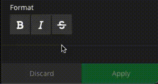
This package provides a new inspector editor displaying it's options as buttons.
Buttons operates like check- or radioboxes.
Installation
Run composer require i13e/buttoneditor.
Usage
Use the new editor in your properties
I13e.Package:Content.Text:
properties:
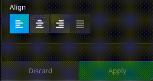
align:
# ButtonEditor supports "string" and "array"
type: string
defaultValue: left
ui:
label: 'Align'
inspector:
editor: I13e.ButtonEditor/ButtonEditor
editorOptions:
# Allow all buttons to be deselected
# boolean, default: false
allowEmpty: false
# Allow multiple buttons to be active
# If set to true also use `type` array
# boolean, default: false
multiple: false
# Disable all buttons
# boolean, default: false
disabled: false
values:
left:
label: i18n
icon: align-left
center:
label: i18n
icon: align-center
right:
label: i18n
icon: align-right
justify:
label: i18n
icon: align-justify
# An alternative icon for the active state
iconActive: align-justify
# Disable a single option
disabled: true
# ---
# Optionally use a data source:
#
# If `dataSourceIdentifier` or `dataSourceUri` is defined, the `values` from above will be ignored
dataSourceIdentifier: 'i13e-some-datasource'
dataSourceUri: 'some/custom-route'
dataSourceAdditionalData:
group: 'align'
dataSourceDisableCaching: false
As you may have realized, the configuration is nearly completely compatible with the default SelectBoxEditor.
Examples
Basic example from above
Multiple with allowEmpty
          editorOptions:
            allowEmpty: true
            multiple: true
            values:
              # define your own
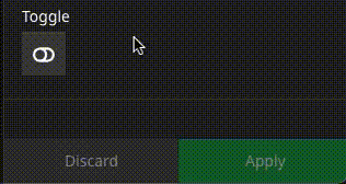
Multiple with allowEmpty:
          editorOptions:
            allowEmpty: true
            values:
              toggle:
                label: i18n
                icon: toggle-off
                iconActive: toggle-on
Known issues
- Although the ButtonEditor works with Neos 5.3 it does not support automatic label i18n handling. With Neos 5.3 please use full translation paths.
Contribution
If you'd like to contribute simply create a pull-request.
Proudly developed in the Hanover Region


 2.8k Dec 19, 2022
 12 Dec 23, 2022
 3 Feb 12, 2022
 13 Dec 1, 2022
 95 Dec 30, 2022
 5k Jan 1, 2023
 2.4k Dec 17, 2022
 1.7k Dec 12, 2022
 25.2k Jan 4, 2023
 25.6k Dec 30, 2022