React Navigation TabBar Collection
Collection of Animated 60 FPS TabBar Components based on React Navigation.
Features
- 60 FPS Animation
- Beautiful TabBar Components
- Based on
React Navigationv5 or higher - Easy to use
- Dark Mode Support
- Many Beautiful TabBars will be added into the collection in the future
Installation
This TabBar Collection is based on
@react-navigation/bottom-tabsand requireReact Navigation v5 or higherso first thing first you must install @react-navigation/native and @react-navigation/bottom-tabs in your project.
via NPM
npm install react-navigation-tabbar-collection
via Yarn
yarn add react-navigation-tabbar-collection
TabBar Collection
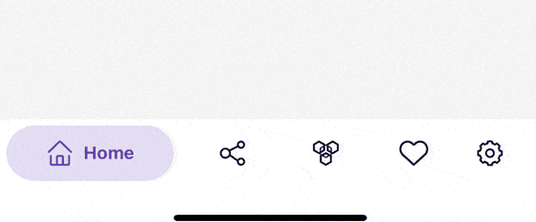
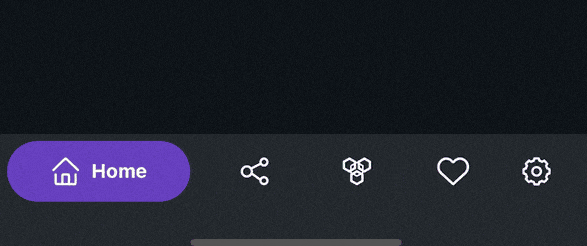
Colorful TabBar
This TabBar is inspired by Aurélien Salomon's works on Dribbble.
import { ColorfulTabBar } from 'react-navigation-tabbar-collection';

const App = () => {
    return (
        <NavigationContainer>
            <Tab.Navigator
                tabBar={(props) => <ColorfulTabBar {...props} />} //Add Here
            >
                {/* Your Screens Here ~ */}
            </Tab.Navigator>
        </NavigatorContainer>
    )
}
Example
import React from 'react';
import { NavigationContainer } from '@react-navigation/native';
import { createBottomTabNavigator } from '@react-navigation/bottom-tabs';
import { StyleSheet, Text, View } from 'react-native';
import { ColorfulTabBar } from 'react-navigation-tabbar-collection';
import Icon from 'react-native-vector-icons/AntDesign';

const Tab = createBottomTabNavigator();

const DemoScreen = ({ route }) => (
  <View style={styles.screen}>
    <Text>{route.name}</Text>
  </View>
);

const App = () => {
  return (
    <NavigationContainer>
      <Tab.Navigator
        initialRouteName="Home"
        tabBar={(props) => <ColorfulTabBar {...props} />}
      >
        <Tab.Screen
          name="Home"
          component={DemoScreen}
          options={{
            title: 'Home',
            icon: ({ focused, color, size }) => (
              <Icon name="home" size={size} color={color} />
            ),
            color: 'primary',
          }}
        />
        <Tab.Screen
          name="News"
          component={DemoScreen}
          options={{
            title: 'News',
            icon: ({ focused, color, size }) => (
              <Icon name="sharealt" size={size} color={color} />
            ),
            color: 'info',
          }}
        />
        <Tab.Screen
          name="Chat"
          component={DemoScreen}
          options={{
            title: 'Chat',
            icon: ({ focused, color, size }) => (
              <Icon name="API" size={size} color={color} />
            ),
            color: 'warning',
          }}
        />
        <Tab.Screen
          name="Likes"
          component={DemoScreen}
          options={{
            title: 'Likes',
            icon: ({ focused, color, size }) => (
              <Icon name="hearto" size={size} color={color} />
            ),
            color: 'danger',
          }}
        />
        <Tab.Screen
          name="Settings"
          component={DemoScreen}
          options={{
            title: 'Settings',
            icon: ({ focused, color, size }) => (
              <Icon name="setting" size={size} color={color} />
            ),
            color: 'success',
          }}
        />
      </Tab.Navigator>
    </NavigationContainer>
  );
};

export default App;

const styles = StyleSheet.create({
  screen: {
    width: '100%',
    height: '100%',
    flex: 6,
    justifyContent: 'center',
    alignItems: 'center',
  },
});
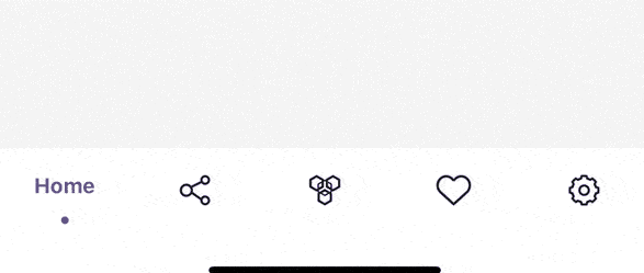
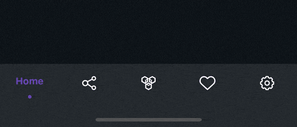
Clean TabBar
import { CleanTabBar } from 'react-navigation-tabbar-collection';

const App = () => {
    return (
        <NavigationContainer>
            <Tab.Navigator
                tabBar={(props) => <CleanTabBar {...props} />} //Add Here
            >
                {/* Your Screens Here ~ */}
            </Tab.Navigator>
        </NavigatorContainer>
    )
}
Example
import React from 'react';
import { NavigationContainer } from '@react-navigation/native';
import { createBottomTabNavigator } from '@react-navigation/bottom-tabs';
import { StyleSheet, Text, View } from 'react-native';
import { CleanTabBar } from 'react-navigation-tabbar-collection';
import Icon from 'react-native-vector-icons/AntDesign';

const Tab = createBottomTabNavigator();

const DemoScreen = ({ route }) => (
  <View style={styles.screen}>
    <Text>{route.name}</Text>
  </View>
);

const App = () => {
  return (
    <NavigationContainer>
      <Tab.Navigator
        initialRouteName="Home"
        tabBar={(props) => <CleanTabBar {...props} />}
      >
        <Tab.Screen
          name="Home"
          component={DemoScreen}
          options={{
            title: 'Home',
            icon: ({ focused, color, size }) => (
              <Icon name="home" size={size} color={color} />
            ),
            color: 'primary',
          }}
        />
        <Tab.Screen
          name="News"
          component={DemoScreen}
          options={{
            title: 'News',
            icon: ({ focused, color, size }) => (
              <Icon name="sharealt" size={size} color={color} />
            ),
            color: 'info',
          }}
        />
        <Tab.Screen
          name="Chat"
          component={DemoScreen}
          options={{
            title: 'Chat',
            icon: ({ focused, color, size }) => (
              <Icon name="API" size={size} color={color} />
            ),
            color: 'warning',
          }}
        />
        <Tab.Screen
          name="Likes"
          component={DemoScreen}
          options={{
            title: 'Likes',
            icon: ({ focused, color, size }) => (
              <Icon name="hearto" size={size} color={color} />
            ),
            color: 'danger',
          }}
        />
        <Tab.Screen
          name="Settings"
          component={DemoScreen}
          options={{
            title: 'Settings',
            icon: ({ focused, color, size }) => (
              <Icon name="setting" size={size} color={color} />
            ),
            color: 'success',
          }}
        />
      </Tab.Navigator>
    </NavigationContainer>
  );
};

export default App;

const styles = StyleSheet.create({
  screen: {
    width: '100%',
    height: '100%',
    flex: 6,
    justifyContent: 'center',
    alignItems: 'center',
  },
});
Props
| Name | Description | Required | Type | Default | Supported Component |
|---|---|---|---|---|---|
{...props} |
Default Bottom Tab React Navigation Props | YES | All | ||
maxWidth |
TabBar Content Max Width | NO | number | 600 | All |
height |
TabBar Container Height | NO | number | All | |
darkMode |
TabBar Style Mode | NO | boolean | false | All |
colorPalette |
TabBar Color Palette | NO | object | see down here | All |
Default colorPalette value
{
    primary: "#5b37b7",
    secondary: "#6c757d",
    success: "#198754",
    danger: "#c9379d",
    warning: "#e6a919",
    info: "#00bcd4",
    light: "#ffffff",       //Background Color
    dark: "#212529",        //Foreground Color
}
Background and Foreground Color are Inverted when the
darkModeistrue
Screen Options
These options came from React Navigation options or screenOptions with additional new options to configure the TabBar Item.
| Name | Description | Type |
|---|---|---|
title, label or tabBarLabel |
Title string of a tab displayed in the tab bar. | string |
labelStyle or tabBarLabelStyle |
Style object for the tab label. | StyleProp |
icon or tabBarIcon |
Function that is given the focused state, color, and size params. |
({focused: boolean, color: string, size: number}) => void |
color or tabBarActiveTintColor |
Color for the icon and label in the active tab. enum options are from the colorPalette primary, secondary, success, danger, warning, info, light, dark. or just a string of hex |
enum | string |
tabBarTestID |
ID to locate this tab button in tests. | string |
Author
Contributing
See the contributing guide to learn how to contribute to the repository and the development workflow.
License
MIT
Built With
- Animated (React Native)
Requirements
| Name | Version |
|---|---|
| @react-navigation/native | >=5.0.0 |
| @react-navigation/bottom-tabs | >=5.0.0 |


 94 Nov 30, 2022
 10.3k Jan 2, 2023
 8 Oct 29, 2022
 130 Dec 14, 2022
 10.1k Jan 3, 2023
 14.8k Jan 4, 2023
 7 May 27, 2022
 8.7k Jan 8, 2023
 136 Dec 30, 2022
 1.4k Jan 4, 2023