My Home Assistant
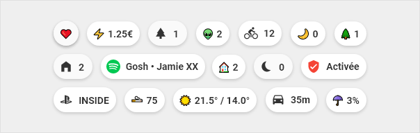
At the top of each page we find the chips which allow me to quickly visualize the important information of the page. Then title to separate the different sections and cards to represent and interact with devices, sensors, etc … I used the custom component button-card for all these cards. I drew a lot of inspiration from 7ahang’s work that I found on Behance.


Table of Contents
Installation
- Add button_card_templates in ui-lovelace.yaml file.
button_card_templates: !include lovelace/button_card_templates/button_card_templates.yaml
- Add resources in your configuration.yaml file. You will need at least button-card
lovelace:
  mode: yaml
  resources: !include lovelace/resources/resources.yaml
- Add themes in your configuration.yaml file
frontend:
  themes: !include configuration/themes.yaml
Design system
Colors
I tried to set up a consistency between the colors used to represent the entities.
| Color | Type |
|---|---|
|
|
|
|
|
|
|
|
|
|
|
|


Chips
Code template
| Template |
|---|
chips:
  tap_action:
    action: more-info
  show_icon: false
  show_name: false
  show_state: false
  show_label: true
  size: 80%
  styles:
    img_cell:
      - width: 24px
    card:
      - border-radius: 18px
      - box-shadow: var(--box-shadow)
      - height: 36px
      - width: auto
      - padding-left: 6px
      - padding-right: 6px
    grid:
      - grid-template-areas: '"l"'
    label:
      - justify-self: center
      - padding: 0px 6px
      - font-weight: bold
      - font-size: 14px
|
Temperature

Code
| Example | Template |
|---|---|
- template: chips_temperature
  type: 'custom:button-card'
|
chips_temperature:
  template: chips
  tap_action:
      action: navigate
      navigation_path: /lovelace/temperature
  label: |
    [[[
      var inter = states['sensor.fibaro_multisensor_salon_temperature'].state;
      var exter = states['sensor.fibaro_multisensor_balcon_temperature'].state;
      var icon = '☀️';
      if (states['sensor.dark_sky_icon'].state == 'clear-day'){
        var icon = '☀️';
      } else if(states['sensor.dark_sky_icon'].state == 'clear-night'){
        var icon = '🌙';
      } else if(states['sensor.dark_sky_icon'].state == 'rain'){
        var icon = '🌧️';
      } else if(states['sensor.dark_sky_icon'].state == 'snow'){
        var icon = '❄️';
      } else if(states['sensor.dark_sky_icon'].state == 'sleet'){
        var icon = '❄️';
      } else if(states['sensor.dark_sky_icon'].state == 'wind'){
        var icon = '🌫️';
      } else if(states['sensor.dark_sky_icon'].state == 'fog'){
        var icon = '🌫️';
      } else if(states['sensor.dark_sky_icon'].state == 'cloudy'){
        var icon = '☁️';
      } else if(states['sensor.dark_sky_icon'].state == 'partly-cloudy-day'){
        var icon = '⛅️';
      } else if(states['sensor.dark_sky_icon'].state == 'partly-cloudy-night'){
        var icon = '⛅';
      }
      return icon + ' ' + exter + '° / ' +  inter + '°' ;
    ]]]
|
Electric consumption

Code
| Example | Template | |
|---|---|---|
- template: chips_power_consumption
  type: 'custom:button-card'
|
chips_power_consumption:
  template: chips
  tap_action:
    action: navigate
    navigation_path: /lovelace/consommation
  label: |
    [[[
      var price = states['sensor.atome_price_conso_today'].state;
      return '⚡ ' +  price + '€' ;
    ]]]
|
Presence counter

Code
| Example | Template |
|---|---|
- template: chips_localisation_present
  type: 'custom:button-card'
|
  chips_localisation_present:
    tap_action:
      action: navigate
      navigation_path: /lovelace/localisation
    label: |
      [[[
        var personnes_presentes = states['sensor.people_count_present'].state;
        return '🏠 ' +  personnes_presentes;
      ]]]
    template: chips
|
Return button

Code
| Example | Template |
|---|---|
- template: chips_return
  type: 'custom:button-card
|
chips_return:
  template: chips
  show_icon: true
  icon: 'mdi:arrow-left'
  size: 80%
  styles:
    grid:
      - grid-template-areas: '"i"'
  tap_action:
    action: navigate
    navigation_path: /lovelace/home
|
Scene

Code
| Example | Template | Template Blue |
|---|---|---|
- entity: sensor.present
  template: scene_blue
  variables:
    state: "Present"
  type: 'custom:button-card'
|
scene:
  size: 20px
  show_label: true
  label: |
    [[[ return (entity.attributes.value )]]]
  styles:
    card:
      - border-radius: var(--border-radius)
      - box-shadow: var(--box-shadow)
      - padding: 10px 0px 8px 0px
    grid:
      - grid-template-areas: '"i" "n" "l"'
    name:
      - margin-top: 10px
      - justify-self: center
      - font-weight: bold
      - font-size: 14px
    label:
      - justify-self: center
      - align-self: start
      - font-weight: bolder
      - font-size: 12px
      - filter: opacity(40%)
    icon:
      - color: 'rgba(var(--color-theme),0.2)'
    img_cell:
      - background-color: 'rgba(var(--color-theme),0.05)'
      - border-radius: 50%
      - place-self: center
      - width: 42px
      - height: 42px
|
scene_blue:
  variables:
    state: "default"
  template:
    - scene
  state:
    - operator: template
      value: >
        [[[
          return states['input_select.localisation_thomas'].state == variables.state
        ]]]
      styles:
        icon:
          - color: 'rgba(var(--color-blue),1)'
        img_cell:
          - background-color: 'rgba(var(--color-blue), 0.2)'
        card:
          - background-color: 'rgba(var(--color-background-blue), var(--opacity-bg))'
        name:
          - color: 'rgba(var(--color-blue-text),1)'
        label:
          - color: 'rgba(var(--color-blue-text),1)'
|
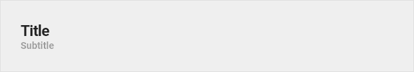
Title
Code
| Example | Template |
|---|---|
- template: title
  name: Title
  label: 'Subtitle'
  type: 'custom:button-card'
|
title:
  tap_action:
    action: none
  show_icon: false
  show_label: true
  show_name: true
  styles:
    card:
      - background-color: rgba(0,0,0,0)
      - box-shadow: none
      - height: auto
      - width: auto
      - margin-top: 12px
      - margin-left: 24px
      - margin-bottom: 0px
    grid:
      - grid-template-areas: '"n" "l"'
      - grid-template-columns: 1fr
      - grid-template-rows: min-content min-content
    name:
      - justify-self: start
      - font-weight: bold
      - font-size: '1.5rem'
    label:
      - justify-self: start
      - font-weight: bold
      - font-size: '1rem'
      - opacity: '0.4'
|
Cards
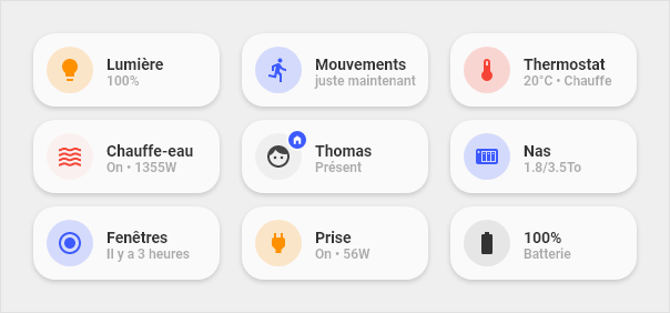
Anatomy
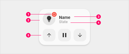
- Dot : Visible when the device is unavailable. Also used on the entity person
- Icon : Icon that represents the device
- Primary line : Main information
- Secondary line : Secondary information
- Optionnal part : Possibility to display buttons to launch actions related to the device. Or display a graph to view the history of a sensor
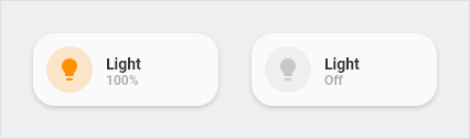
Light
Code
| Example | Template |
|---|---|
- entity: light.example
  name: Lumière
  template:
    - icon_info_bg
    - light
  type: 'custom:button-card'
|
light:
  tap_action:
    action: toggle
  hold_action:
    action: more-info
  label: >-
    [[[ if (entity.state !='unavailable'){
          if (entity.state =='off'){
            var bri = Math.round(entity.attributes.brightness / 2.55);
            return 'Off';
          }else{
            var bri = Math.round(entity.attributes.brightness / 2.55);
            return (bri ? bri : '0') + '%';
          }
        }else{
          return "Indisponible";
        }
    ]]]
  template:
    - yellow
|
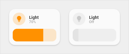
Light slider
Code
| Example | Template |
|---|---|
  - entity: light.exemple
    template:
      - light_slider
    variables:
      entity: "light.exemple"
      name: "Light"
    type: 'custom:button-card'
|
  light_slider:
    variables:
      name: "Default name"
    show_icon: false
    show_name: false
    show_label: false
    styles:
      card:
        - border-radius: var(--border-radius)
        - box-shadow: var(--box-shadow)
        - padding: 12px
      grid:
        - grid-template-areas: '"item1" "item2"'
        - grid-template-columns: 1fr
        - grid-template-rows: min-content  min-content
        - row-gap: 12px
    state:
      - operator: template
        value: >
          [[[
            return entity.state == 'on'
          ]]]
        styles:
          card:
            - background-color: 'rgba(var(--color-background-yellow),var(--opacity-bg))'
    custom_fields:
      item1:
        card:
          entity: '[[[ return variables.entity ]]]'
          name: '[[[ return variables.name ]]]'
          template:
            - icon_info
            - light
          type: 'custom:button-card'
      item2:
        card:
          type: 'custom:slider-card'
          entity: '[[[ return variables.entity ]]]'
          radius: 14px
          height: 42px
          mainSliderColor: rgba(var(--color-yellow),1)
          secondarySliderColor: rgba(var(--color-yellow),0.2)
          mainSliderColorOff: rgba(var(--color-theme),0.05)
          secondarySliderColorOff: rgba(var(--color-theme),0.05)
          thumbHorizontalPadding: '0px'
          thumbVerticalPadding: '0px'
          thumbWidth: 0px
          card_mod:
          style: |
            ha-card {
              border-radius: 14px;
              box-shadow: none;
            }
|
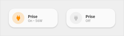
Outlet
Code
| Example | Template |
|---|---|
- entity: switch.exemple
  name: Prise
  template:
    - icon_info_bg
    - outlet
  label: |-
      [[[ if (entity.state =='on')
          var etat = "On • " + states["sensor.exemple"].state + "W";
          else
        var etat = "Off";
      return etat ; ]]]
  type: 'custom:button-card'
|
  outlet:
    tap_action:
      action: more-info
    label: |-
      [[[ if (entity.state =='on')
         var etat = "On";
         else
        var etat = "Off";
      return etat ; ]]]
    template:
      - yellow
|
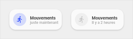
Binary sensor
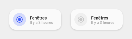
Code
| Example | Template |
|---|---|
- entity: binary_sensor.example
  name: Mouvement
  icon: 'mdi:run'
  template:
    - icon_info_bg
    - binary_sensor
  type: 'custom:button-card'
|
binary_sensor:
  show_last_changed: true
  template:
    - blue
|
Cover
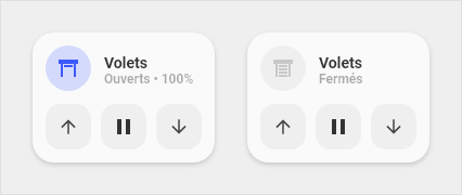
Code
| Example | Template |
|---|---|
- template: cover_buttons
  variables:
    entity: "cover.example"
    name: "Volets"
  type: 'custom:button-card'
|
cover_buttons:
  variables:
    entity: "cover.fibaro_cover_balcon"
    name: "Default name"
  styles:
    card:
      - border-radius: var(--border-radius)
      - box-shadow: var(--box-shadow)
      - padding: 12px
    grid:
      - grid-template-areas: '"item1" "item2"'
      - grid-template-columns: 1fr
      - grid-template-rows: min-content  min-content
      - row-gap: 12px
  custom_fields:
    item1:
      card:
        entity: '[[[ return variables.entity ]]]'
        name: '[[[ return variables.name ]]]'
        tap_action:
          action: more-info
        template:
          - icon_info
          - cover
        type: 'custom:button-card'
    item2:
      card:
        template: list_items
        type: 'custom:button-card'
        custom_fields:
          item1:
            card:
              icon: 'mdi:arrow-down'
              tap_action:
                action: call-service
                service: cover.close_cover
                service_data:
                  entity_id: '[[[ return variables.entity ]]]'
              type: 'custom:button-card'
              template: widget_icon
          item2:
            card:
              icon: 'mdi:pause'
              tap_action:
                action: call-service
                service: cover.stop_cover
                service_data:
                  entity_id: '[[[ return variables.entity ]]]'
              type: 'custom:button-card'
              template: widget_icon
          item3:
            card:
              icon: 'mdi:arrow-up'
              tap_action:
                action: call-service
                service: cover.open_cover
                service_data:
                  entity_id: '[[[ return variables.entity ]]]'
              type: 'custom:button-card'
              template: widget_icon
|
Thermostat

Code
| Example | Template |
|---|---|
- entity: climate.example
  template:
    - icon_info_bg
    - thermostat
  type: 'custom:button-card'
|
thermostat:
  hold_action:
    action: more-info
    entity: input_boolean.radiateur_arret_force
  label: >-
    [[[
        if (entity.state =='off'){
          return 'Off' ;
        }else{
          if (states['light.qubino'].state == 'on'){
            var etat = "Chauffe";
          }else{
            var etat = "Inactif";
          }
          return (entity.attributes.temperature ) + '°' + ' • ' + etat ;
        }
    ]]]
  state:
    - operator: template
      value: >
        [[[
          return states['light.qubino'].state == 'on'
        ]]]
      styles:
        icon:
          - color: 'rgba(var(--color-red),1)'
        img_cell:
          - background-color: 'rgba(var(--color-red),0.2)'
        card:
          - background-color: 'rgba(var(--color-background-red),var(--opacity-bg))'
        name:
          - color: 'rgba(var(--color-red-text),1)'
        label:
          - color: 'rgba(var(--color-red-text),1)'
|
Water heater
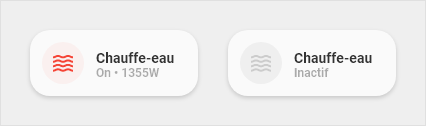
Code
| Example | Template |
|---|---|
- entity: switch.example
  name: Chauffe eau
  template:
    - icon_info_bg
    - water_heater
  type: 'custom:button-card'
|
water_heater:
  icon: 'mdi:waves'
  tap_action:
    action: more-info
  hold_action:
    action: more-info
  label: >-
    [[[
        if (entity.state == 'off'){
          return 'Arrêt forcé';
        }else{
          if (states["sensor.shelly_prise_salon_conso"].state > 0){
            var etat = "Chauffe • " + states["sensor.shelly_prise_salon_conso"].state + "W";
          }else{
            var etat = "Inactif";
          }
          return etat ;
        }
    ]]]
  state:
    - operator: template
      value: >
        [[[
          return (states['sensor.shelly_prise_salon_conso'].state > 0)
        ]]]
      styles:
        icon:
          - color: 'rgba(var(--color-red),1)'
        img_cell:
          - background-color: 'rgba(var(--color-red),0.2)'
        card:
          - background-color: 'rgba(var(--color-background-red),var(--opacity-bg))'
        name:
          - color: 'rgba(var(--color-red-text),1)'
        label:
          - color: 'rgba(var(--color-red-text),1)'
|
Media player

Code
| Example | Template |
|---|---|
- entity: media_player.example
  name: Enceintes
  template:
    - icon_info_bg
    - media
  type: 'custom:button-card'
|
  media:
    label: >-
      [[[ if (entity.state =='off'){
            return "Off";
          }else{
            return entity.state;
          }
      ]]]
    icon: |
      [[[
          var application = entity.attributes.app_name;
          var icon = 'mdi:speaker';
          if (application == 'Oto music'){
            var icon = 'mdi:music-circle';
          } else if(application == 'Spotify'){
            var icon = 'mdi:spotify';
          } else if(application == 'Google Podcasts'){
            var icon = 'mdi:google-podcast';
          } else if(application == 'Plex'){
            var icon = 'mdi:plex';
          }
          return icon ;
      ]]]
    styles:
      label:
        - opacity: '0.6'
      icon:
        - color: 'rgba(var(--color-theme),0.2)'
      img_cell:
        - background-color: 'rgba(var(--color-theme),0.05)'
      card:
        - background-blend-mode: multiply
        - background: >
            [[[
              var image = entity.attributes.entity_picture_local;
              var bg = entity.attributes.entity_picture_local;
              if (image == null){
                var bg = '';
              } else{
                var bg = 'center / cover url(' + image + ') rgba(0, 0, 0, 0.15)';
              }
              return bg;
            ]]]
    state:
      - operator: template
        value: >
          [[[
            return entity.state !='off'
          ]]]
        name: >
            [[[
              return entity.attributes.media_title;
            ]]]
        label: >
            [[[
              return entity.attributes.media_album_name;
            ]]]
        styles:
          label:
            - color: white
            - filter: opacity(100%)
          img_cell:
            - background-color: 'rgba(var(--color-theme),0.0)'
          icon:
            - color: white
          name:
            - color: white
|
Playstation
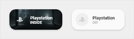
Code
| Example | Template |
|---|---|
- entity: media_player.example
  template:
    - icon_info_bg
    - ps4
  type: 'custom:button-card'
|
ps4:
  label: >-
    [[[ if (entity.state =='unknown'){
          return "Off";
        }else if (entity.state =='standby'){
          return "En veille";
        }else{
          return "On";
        }
    ]]]
  styles:
    icon:
      - color: 'rgba(var(--color-theme),0.2)'
    img_cell:
      - background-color: 'rgba(var(--color-theme),0.05)'
  state:
    - value: 'idle'
      styles:
        icon:
          - color: 'rgba(var(--color-blue),1)'
        img_cell:
          - background-color: 'rgba(var(--color-blue), 0.2)'
    - value: 'standby'
      styles:
        icon:
          - color: 'rgba(var(--color-theme),0.2)'
        img_cell:
          - background-color: 'rgba(var(--color-theme),0.05)'
    - operator: template
      value: >
        [[[
          return entity.state !='unknown'
        ]]]
      name: >
          [[[
            return entity.attributes.media_title;
          ]]]
      label: >
          [[[
            return entity.attributes.friendly_name;
          ]]]
      styles:
        label:
          - color: white
          - filter: opacity(100%)
        img_cell:
          - background-color: 'none'
        icon:
          - color: white
        name:
          - color: white
        card:
          - background-blend-mode: multiply
          - background: >
              [[[
                var image = entity.attributes.entity_picture;
                return 'center / cover url(' + image + ') rgba(0, 0, 0, 0.15)';
              ]]]
|
Person
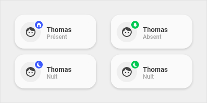
Information
Dot :
- At home : Blue
- Away : Green
Dot icon :
- At home : Home
- Away : Walking man
- Sleeping : Moon
Comment : The sleep state takes over the At home or Away state to display the moon icon
Code
| Example | Template |
|---|---|
- entity: input_select.localisation_thomas
  variables:
    personne: "thomas"
  template:
    - icon_info_bg
    - personne-thomas
  name: Thomas
  type: 'custom:button-card'
|
person:
  tap_action:
    action: more-info
  show_label: true
  label: >
      [[[return entity.state]]]
  styles:
    icon:
      - color: 'rgba(var(--color-theme),0.9)'
    custom_fields:
      notification:
        - border-radius: 50%
        - position: absolute
        - left: 38px
        - top: 8px
        - height: 16px
        - width: 16px
        - border: 2px solid var(--card-background-color)
        - font-size: 12px
        - line-height: 14px

####################################################

person-thomas:
  variables:
    person: "thomas"
  template: person
  hold_action:
    action: more-info
    entity: input_boolean.thomas_nuit
  styles:
    custom_fields:
      notification:
        - background-color: >
            [[[
              if (states['input_select.localisation_thomas'].state == 'Present'){
                return "rgba(var(--color-blue),1)";
              }else{
                return "rgba(var(--color-green),1)";
              }
            ]]]
  custom_fields:
    notification: >
      [[[
        if (states['input_boolean.thomas_nuit'].state == 'on'){
          return `<ha-icon icon="mdi:power-sleep" style="width: 10px; height: 10px; color: var(--primary-background-color);"></ha-icon>`
        }else{
          if (states['input_select.localisation_thomas'].state == 'Present'){
            return `<ha-icon icon="mdi:home-variant" style="width: 10px; height: 10px; color: var(--primary-background-color);"></ha-icon>`
          }else{
            return `<ha-icon icon="mdi:pine-tree" style="width: 10px; height: 10px; color: var(--primary-background-color);"></ha-icon>`
          }
        }
      ]]]
|
Generic

Code
| Example | Template |
|---|---|
- entity: sensor.example
  template:
    - icon_info_bg
    - generic
  type: 'custom:button-card'
|
generic:
  label: >
      [[[return entity.state + " " + entity.attributes.unit_of_measurement]]]
  styles:
    icon:
      - color: 'rgba(var(--color-theme),0.9)'
    grid:
      - grid-template-areas: '"i l" "i n"'
      - grid-template-columns: min-content auto
      - grid-template-rows: min-content min-content
    label:
      - align-self: end
      - justify-self: start
      - font-weight: bold
      - font-size: 14px
      - margin-left: 12px
      - filter: opacity(100%)
    name:
      - justify-self: start
      - align-self: start
      - font-weight: bolder
      - font-size: 12px
      - filter: opacity(40%)
      - margin-left: 12px
|
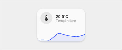
Generic + graph
Code
| Example | Template |
|---|---|
- type: 'custom:button-card'
  template: graph
  variables:
    entity: "sensor.exemple"
    color: "var(--google-blue)"
    name: "Température"
|
graph:
  variables:
    entity: "sensor.xiaomi_multisensor_salon_humidite"
    color: "var(--info-color)"
    name: "Default name"
  styles:
    card:
      - border-radius: var(--border-radius)
      - box-shadow: var(--box-shadow)
      - padding: 0px
    grid:
      - grid-template-areas: '"item1" "item2"'
      - grid-template-columns: 1fr
      - grid-template-rows: min-content  min-content
  custom_fields:
    item1:
      card:
        entity: '[[[ return variables.entity ]]]'
        name: '[[[ return variables.name ]]]'
        template:
          - icon_info
          - generic
        styles:
          card:
            - padding: 12px
        type: 'custom:button-card'
    item2:
      card:
        type: 'custom:mini-graph-card'
        entities:
          - entity: '[[[ return variables.entity ]]]'
        line_color: '[[[ return variables.color ]]]'
        show:
          name: false
          icon: false
          legend: false
          state: false
        style: |
          ha-card {
            box-shadow: none;
            border-radius: var(--border-radius);
          }
|

![[Info Request] - Config of Presence Sensors](https://avatars.githubusercontent.com/u/60232595?v=4)


 11 Jul 21, 2022
 1.2k Jan 5, 2023
 165 Dec 31, 2022
 79 Dec 16, 2022
 127 Dec 24, 2022
 1 Jan 22, 2022
 12 Aug 12, 2022
 13 Dec 12, 2022
 9.9k Jan 4, 2023
 59.5k Jan 5, 2023
 4 Dec 2, 2022
 3 Aug 22, 2022
 485 Dec 12, 2022
 7 Feb 3, 2022
 9 Dec 3, 2022
 7 Jun 30, 2022
 14 Jun 23, 2022
 7 Mar 5, 2022
 6 Jun 9, 2022